Hat tips to Mark, John Li and Chien Jen.
So what’s similar to 1929?
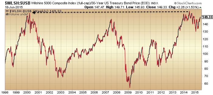
A stock market mania to extreme valuations.

Source: D Short
A similar low intensity solar cycle.
 Source: Chien Jen
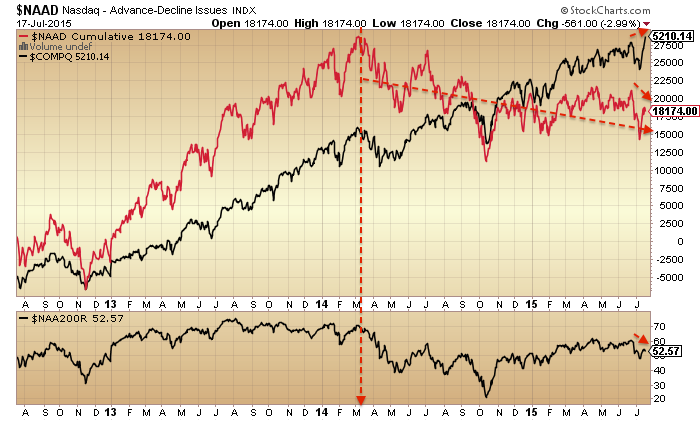
Stock market breadth peaked very close to the smoothed solar maximum (May 1928 vs April 1928, Mar/Jul 2014 vs April 2014) whilst stock index prices didn’t peak until at least a year later.

Source: RW Nelson Source: Stockcharts
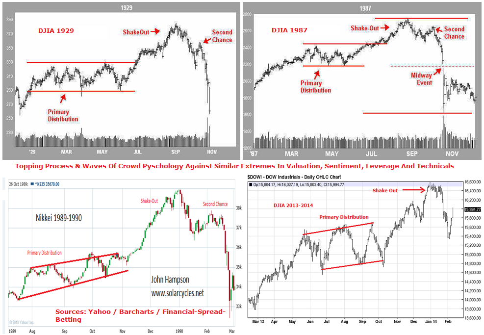
Maybe stock prices are following a similar technical pattern.

The timings within the year fairly closely match too. 1929 began with a range. The final push was June to Sept. Therefore, the onus is on the bulls here to push prices back up into the range and out, to prevent the breakdown from the current position.
Now what’s not similar.
Economic growth was stronger in the 1920s.
The fed funds rate was around 4-5% in 1928/9 versus zero now.
It was a demographic climax produced by peak immigration at the start of the century of the age bracket that would buy the stock market in the 1920s.
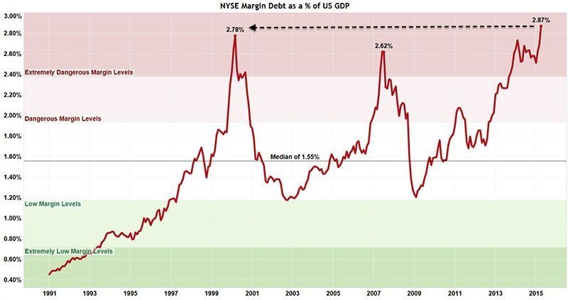
 Leverage reached 12% of GDP by the peak, versus 3% now.
All things considered, I believe 1929 has more in common with 2000, which was a demographic climax following strong economic growth with fed funds rate similarly around 5%. Post 1929 we saw the Great Depression, post 2000 the Great Recession, then following both we experienced a valuations-led stock market mania into the next solar max set against easy money conditions. Hence 1937 is a better all round fit to now (see HERE for details).
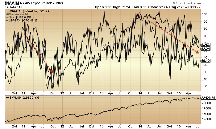
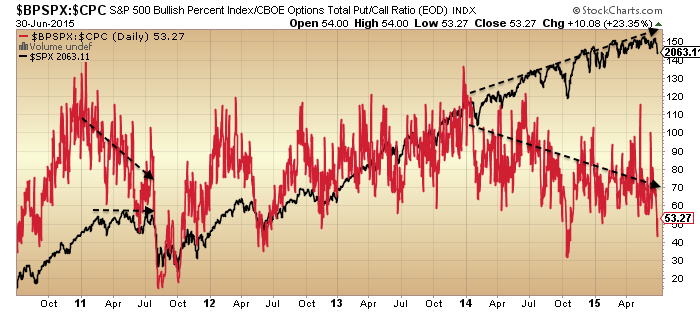
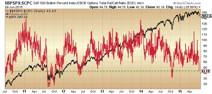
However, what’s common with 1929 is important, specifically that breadth peaked out 16 months before prices, and that is was ultimately leverage that delivered the craziness into the peak. Here in 2015 margin debt is hitting new highs so maybe the game isn’t over yet.
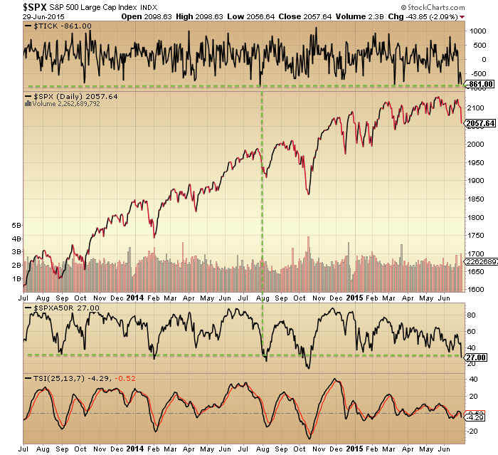
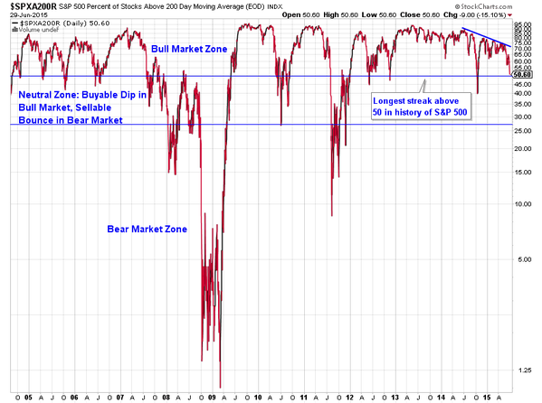
There was always a question mark over why prices didn’t peak with the 1928 solar max but made the anomalous extension into 1929. However, now we can see that breadth peaked at the 1928 solar max, like it has at the mid-2014 solar max, so in both cases marking some kind of speculation peak. The majority of other solar maxima delivered peaks in both breadth and prices close to the sunspot peak. Assuming prices peak out within the next several months (and don’t keep going, new secular bull style) then we are again producing that kind of anomaly that we saw in 1929, namely a fairly long period of degrading internals whilst prices continue to levitate or rise. Why? It’s leverage. Saturation levels in sentiment, allocations and valuations have been in place since the start of 2014. Buybacks were significant for much of last year but now it is leverage which is left holding things up.
So what stopped it in 1929? Answer: nothing in particular. One day the market topped out without any notable trigger, like most tops. Ultimately it was a combination of the fuel for higher prices being spent, leverage at unsustainable levels, prices for stocks being fairly unpalatable, and the whole thing having become a ponzi scheme. Then I would argue that the twin downward pressures of post solar max and the geomagnetic seasonal lows of Sept/Oct produced the timing.
Which brings us to today. What’s to stop prices making a final major leg up like in June-Sept 1929? Nothing, if leverage can keep rising, and the appetite amongst participants is there. However, that ‘appetite’ is under threat due to our positioning post smoothed solar max and the seasonal downtrend from July to October.
Solar cycle 16 had a sting its tail with a final surge in sunspots from September to December 1929. As this rather fits with the declines than the final run up in prices, I don’t think it’s relevant as a cause of the last leg up.
I would summarise that stocks are on borrowed time since the solar max of mid-2014. Breadth, volatility (inverted) and various risk measures all peaked out then. Buybacks also peaked out around then, leaving leverage as the key driver. This kind of anomalous extension post solar max was only seen before in 1929. Given most things in the world are now ‘bigger, better, faster, more’ than back in the 1920s, what’s to stop us blowing that reference point out of the water with an even dizzier anomaly now? Well, I would argue that in the context of negative demographic trends we already have.
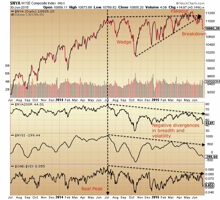
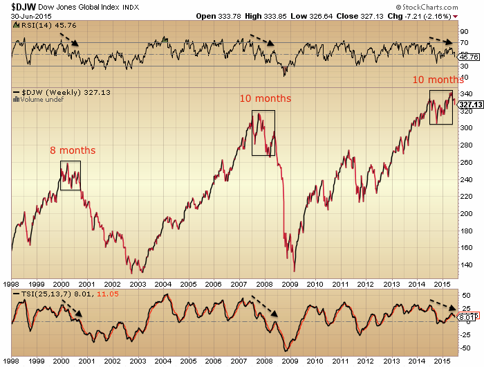
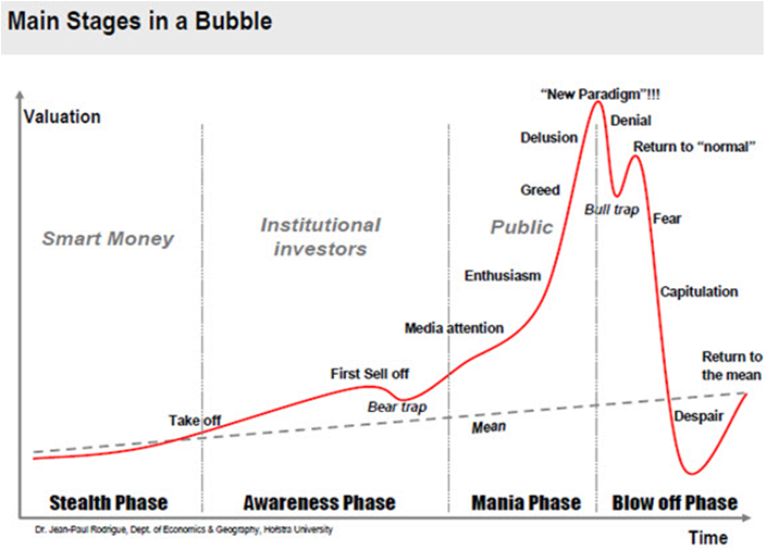
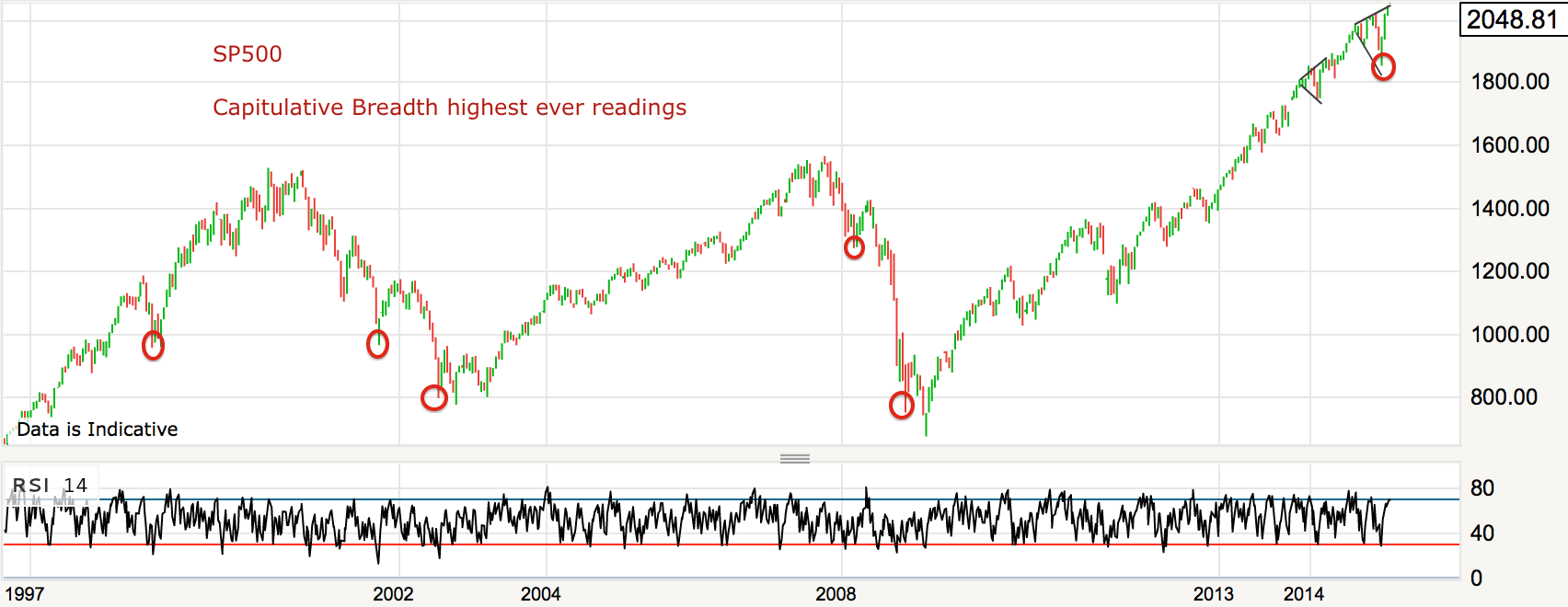
A common historic technical topping pattern looks like this.

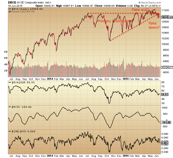
Bottom right is a chart from last year when it appeared to have formed into early 2014, but was a red herring. Drawing together several indices from around the world we could argue it is there again, with the primary distribution across last year and the final leg up in 2015.
 Or we could argue the final leg needs to go higher yet, or has to happen yet on the main US indices. Not easy to call.
So if we stick to what we know, I suggest it’s this. Stocks are on borrowed time since mid-2014 as divergences continue to grow. The geomagnetic downtrend from July to October 2015 together with the post-solar-max downward pressure has a strong chance of killing the bull. The two things to watch are these. Can prices be bid back up into the 2015 range and out of the top? If so, a final leg up would gain weight. And can leverage keep rising? It needs to, if another leg up is to happen.

 Source: Urban Camel
 Source: Stockcharts
 On the flip side of the equation, gold miners bullish percent hit zero again, like the boxes in the past shown:
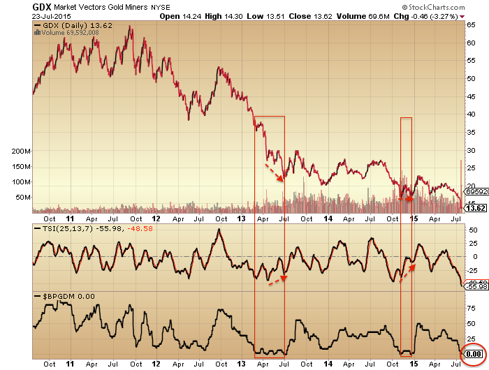 But note the norm in the past was for a lower low on positive divergence before a true bounce.