Reversal Ahead

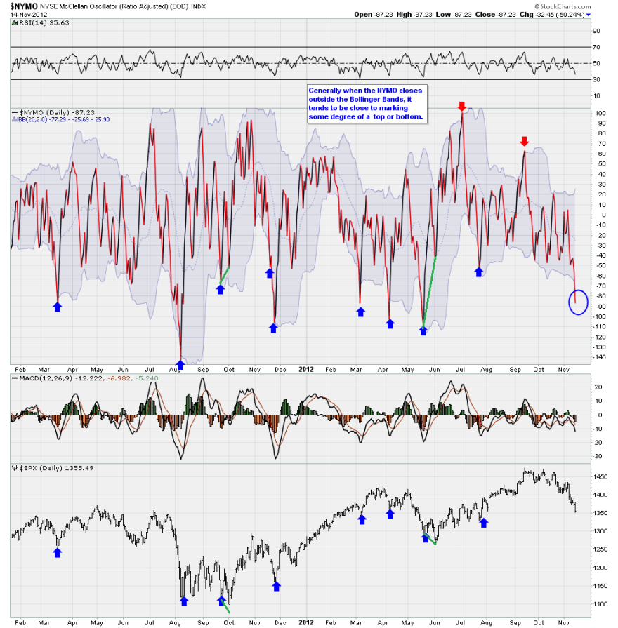
For NYSE stocks, take a look at the Mclellan Oscillator as at the end of Wednesday’s session:

Source: Breakpoint Trades /My positive divergences in green added

Out of the lower bollinger band and sufficiently oversold to suggest a bounce right ahead. The question is whether US stocks are a buy here or whether they need to print a lower low following a relief bounce with a positive Nymo divergence – see green highlights.

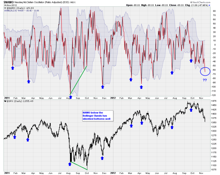
Here is the Nasdaq Mclellan Oscillator, and the same applies:

Source: Breakpoint Trades /My positive divergences in green added

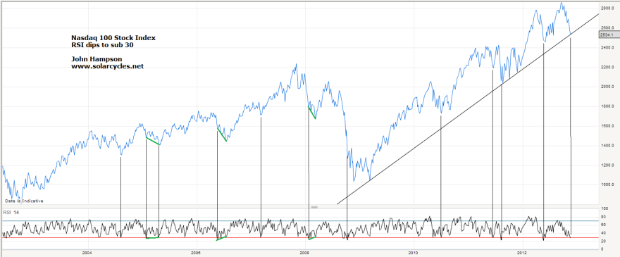
The Nasdaq RSI is also sufficiently oversold to suggest a bounce. I have highlighted previous such occurences and the story is similar to above – either a reversal occurs, or stocks need to print a lower low in the weeks ahead with a positive RSI divergence (again shown in green):

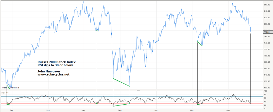
And here is the Russell 2000 index, with the same message as above:

To add to this, Sentimentrader reveals that the majority of US stock market sectors are at bearish sentiment extremes, and stocks above the 50MA have reached the lowest range. So there are reasons to expect a bounce in US equities as early as today. The unknown is whether they will reverse course, or merely make a relief bounce before a lower low with positive divergence.

Looking wider, daily sentiment index extremes are currently showing for treasury bonds (extreme bullish) and Nikkei, soybeans and coffee (extreme bearish). This suggests a bounce in US stocks may well be part of a broader bounce in pro-risk and away from safety.

We have just seen a lunar inversion – stocks declining into this week’s new moon. That gives potential for a brief relief rally before a lower low into the week commencing 26 November – the week of the full moon. That would roughly tie in with the Gann predicted take off point for commodities (and reversal in stocks) around 21 November. Alternatively, lunar inversions have sometimes historically meant trend changes, so there is the potential to rally from here and not look back, which would be in line with the presidential seasonality and geomagnetism I presented earlier this week, and also close enough to the Gann take off.

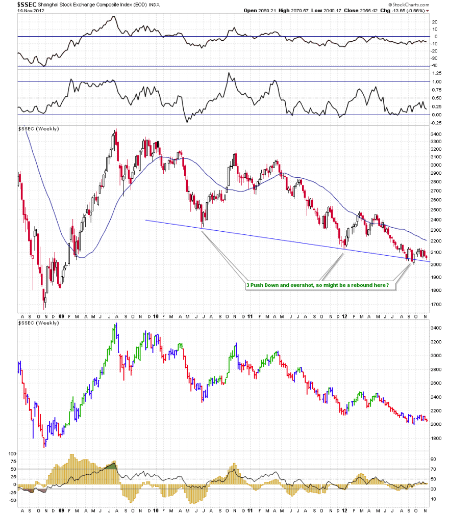
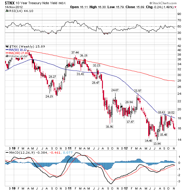
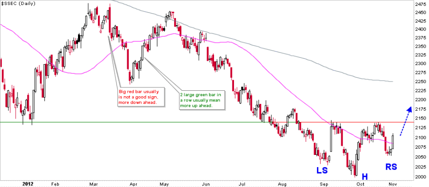
Both Chinese stocks and US treasury yields are still trying to carve out bottoms, both holding above their lows and with the potential to make inverse H&S patterns, and doing so on extreme cheapness. Potential bottoms only of course, but with justifications.

Source: Cobra / Stockcharts

Source: Stockcharts

Russian stocks have also dropped further since I opened a position last week, now at a p/e of just 5.8. Coffee public sentiment is at an extreme low not seen since 2001.

In short, there are a few candidates in my mind to play a bounce in pro-risk – and that includes US equities – and I’m just weighing up where and if I want to add today. The ‘if’ part is related to the potential for a lower low ahead, where a positive divergence in breadth or RSI is required.

We do not as yet see a washout in other indicators, such as sentiment surveys. These might also suggest caution. However, I maintain that if this is a topping process in stocks then we should see up-down volatility near the top, rather than the kind of deep cleansing washout that enables a bull market to continue.

Will post in the notes if I add positions.

Into Year End

If the secular commodities finale is to play out as I predict, then this should be about the point that commodities, led by gold, start to outperform. Supporting this is Gann methodology, which suggests commodities should take off in a large up-move into 2013 as of around 21 November. Here is my suggested historical mirror, with the previous square showing how things might progress:

What could give commodities such a thrust? Strengthening in China for one, and we see this in the latest data. Industrial production rose 9.6% year on year, retail sales beat expectations at 14.5% year on year, and auto sales rebounded strongly from September’s weak number. Commodity technicals could also assist, with gold having bounced at the 200MA again which has largely supported the secular gold bull to date, soybeans having retraced sufficient of their mid year gains to reach just 8% bullish daily sentiment, and coffee having reached an all time record speculator short position.

Tame geomagnetism could also help, and it can be seen from the chart below that the geomagnetic model is finally showing an upturn into year end, as negligible geomagnetism is forecast (all models have been updated this morning):

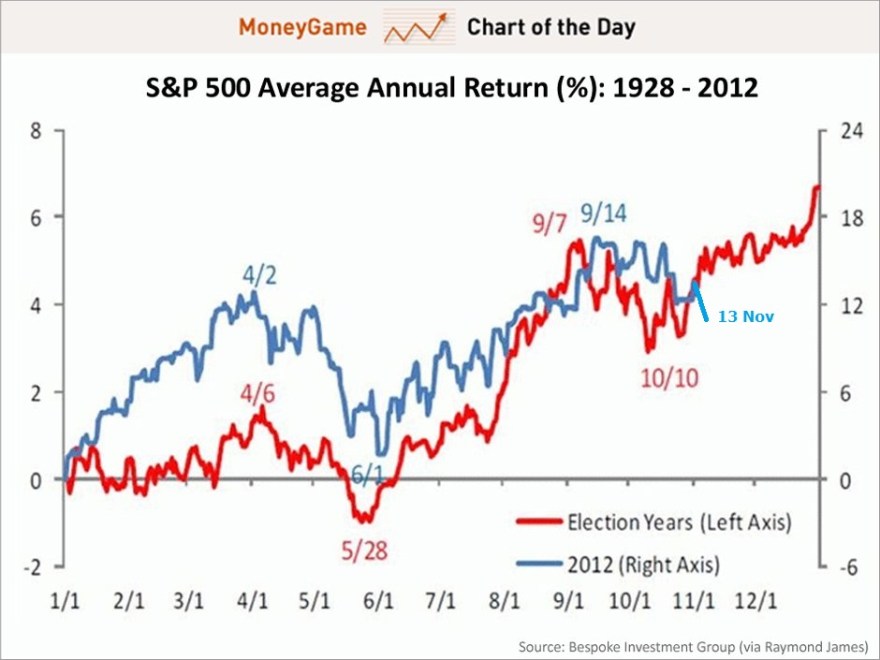
Such tame geomagnetism should also be positive for equities, with Presidential seasonality too:

Source: Bespoke / Moneygame / My Update

Potentially we could see pro-risk wash out a little more in sentiment before take-off next week, but I predict the next move will be a rally in both stocks and commodities whereby equities (globally speaking) re-reach for their Q3 highs, but make negative divergences in internals (if they are to be topping out), whilst commodities outperform upwards. I am watching leading indicators to judge whether there is ‘sufficient’ growthflation ahead to enable this scenario. The rest should be fulfilled by the influence of solar maximum activity on humans collectively. 2013 is the big test for my solar theories.

I leave Kuala Lumpur tomorrow for 6 nights in Penang, continuing to explore Malaysia.

Country Stock Index Valuations

Today’s exercise is a 3-way cross reference between price-book valuation (p/b), price-earnings valuation (p/e) and cyclically-adjusted price-earnings (CAPE) valuation of stock indices around the globe. I believe we are in a gradual process of transition from a secular stocks bear to a secular stocks bull globally, with the nominal low already achieved in 2009 and the momentum ‘go’ point likely 18 months hence or so. I am on the look out for timely points to invest in stock indices that reach p/es/CAPEs sub 10 and p/bs of around 1 or lower, as these mark secular extreme low valuations.

The first table is a list of some of the main country p/b ratios, as at the end of October 2012. Green – cheap, red – expensive.

Source: Globe and Mail

The second table contains a more comprehensive list of countries, this time valued by CAPE as at the end of October 2012. They are in order of valuation from green/cheap to red/expensive.

Source: Megane Faber

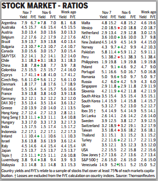
And the last table is right up to date as of the end of yesterday, showing countries valued by regular p/e and also by the yield of the country’s index. Peer at this to spot green markers against cheap countries and red against more expensive. It should be noted that because we are reaching towards the end of a global stocks bear market, there are very few countries that are truly expensive, as the historic average p/e is around 15-16.

Source: FT

What are the main takeaways, when cross referencing?

Pawel mentioned Turkey. It is cheap by p/e and cheap by p/b (though less so by CAPE), and this is after rising 40% over the last 12 months. Japan, particularly the Topix, is also cheap by both (though slightly less so by CAPE). Ireland looks to be the pick of the PIIGS, with a cheap p/e and ultra cheap CAPE (although it is yielding little). But there is one winner, extremely cheap by p/b, CAPE and p/e and yielding 4.2% to boot, and that’s Russia. The Russian stock index is most weighted towards energy, so aside the political risks, the key question is whether you believe energy prices can hold up ‘well enough’ looking into the future. I’ve opened a long position in JPM Russian Securities today.

On the flip side, Cyrpus and Peru are the notable ultra expensive countries, but two other countries stand out because of being relatively expensive to the others by all 3 measures above, and that is India and the USA. I continue to await the forthcoming rally in equities – which should occur whether this is a topping process or a bullish continuation, and if evidence grows for a cyclical bull top, I would look to exit my SP500 stock indices positions.

China

A pick up in China looks likely into year end, both in the stock market and economy.

On the weekly and daily views, the Shanghai Composite looks to be basing for an up-move.

Source both: Cobra / Stockcharts

It is doing so on a p/e valuation of just 7.8, which is historic extreme cheapness.

Meanwhile, the Hang Seng broke out of its long term triangle and has advanced away from the breakout, which further bodes well for Chinese equities.

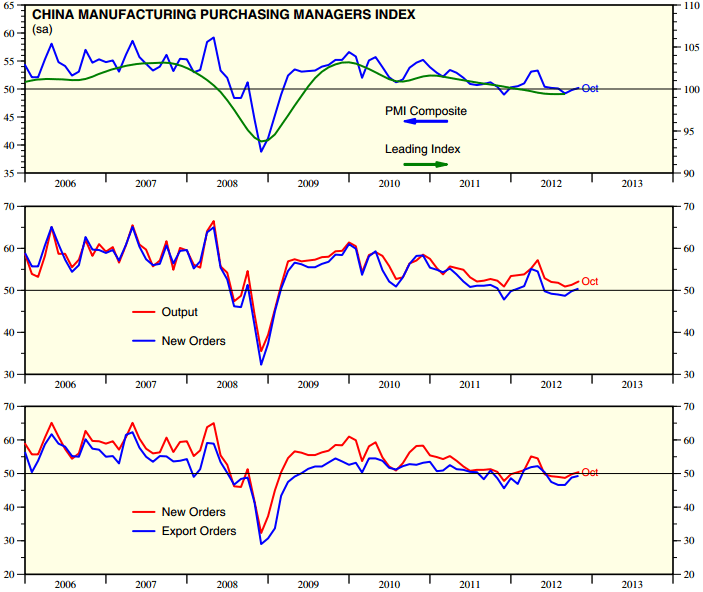
China PMI has pushed back up recently, which as a leading indicator suggests an upturn in the economy ahead, even if only short lived rather than enduring.

Source: Ed Yardeni

And the Chinese National Bureau Of Statistics leading indicator suggests an uptick in GDP growth is likely.

I maintain that strength in China is important to fulfill a secular commodities finale next year, due to China’s role as the world’s largest aggregate commodity demand source. Now let’s see whether this improvement in China is mere counter trend respite and stabilisation or a move that gathers momentum, but given the Chinese central bank pumped the equivalent of $50bn into the economy on Sep 25 and another $42bn on Oct 9, there is the potential for a period of reasonable strength.

Price To Book Ratio

My multi-month world trip with my wife (who is Austrian – nationality rather than economic school of thought) and 2 kids (who are 6 and 10) begins on Tuesday, starting with a week in Singapore, adopted home of Jim Rogers. He has said that a smart man would have moved to London at the start of the 1800s, to New York at the start of the 1900s and to Asia in the early 2000s, anticipating Asia to be the economic power of this century. He believes today’s Asian work ethic is the same as the USA used to have. I hope to get a feel for that myself. After Singapore we travel by land into Malaysia, and from there into Thailand. We intend to visit quite a few countries around the world, so if I am coming to your neck of the woods, and you have a few tips on what to do, what to see, where to eat or where to stay, let me know. John (at) solarcycles (dot) net. I will keep you updated of our route. My posting times will change, due to the time difference. Also I may not be able to achieve the same depth or frequency. But over this important time (when it is ever not?) I will absolutely still be sharing my thoughts and actions, and looking for your continued input.

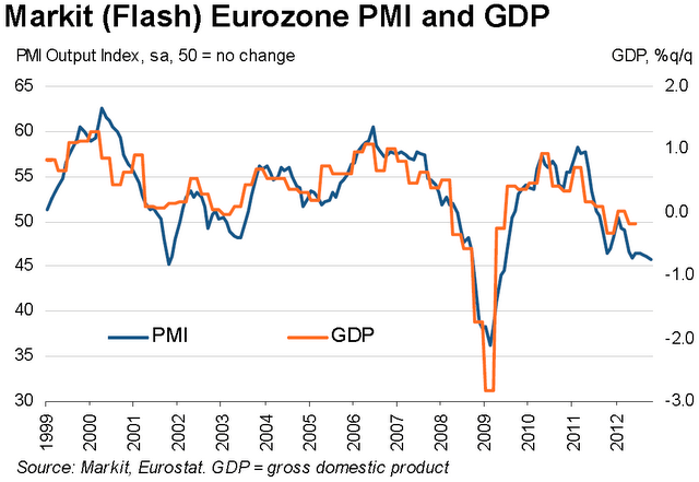
OK, to the markets. This week’s data looks like this. US earnings are now overall slightly negative year on year but slightly above pre-season expectations (which was for worse). US economic was data overall mixed, but Economic Surprises are still strong (now standing at +51.7). Conference Board global leading indicator data has generally disappointed for this month. Australia -0.8 (last month zero), Eurozone -0.4 (last month +0.5), China +0.3 (last month +0.7). That data is a warning flag because the global improvement seen in September over August may be being reversed. Eurozone PMI came in lower than expectations and sets the scene for a negative GDP reading.

Source: SoberLook / Markit

Technically pro-risk has been pulling back en masse, but without obvious recipients, as treasury bonds, corporate bonds and gold have not advanced. I’m not quite sure what to make of that development, but we will find out soon. As per my last post, I believe that the next move will be a counter rally in pro-risk and there is some evidence that we may be reaching the kind of bearishness that may initiate a snapback:

Source: Sentimentrader

After this coming Monday’s full moon the pressure should change to positive, coinciding with positive seasonality into and around the US election. Again, as per my last post, I will be looking for an up move with negative divergences (in economic data and technicals) for evidence a cyclical equities topping has begun (and to sell into the up move), or for positive developments to accompany the up move and to suggest that the sell-off we have seen was rather a post QE announcement normal pullback based on unimpressive earnings. Tom Demark believes the Nasdaq has made its price peak already and the counter rally due will therefore fall short, whereas he believes the SP500 will make a marginal new high, before both then retreat 12-17%.

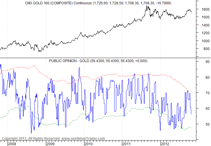
The Hang Seng has held up relatively well during this last 2 weeks and has maintained its long term triangle breakout. Treasury yields have also performed bullishly. Gold sentiment has pulled back sufficiently to enable a renewed move higher, and the 1700 level that it has currently reached represents a 38 fib retracement of the recent up move.

Source: Sentimentrader

Below is my recent prediction for stocks and commodities into 2013. Now if stocks top out lower than 1600 on the SP500 and have begun their topping process already then that is still consistent with historic mirrors (only the peak price level would change), as long as commodities now go on to outperform and make their blow off secular top. The rise in treasury yields despite the pull back in pro-risk is a positive for this scenario because by history yields need to rise as money flows out of safe havens into pro-risk, and if equities are stalling then commodities should be the recipient. The current threat to this scenario is the renewed weakness in global data (leading / concurrent). I maintain there needs to be sufficient health in the global economy into 2013 to enable a broad secular commodities blow-off top. Gold could potentially go its own way – operating as a hard currency and safety asset – but right now it isn’t showing any outperformance. And one last thought – if a renewed global turndown did gather pace right ahead, then might the Fed step in once again, this time with one of its as-yet-unused unorthodox policy tools, which could then inspire a mania into hard assets if desperation was perceived? It may not work again but could provide a tipping point into hard assets.

Well, that’s just speculation. We will see how things develop. Any cyclical stocks top should be a drawn out rounded affair so there is no rush to action. And the leading commodity in this secular commodities bull, gold, is in a bullish technical position, having broken upwards out of its 11 month consolidation. Collectively, when stocks and commodities make their next up trend move – whether that be counter or renewed trend – more evidence will come to light.

Regarding US stocks, if we cross reference the closest percentage correlated periods from history in terms of chart action to date together with presidential election seasonality (i.e. periods into the US  election like now) as well as previous secular stocks bears / secular commodities bulls periods then the closest mirrors from history are shown below:

Source: MRCI

Both have chart correlation percentages over 80%, both 1944 and 1972 were US election years and both fell within secular stocks bear / secular commodities bull periods, and the combined prediction would be for an up move next into and around the US elections, which is consistent with expectations further up the page. No guarantees of course – just a guide.

Lastly today, price to book ratio.

Price to book ratio (p/b) is an alternative valuation measure for stocks to price/earnings. A p/b ratio of 1 is the theoretical liquidation value of a company or stock index, i.e. assets minus liabilities. Buying a stock at a p/b sub 1 is either getting a bargain or there is something wrong with the company. Shown below is the p/b ratio for US and Europe indices since 1975 to current. The best time to buy a porfolio of the two would have been 1981/2 when they both dipped under p/b 1.

Source: Seeking Alpha / MSCI

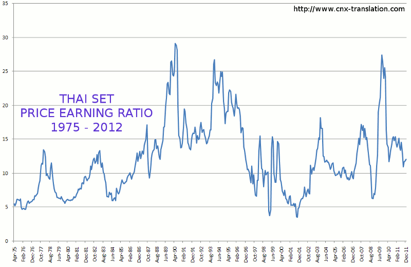
The cheapest stock indices valuations globally that have ever been witnessed were in Thailand at the time of the Asian Financial crisis (late 1990s) and Greece in the Euro debt crisis of current times. Greece hit a price/earnings valuation of sub 2 at its lowest whilst the Thai SET reached a p/e of 3.

Here is the Thai SET long term p/e valuation chart, showing a double dip to around 3 in that crisis period. The Thai SET is currently 4 times higher now than then, so buying Thai stocks when the p/e was 3 would have been a good investment.

We can also see the p/b ratio hit its lowest around then also, to around 0.6, which again would have been a great entry point, with markets overly discounting bad scenarios.

A snapshot of global stock indices p/b valuations in 2011 looked like this. Greece was the cheapest on a p/b of 0.76. The great majority of other countries, ranging from G10 to developing nations ranged from a p/b of over 1 to sub 3, with a few rogue outsiders more expensive than p/b 3.

There is no question in my mind that the Greek stock index will return handsomely in the long term for those brave enough to have ventured in at its lows this year and last (it has currently doubled off its lows). The risk is that it tanks again, once or more, before rallying in earnest, subject to developments in Europe and the wider world. Now that is has doubled, its valuation by p/e or p/b is no longer cheap but mid-range globally. But, like the Thai SET in the late 1990s, the point is to buy in at a p/b some way below 1 and be patient.

So, it is interesting to see Japanese stocks at a p/b ratio of just 0.77.

 Source: Vectorgrader

Whilst price/earnings valuations haven’t dropped so extreme low (13.7 Nikkei, 10.9 Topix currently), the price/book ratio reveals a much more compelling undervaluation, suggesting the liquidation of all Japanese companies in the Nikkei would actually return almost 25% more cash than it costs to buy them currently.

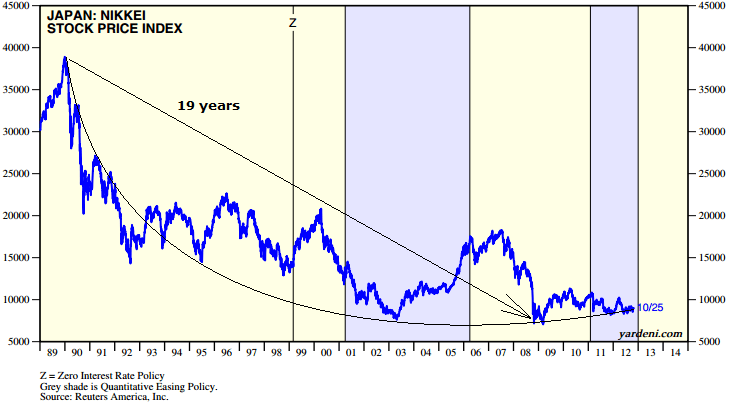
Since the 1989 Nikkei peak, the index has gradually been making what appears to be a rounded bottom. Recall the 19 year cycle showing up in the Dow Jones stock index spectrogram? Well, from the Nikkei peak to the nominal low to date was 19 years. Just speculation that it may have relevance here, but if the rounded bottom continues its trajectory then that nominal low of Oct 2008 should hold.

Underlying source: Ed Yardeni

In support of that price bottom holding, the price to book ratio of 0.77 is historically extreme. It is in the same zone as the Thai SET at the worst of the Asian financial crisis and as Greece in the Euro debt crisis accuteness. It is also little higher than that reached at the Nikkei’s nominal Oct 2008 bottom.

So are the Japanese stock indices a great buy and hold opportunity here?

To answer that we have to consider its debt and deflation problem that has plagued it throughout its decline since 1989. It has the highest debt to GDP ratio in the world. However, unlike other indebted countries most of this debt is held domestically, by the Japanese people. This makes Japan less likely to be a default candidate, particularly given the Japanese culture. However, it has to keep rates low to service the debt and pursues inflationary policies which would help shrink the debt. Until now though it has failed to re-ignite inflation despite its policies. It is heading for one of two outcomes: debt default – which I believe is unlikely (at least in this decade) – or inflation finally takes hold and yen-weakening becomes the trend. Given the yen has been in a 30 year bull market since the early 1980s making for extreme relative historic valuation to other currencies, and real estate prices have dropped to 36% below long term averages in terms of both versus rent and versus income, and equities have reached extreme historic p/b cheapness valuation, I believe there is a strong possibility that money now starts to pour into the inflationary assets or equities and real estate (over months and years).

So what about the p/e valuations not having reached sub 10? Well, that is a thorn in the side of the undervaluation story, however, Japanese p/es average higher historically than other countries. Nikkei and Topix p/es are actually lower now than they were at the bottom of the 1970s secular bear.  On p/e alone I would not be a buyer but it is the p/b valuation that really shows the current value on offer. If further casts doubt on a deep stocks bear ahead – at least in that part of the world, with also Chinese equities on a p/e of just 7.9 paying dividend yields of 3.8.

In terms of Japanese equities I believe it is more likely they can further their rounded bottom. The historic extreme undervaluation for real estate and historic extreme overvaluation for the Yen is also supportive of a wider risk/safety inflation/deflation asset reversal. I maintain we are in the transition years from global secular stocks bear to global secular stocks bull and K-winter to K-spring, and that this is also supportive.

My average Nikkei long position is 8481 (current price 8913). I have added to that this morning with a view to a longer term hold based on the above.

Edit: One more chart to add that I missed off: Japanese equities now yielding more than Japanese bonds, adding to their relative attractiveness.

Source: Daily Wealth


Cyclical Stocks Bull Topping Indicators

This is how some of the key stock indices currently stand. The FTSE 100 is trying to break out of a long term triangle.

On the nearer term view, however, it has been turned away at declining resistance. The question is whether this is a fifth failure since the cyclical bull began in 2009, or whether it is consolidating before it finally breaks through.

The Hang Seng, meanwhile, has now broken out of its similar long term triangle, and it is breaking out on a p/e of 11, which is historically relatively cheap. Unless it is pulled back in this week then that break would be validated.
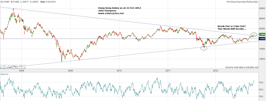
On the nearer term view, it can be seen that it is now up against another resistance level: the March 2012 highs. So if it is to be pulled back into that long term triangle range, then here is a level to be repelled at. Two things to keep an eye on therefore.

The German Dax is also into a zone of importance. Below is the horizontal support of the March 2012 highs which it appears to have successfully backtested, whilst above is the cyclical bull high-to-date resistance (from 2011) around 7500. It additionally has the support of a rising channel to potentially take the index up to that resistance level. A break of either support would turn things more bearish.

Meanwhile, the Nasdaq in the US is in a different place. Unlike the indices above, the Nasdaq reached far above its 2011 highs already, early in 2012. It since then rose above those 2012 highs (in March) to higher highs (in September) but has failed to hold above. The chart below shows that this could be meaningful.

The near term action since September has produced a little series of lower highs and lower lows, which suggests a new bearish trend. On the flip side, the index is nearing oversold, approaching RSI 30.

Clearly the Nasdaq has some way to fall before dropping out of the bottom of its cyclical bull channel and officially into a new bear market, but we should not need to wait for that to be able to judge whether the cyclical bull has topped out. One topping signal would be a major distribution day near the top, and we saw that on Friday. Another would be that cyclical stocks such as Techs break down first and money roates into defensive stocks. Techs are the weakest sector currently. US earnings are now overall flat year-on-year, which actually beats expectations (which were for shrinkage), but tech stock reports particularly have disappointed.

So the question is, are we seeing the first part of a topping process, with techs leading us down first, or are we just seeing some current weakness particular to tech stocks and their poor earnings (overall US earnings are so far flat, which actually beats expectations), with some knock on effect from the Nasdaq index onto other indices? With different indices around the world in different positions, it’s not clear, but there are some other common characteristics to cyclical stocks bull tops, so let’s review:

1. A topping process, normally months, with reversals of reversals of reversals in a range

This chart shows the last two cyclical bull market tops highlighted. Both topping processes lasted around a year, and within the boxed ranges there are both double tops and double bottoms, reflecting the reversals of reversals in a range criteria. If we are seeing a top on the SP500 currently, then we should see this play out into next year, with some sideways volatility to make a topping process. That should allow the 200MA to catch up and then the market can slice through it to begin a new cyclical bear. Could the topping process have begun in March this year at the lower peak? If so, we should still see more up/down oscillation as the market gradually rolls over.

Source: Ed Yardeni

2. Evidence of overbought and overbullish extremes (such as RSI and sentiment surveys)

I’ve done some checks on this and the evidence isn’t very compelling that this actually correlates with a cyclical bull top, namely because of the sideways ranging. These indicators can flash at the start of a topping process, as an up move rolls over into ranging, but thereafter don’t hold persistently.

3. Breadth divergence (such as new highs / new lows and advance-declines)

Cobra’s chart here shows how at the 2007 cyclical bull top for the SP500 price made a higher high whilst advance-declines made a negative divergence. This shows narrower participation compared to a healthy rally which is based on broad participation.

Source: Cobra / Stockcharts

Chris Puplava’s chart here shows that in the run up to the previous cyclical bull top of 2000 shares hitting new lows in the NYSE (SP500 and Dow) exceeded those hitting new highs, which again is a signal of a narrowing rally.

Source: Chris Puplava

This is how things stand today. NYSE (SP500 and Dow) advance-declines are still in an uptrend. For topping evidence, we would want to see a pullback in stocks and this ratio, followed by a new high or double top in stocks where the ratio negatively diverges.

Source: Stockcharts

And this chart is a cominbation of Nasdaq new highs – new lows and NYSE new highs – new lows. Again, we don’t see divergence yet, so would want the same as above – pullback then push up with negative divergence.


Source: Humble Student / Stockcharts

4. Cyclical sectors topping out before the index top and money flow into defensives

Leading into a cyclical bull top, money normally rotates out of cyclical sectors such as technology, consumer discretionary and materials into defensives such as healthcare, utilities and consumer staples. This is because the economy is turning down or forecast to turn down and these sensitive sectors therefore become less attractive. Below we can see that into the 2007 top, two cyclical sectors topped out several months before, whilst one remained strong, but the two were sufficient a clue for a top.

Source: Chris Puplava

Fast forward to today and this is how things stand. SP500 cyclicals have overall been in an uptrend since August and do not show that negative divergence.

Source: Stockcharts

Comparing three defensive sectors to three cyclical sectors below, we don’t yet see defensives outperforming and cyclicals falling away.

XLV Healthcare, XLU Utilities, XLP Consumer Staples

XLY Consumer Discretionary, XLF Financials, XLB Materials

Source: Stockcharts

However, the biggest faller has been tech, and that is a cyclical sector. So, as things stand, I would want to see a couple of other cyclical sectors join tech in underperformance relative to the wider indices, to add weight to a top.

5. Major distribution days near the highs

We got one on Friday so that’s a warning flag.

And in the wider environment:

4. Yield curve flat or negative

5. Tightening of rates through rising yields

6. Excessive inflation

7.  Rolling over of leading indicators and recession model alerts

The below chart captures 4. and 5.

Source: Scott Grannis

Cyclical stocks bulls have historically ended with inflationary and speculative froth, money pouring out of safety and pushing up yields, inflationary pressure and natural tightening tipping us over into recession, and indicators of forthcoming recesssion in evidence before the speculation tops. Is this time different due to Fed intervention in the bond market? I don’t believe it affects the overall mechanism, but perhaps means yields will peak lower than otherwise. I still foresee this excessive speculation and inflation playing out, as per my previous Forecast 2013 posts. Thus far we see a little inflationary froth through grain prices, but little else excessive.

Regarding leading indicators rolling over, a glance at the US ECRI WLI shows an indicator performing quite differently to the last two cyclical bull tops (leading into the grey banded recessions). What we would need to see is this indicator start to roll over and break into the negative. This coming Friday’s WLI reading is forecast to slip to 5.82, so there is a potential seedling for a trend change. But we would need to see a few weeks of increasingly lower readings to be consistent with previous tops.
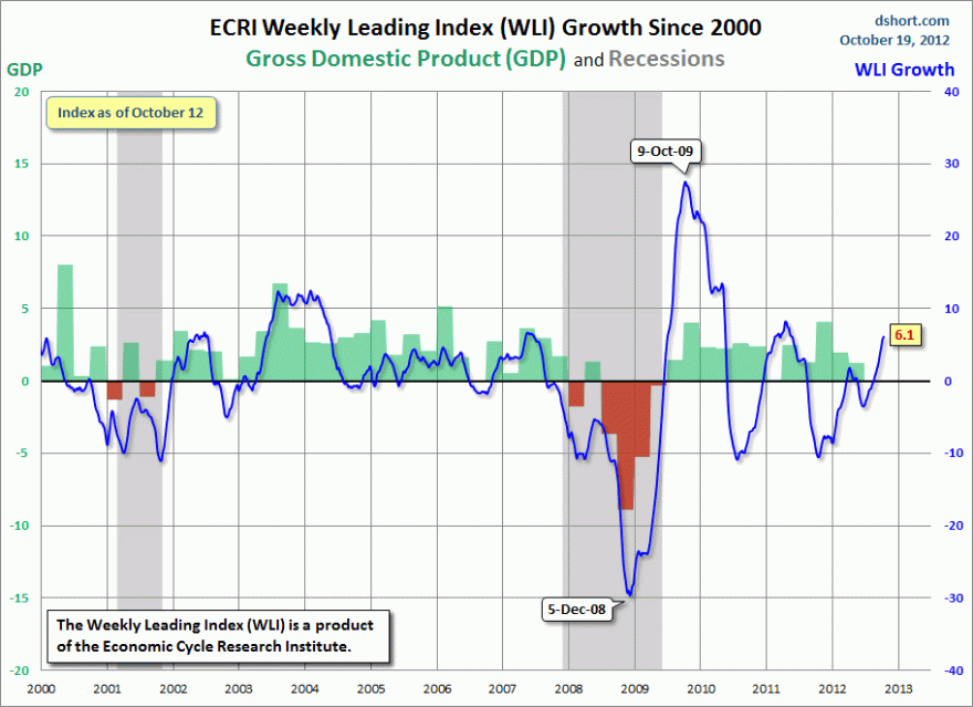
Source: Dshort

The Citigroup economic surprises index for the US is also in a strong uptrend, and its correlation with the SP500 is shown. Again, it would need to reverse trend for a few weeks and break into the negative to be consistent with previous tops. More often than not, this indicator leads a trend chane ahead of stocks topping or bottoming.

Source: Ed Yardeni

 Turning to the global picture, Conference Board leading indicator latest readings for Germany and Australia this week both came in negative and worse than last month. This is in contrast to the recent general improvement since August in global leading indicators. Once again, we should see a trend change in global indicators back to the negative over several weeks, to be consistent with previous equities tops, i.e. leading indicators should roll over before the definitive top in stocks.

So let me sum up. There are several potential cyclical stocks bull topping signs: techs underperforming, the Nasdaq breaking technically and a major distribution day near the highs. However, this could as yet be a ‘theme’ to US earnings season, namely disappointing tech stocks sell off, infecting other indices, in seasonally weak mid-October, before the cyclical bull continues. To differentiate between the two we should see more bull topping indicators aligning, if this is to be a top, and the whole process should last a while yet. Following the current down move we should see another up move, and perhaps repeat that down-up oscillation one or more times again lasting into the end of this year. In support of this, Tom Demark’s latest forecast is for the SP500 to make a move up again to peak out at 1478-1485 in the next 10-12 trading days and for that to be the high for this year. That would fit with Presidential seasonality being strong into and around the US election.

Should we get that move up, then we should expect to see some negative divergences if this is indeed a topping process, such as narrower participation or economic indicators weakening or underperformance of cyclicals. Should that occur then I will use that strength to sell out of some or all of my stock indices positions.

It is curious to see the Hang Seng breaking out and the Shanghai attempting to bottom whilst the Nasdaq is potentially peaking. How might that resolve? Well, my overall message is that a market top should take some months yet to fully form, so there is no rush for everything to align. Solar and secular history suggests equities should top first and then commodities should make their blow off top. It is therefore appropriate that we see some strength or at least stabilisation in China, as a key demand source for commodities. US indices are also amongst the most expensive by p/e whilst China is in single digits. It would therefore fit if the US indices were to roll over first.

A gradual topping process over a few months (rather than a swift decline) should also enable sufficient speculative froth to produce the inflationary finale whereby commodities make a secular final parabolic and bond yields escalate.

So, I sit on my positions for now. I await a renewed up move in pro-risk after this coming weekend’s full moon and into the US elections, targetting Tom Demark’s range. There I will look for further evidence of a topping process to judge whether to sell out of equities.

Global Stocks Secular Bear Market

This is my pattern and projection for the global secular stocks bear market and its conclusion, based on solar/secular history:

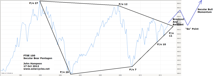
That secular bear pentagon is present in the individual main country stock indices. Here is the current UK FTSE and my projection (click for larger):

Here is the German Dax:

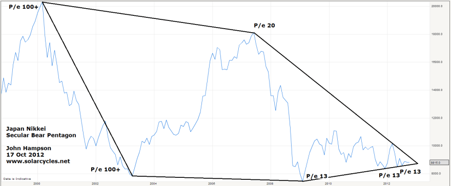
Moving to Asia, here is the Japanese Nikkei:

Here is the Hong Kong Hang Seng:

Moving to the US, here is the SP500:

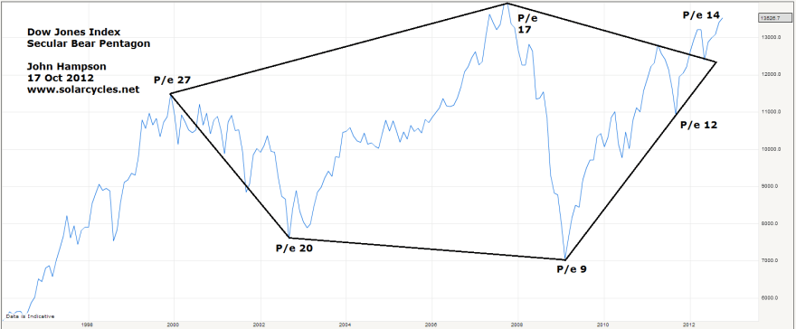
And lastly the Dow Jones:

So, my projection for all the indices is an approximation of that shown on the MSCI world stock index and the FTSE index charts at the top, namely a breakout upwards out of the pentagon into 2013, followed by a giving back of those gains and a retreat to the pentagon nose price level 2013-2014 (leading into and out of a mild recession), followed by a momentum take-off in a new secular bull market as of 2014/15. The US stock indices have led the way out of the pentagon, with the German and Hong Kong indices are now attempting to break out also.

I have added the price/earnings valuations of the indices at the key highs and lows. There is a theme of p/e valuations declining over the secular period, which is consistent with normal secular bear progress. It is inflation that makes secular bears track overall sideways rather than downwards, but progress in p/es reveals the true decline in stocks from expensive to cheap.

Secular bear history dating back into the last century reveals that stocks become a long term buy once they hit single digit p/es. In the secular bear to date, all the indices above have hit single digit p/es for a period, except the Nikkei. Despite falling the farthest in terms of valuation from its peak, the Japan index has only just lately come back to fair value when compared to the other country indices, and accordingly has the sorriest looking chart.

In the secular bear of the 1970s, the Dow Jones hit p/e 7 at its lowest valuation. In the secular bear of the 1940s, the Dow Jones hit p/e 9 at its lowest valuation. I suggest there is a reason why that stock index was bought up at a higher bottoming valuation in the 1940s than in the 1970s: the difference in secular yields/rates. Whilst the 1970s mirrors the 2000s in terms of a secular commodities bull and secular stocks bear, the 1940s is our closest match historically as it is both those but also a secular bonds bull. The 1970s was a secular bonds bear. It makes an important difference, in that equities are more attractive relative to other assets when bond yields and rates are ultra low. These next two charts show how stocks have now moved to relative extreme value versus treasury bonds and corporate bonds by dividend yields.

With both types of bonds paying negligible or negative real yields, the relative attractiveness of equities in that environment becomes that much greater. It is the pessimism that characterises the end phase of a secular stocks bear that is keeping money parked in bonds, but once confidence grows in economic outcomes, money should flow the other way. I am suggesting that stocks could bottom at a 1940s style p/e 9 rather than a 1970s style p/e 7 in this environment because of the additional value provided by dividend yields over and above treasury and corporate bonds and the relative attractiveness of true yielding assets in a negligible interest rates environment (rather than a high interest rates environment like the 1970s).

Solar and secular history predicts an inflationary finale in 2013, which if stocks went nowhere (nominally) would reduce p/e valuations further. I therefore expect that my projection of stocks breaking out and then returning to that kind of nominal level perhaps 18 months hence will see the indices largely breaking beneath 10 into single digit p/es at the ‘go’ point. The US indices, currently the most expensive, would be unlikely to make single digits unless they fell harder than the rest. However, not all indices made single digits at the end of the last secular bear – the Nikkei, for example, ended at p/e 20. The US stock indices have both hit p/e 9 in this secular bear already however, and that is comparable to the bottoming valuation of the 1940s secular bear. In support of this, it can be seen that the German Dax has been bought up each of the three times it hit p/e 9, in 2003, 2009 and 2011.

Friday Roundup

This is how the Sp500 stands. The consolidation is comparable after both QE announcements, if the market now proceeds to rally, and it has twin technical support for an uptrend resumption, as shown:

Its a useful triple confluence (channel support, holding above March highs and behaviour similar to the last QE announcement), because a decisive breakdown would swiftly provide 3 reasons to be bearish (i.e. triple confluence failure). I say decisive breakdown, because the market can sometimes make a fakeout to flush out the weak hands, so I’d want to see a couple of consecutive closes beneath the marked zones, to give more weight to the bearish alternative. The positive pressure around Monday’s new moon is still in play if the market can rally today and early next week, which gives us another reason for a renewed rally without delay, if it is going to happen.

The correction so far has largely neutralised indicators, such as II investor sentiment (now more bears than bulls), stocks above the 50MA (now back beneath the mean), and bullish percent / call put (neutral zone). If the correction is going to be a full flush out (or a new bear), then we’d expect these indicators to go all the way to extreme oversold/bearishness, but if this is just a consolidation in an uptrend then they have reset enough to push on again. I am still in the continued uptrend camp, and still expect the SP500 can reach around 1600 before keeling over. I maintain that because we don’t yet see the typical evironment for a cyclical bull market top (yields rising, inflation rising, leading indicators in a renewed downtrend, economic surprises in a downtrend, negative breadth divergence, etc) and that there is growing evidence of reflation.

What few US earnings report there have been so far have on average beaten expectations, but next week will produce a better sample.  ECRI leading indicators rose again last week and this week the shadow index is predicting the WLI growth will rise to 5.53 from 4.67. Conference Board leading indicators for the UK came in positive again today and higher than last month, but we have to wait until the end of next week for other country updates. OECD leading indicators came in unimpressive again this month:

 Source: OECD

The horizontal lines represent historic average growth, not a growth/recession divide, but nevertheless they don’t paint a picture yet of a global economy in resurgence. The particular bright spots in their report were Brazil and UK. There is a potential trend change in China occurring as shown, and the Shanghai stock index continues to look like it may be breaking out of its long term downward trend, plus the Baltic Dry index has risen 40% over the last couple of weeks, so I continue to watch these.

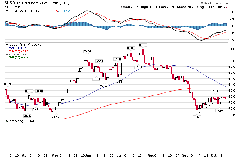
Yesterday grains had a bumper day as the latest US Department of Agriculture report suggested stockpiles will drop more than expected due to the adverse weather conditions and continued robust demand. And the US dollar index made an inverse hammer candle at both horizontal and diagonal resistance.

Source: Stockcharts

That’s only significant if there is now follow through, so again my focus is on how pro-risk and safety behave the next couple of sessions.

Gold And Apple

The exponential or parabolic or Hubbert phenomenon typically looks like this:

Source: Wikimedia Commons

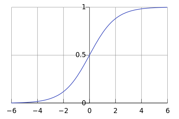
It occurs in nature and it occurs in the markets. Occasionally the exponential run up is followed by a flattening out at the top, to make an S-curve:

Source: Wikimedia Commons

But most of the time there is a collapse down the other side, fairly equal to the run up, and here are some examples of that:

Source: Chris Kimble

Apple is the world’s biggest stock by market capitalisation and now dominates the fortunes of the Nasdaq. Apple’s chart has gone parabolic over the last few years:

Source: Stockcharts / Yahoo

So is it due to collapse? Well, here’s the thing about exponentials: they can get steeper and steeper, putting on faster and faster gains.  Recognising the pattern therefore isn’t enough, plus there is the possibility that a chart that has gone exponential flattens out into an S-curve rather than collapses. Typically, a parabolic that reflects a speculative mania to valuation excess will result in a collapse, whereas a parabolic that reflects genuine growth or fair value may flatten out.

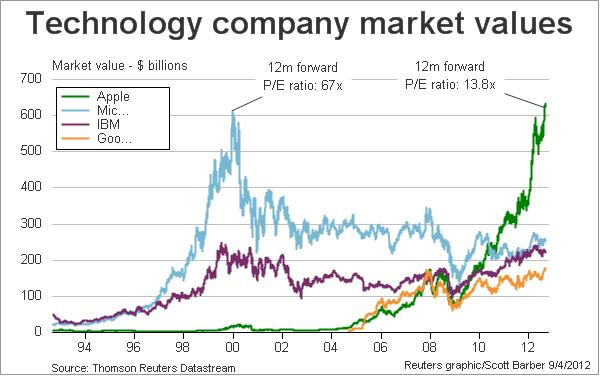
In this next chart we can see that Microsoft was bid up to a forward p/e of 67 in 2000, compared to a historical average around 15. The new internet companies of the time reached 8% of the total US stock market capitalisation, the SP500 reached a p/e of over 40, and the Dow-gold ratio reached an all time high of just under 50. By various measures, it was clear the tech parabolic became a speculative mania, and a collapse followed. Of course, timing the exit from the parabolic was difficult – it only looks easy with hindsight.

Source: Reuters

As can be seen, Apple is currently valued at just a 13.8 forward p/e, which is cheaper than the historical average, and it is cheaper than the majority of SP500 companies currently. So whilst it has exceeded Microsoft’s capitalisation of 2000, it isn’t the same kind of speculative bubble.

The near term view of Apple looks like this. A correction is occurring, following a higher high on negative volume divergence.

 Source: AfraidToTrade

That suggests it may correct further yet, and in so doing it is dragging down the Nasdaq. As the Nasdaq is usually the leading index, other indices are usually affected. So Apple’s fortunes are important. But Apple’s parabolic does not suggest a collapse as its rise is based on genuine growth and its valuation is still relatively cheap. Barring an economic downturn whereby all stocks are affected, I expect Apple to resume its uptrend post-correction, or to flatten in an s-curve if Apple’s growth starts to slow.

Turning to gold, we see the same exponential pattern over the last few years. At any point up the curve a trader could have called a top based on an unsustainable trajectory, but the curve just got steeper. The 9 month consolidation from 2011-2012 brought about bigger calls for a top, but again it appears to be resolving upwards into what should be an even steeper parabolic.

Source: Valcambigold

Assessing the parabolic for gold is more complex than for equities, because there are multiple valuation measures for gold as it fulfils various purposes from inflation hedge to hard currency to commodity. The publisher of that chart compares the percentage of assets in the gold sector as one measure. Certainly the 1% current position is not excessive compared to 26% in 1980 or dot com companies reaching 8% of the US market in 2000.

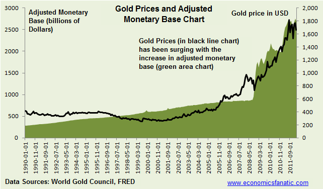
Valued as a reserve currency in the face of large monetary base expansion, its parabolic appears to reflect genuine fundamentals.

Source: Economicsfanatic

As a non-yielding asset that fares well when real interest rates are negative and declining, it has also been rising at ‘fair’ value.

Source: Moneyweek

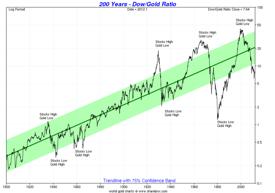
However, when we look at its relative expensiveness to real estate or equities, it is into the historic extreme zone. Versus equities, it could yet become more relatively expensive to reach down to the 1980 level, but on this measure alone the gold parabolic does reflect some speculative froth.

Source: Sharelynx

Other ways to value gold include its relative price to food or broad commodities (due to close relations) and the proportion of its demand from investment (central banks and investors) versus supply growth. Drawing all together, I would suggest the picture for gold is one of a parabolic so far based largely on fundamentals, i.e. a genuine ‘growth’ based exponential rather than a speculative mania. However, I also suggest that this is likely to change ahead. I have argued elsewhere that yields should begin to rise now, that ‘investment’ demand for gold is due to top out in the next 18 months whilst supply is already growing, and that a whiff of policy change in relation to rates was enough in the 1940s to kill the gold bull (rather than requiring real rates to go positive). I believe we will get that whiff once we reach an inflationary spike next year.

I predict a speculative mania in gold will occur, based on historical mirrors, and we will then see the divergence from fundamentals that will bring about a huge run up followed by a collapse. But thus far, gold’s parabolic is not particularly speculative, and that does suggest that the Dow-gold ratio could reach 1980s levels before reversing. There is no easy way to time an exit from a speculative parabolic that has diverged from fundamentals, only to recognise it and then choose your weapon. That weapon could be trailing stops, or solar cycle timing, or technical indicators such as overbought/overbullish extremes together with negative internal divergences. But first, let’s look for evidence of transition from value parabolic to speculative parabolic.