
Dow is up more than 5% five consecutive years now. A sixth such year has not happened before in history. A 5-year bull trend only occurred once before, in the 1990s, and was followed by 3 down years. Russell 2k rallies of similar size and duration to 2013’s (excluding accelerations from major bear lows) are shown below. In each case all the gains were given back the following year.

Source: Fat-Pitch
2014 is the second year in the Presidential cycle, and is the weakest historically by returns, averaging flat. The logic for this is that is it a time for governments to deploy tougher, unpopular policies. The Investors Intelligence bull-bear ratio currently exceeding 40% also forecasts a flat return for the SP500 by the end of 2014, by averaging history, whilst the II bear percentage alone, around 15% the last 4 weeks, has historically produced returns of -5% to -20% over the next 6 months.
The Citigroup Panic/Euphoria Model, having crossed the Euphoria threshold, predicts an 83% chance of losses in 2014. Goldman’s analysis of performance following a year of 25% gains or more point to a median drawdown of 11% in the next 12 months.
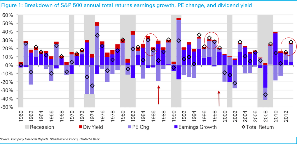
Next is a chart highlighting a couple of previous occurrences similar to 2012 and 2013 where stock index rises were dominated by multiple expansion, not earnings growth.
 Source: Fat-Pitch
In both instances the following two years saw better earnings growth. But notably the next two years were 1987, stock market crash, and 1999, at the end of which the Dow peaked, suggesting a common theme of pre-correction exuberance.
Both the following charts reveal that 10 year stock market returns are closely correlated to deviations from norms 10 years earlier. The first correlates average investor allocations and the second market cap to GDP. I have added the blue horiztonal line averages, revealing both are overvalued currently, but one more extreme than the other.

Source: Philosophical Economics Source: Hussman
The logic behind both is that mean reversion always occurs. The bigger the deviation build the bigger the subsequent normalisation, as ‘this time is different’ each time is disproven. For US markets currently, we see the second highest market cap to GDP valuation outside of 2000, the 4th highest Q ratio valuation and 4th highest CAPE valuation in history. In all the other such historic outliers, a bear market followed to correct the extreme, there was no orderly consolidation of prices whilst the underlying fundamentals accelerated to catch up. ‘This time is different’ thinking argues that because the Fed has suppressed cash and bond yields, equities have to be revalued higher, so this valuation outlier doesn’t count, and there will be an orderly normalisation of valuation as earnings and GDP will accelerate and yields rise slowly, without any crash in equities.
Interesting to discover that the rally in the 1990s was also at the time considered to be Fed-induced and prolonged. Also interesting to find out that the rally in 1980s, where price also accelerated beyond earnings, was achieved in the opposite environment to today where bond yields were record high and twice as high as equity yields at the time. So for no risk, investors could choose bonds at twice the yield, but still went big into equities as they were at historically cheap valuations and were bought up to mean reversion. Today, investors can choose equities at higher yield than bonds, but equities are conversely at historically expensive valuations. No ‘revaluation’ was required in the 80s, so maybe none is required today and equities will be sold down to mean reversion.
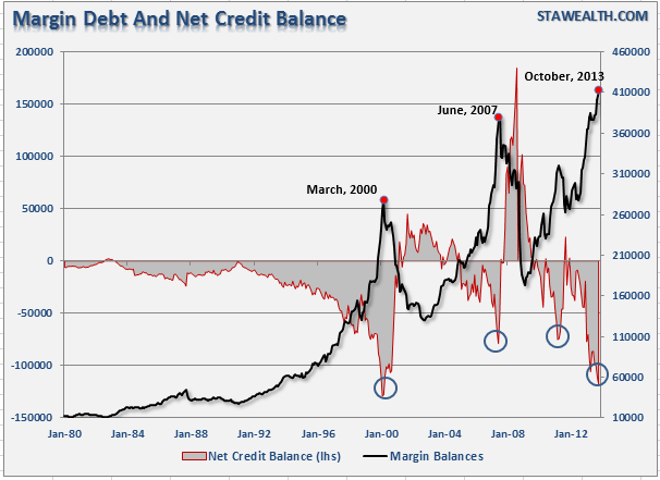
Spikes in margin debt and net investor credit balances to extremes have never previously been resolved in an orderly manner, always leading to bear markets or sharp corrections (as in 2011).
 Source: STA Wealth
If ‘this time is different’ we would need to see an orderly reduction in leverage whilst lots of new buyers come to market. But recall through demographics, net investor populations are shrinking across USA, Europe and China, and this is reflected in declining trading volumes.
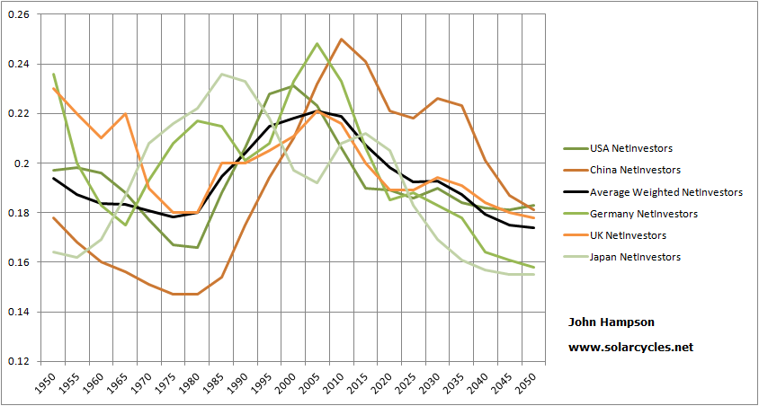 We therefore have a gradually thinning investor population, which adds weight to the likelihood of the current leverage excess spike being resolved in the usual historic manner, namely a deep correction or bear market.
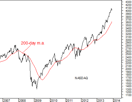
However, in the near term, we could yet see more equities allocation and potentially even more leverage. How much higher could equities run before a bear market or a proper correction erupts? I say proper correction, because none of the pullbacks in 2013 have displayed the usual correction characteristics in terms of depth, duration, and flush-out or spike in breadth and vix. They have been shallow pullbacks, with keen buy-up. To this prolonged lack of correction we can add the deviation in distance above the 200MA of the major indices, the excessive bullish sentiment and the current divergences in breadth, and history is fairly compelling in suggesting high risk of a sharp correction. But again, the question is when, and from how much higher?
The 2007 top in US equities was marked by a steeper ascent in the last 12 months of the bull, but this is beaten in steepness by 2013’s rally. In fact, stocks have moved into a parabolic pattern:
 Source: Sy Harding
Parabolic rises are typically resolved in a crash of similar steepness and depth. Comparisons to 1929 are valid if we consider the parabolic ascent, exuberance extremes in valuations, leverage and debt extremes, and a ‘this time is different’ mantra. Where 1929 differs is that it was the culmination of an economic boom with a demographic dividend. The current episode is neither.
History suggests a combination of internals degradation, buyer exhaustion and one or more ‘triggers’ are the likely terminators of a parabolic bull. We see breath divergence, but this should yet degrade further. In a normal topping process, there would be thinnest participation at the final push, but if this is a parabolic top, then we should see increasing divergence as we move higher. There is evidence of buyer exhaustion in sentiment and leverage extremes. We lack the trigger or triggers for the shift in perception. One potential trigger is the earnings season in January, as negative guidance is at a record extreme. A second is that the boost in GDP due to inventory build is likely to be reversed ahead as inventories give-then-take. A third potential trigger is if we see evidence that the current pick up in growth turns out to be a peak in growth rather than a new dawn.
 Source: Moneymovesmarkets
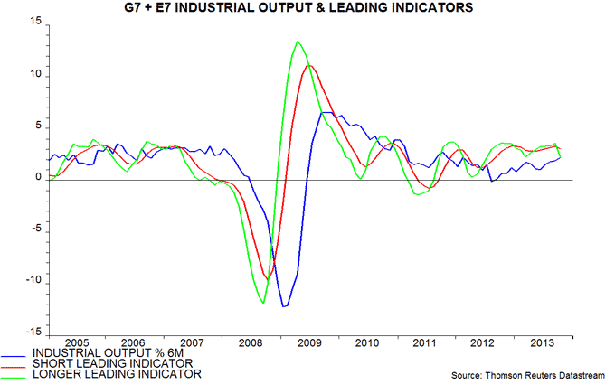
The above chart is derived from OECD’s leading indicators and predicts a peak in industrial output between Dec and Feb.
The case that we are in a new secular bull market for equities relies on growth picking up in a meaningful way from here. For forward earnings calculations to be valid, GDP next year would have to average over 3% for the year and earnings growth come in around 10%. If global growth were to pick up, then we would likely see relative outperformance in emerging market equities and in commodities relative to developed market equities, as both are at relative cheapness to the latter and both are beneficiaries of a growth theme.
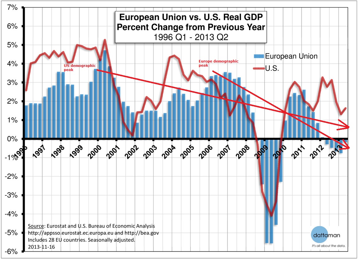
However, the history of demographics suggest a sustaining economic revival is unlikely to occur in the foreseeable future. Collective demographic trends in USA, Europe, other developed countries (aside Japan) and China are now both recessionary and deflationary, and we can see that in evidence below:
Source: dattaman

Source: Yardeni
The only G7 country in a positive inflationary trend is the only G7 country in a curent demographic tailwind window: Japan.
The demographic trends are pretty fixed on a medium term view, and historic evidence suggests that government / central bank intervention cannot force people to borrow or spend. Hence we see continued weakness in bank lending in Europe and the US, and real final sales of domestic product at previous recessionary levels.
5 years after the financial crisis, ZIRP is still in place across most of the developed world, and large QE programmes are still required in USA, UK and Japan. The global economy is fragile, and this puts it risk of rising bond yields and/or commodity price increases snuffing out any pick up in growth, as the former two tend to accompany the latter. The US cannot afford bond yields to rise much further because it would have a detrimental effect on interest sensitive sectors such as housing and autos (and also because of the servicing costs of its ballooning debt), whilst rising commodity prices, particularly energies, are input cost drags on all sectors.
To sum up, from a pure statistical perspective, removing any notion of the bigger picture, the probability for 2014 is at best a flat year for equities with a significant drawdown on the way, and at worst a significant down year. Stats are just a guide, but we see united predictions across a range of measures, drawn together at the top of the page.
However, when we look at similar episodes of stock market rises without earnings growth, similar outliers in stock market valuations to now (market cap to GDP, Q ratio, CAPE), similar historic spikes and extremes in margin debt, and similar extremes in bullish sentiment or euphoria as are currently in place, the same mirrors from history keep cropping up: 1929, 1987, 2000, 2007. Together, these signals point to something more historic and devastating at hand, and the ‘fundamentals’ for that occurring are provided by demographics. Yet the bullish momentum of the market and ‘this time is different’ thinking (Fed trumps all, equities need revaluing due to suppressed bonds and cash yields) are making for widespread complacency about (and dismissal of) the parallels.
Whilst we should not overly rely on any one indicator or discipline, it’s the collective case that gives me such conviction on the short side (disclosure: short stock indices). Now do me a favour and give me a convincing case below for why equities will rise in 2014.

Reblogged this on thedarklordblog and commented:
“This time is different”…parallels from history are seldom learnt.
Top work John.
Thank you sir
excellent work John
hope you and your family have a merry xmas and a happy new year.
V
Thanks Viren
Margin debt at new record high in November
http://www.nyxdata.com/nysedata/asp/factbook/viewer_edition.asp?mode=table&key=3153&category=8
Here adjusted for M1 money supply for relative comparison over time:
https://www.greedometer.com/margin-debt-yet-another-new-time-high/
And that site’s greedometer (aggregate of macroeconomic, fundamental and technical market data) at record high:
https://www.greedometer.com/15-years-greedometer-warnings/
Another measure of margin debt: now at 2.5% of GDP versus 2.6% in July 2007 and 2.8% at dotcom boom peak.
Interesting…GDP here in USA to keep rising as energy plays a greater role. Other sectors to compromise less. If natgas exports happen then really pickup. Be interested in a margin debt vs gdp graph. Any margin debt versus solar cycles patterns?
Thanks a lot, John. Awesome. I´d like to reapet that I consider two scenarios for 2014-15 for the Dow jones:
1- 1980 pattern s&p, retracement till Monthly MA200, about -30% or more.
2- Upward pattern-model wedege as 1909-16-19, Dow Jones 16.000-17.000 (logarithmic scale), plunge after -40/-50% at least, fib. 0,76.
1st Case, Dow about 11.000 or less.
2nd Case, Dow range btw 8.000-9.000.
My thesis is that we are in the last 17-year-cycle from 1932, that w´end in 2017, and afte r2017 will assist a parabolic rise until, roughly 2023, when would finish the 300-year-cycle since 1720 and of course the 90-100 y-cycl from 1929 crash.
Merry Christmas, John, and all of you that contribute in this excellent blog and Happy New Year from San Sebastián, Vasq Country, Spain.
@apanalis
Many thanks Antonio
The markets showed a positive response to news of tapering by the Fed, the question is whether further tapering or even rate rises at some point will get the same response. I have heard from some that people are more concerned about rates staying too low rather than being slightly raised.
The ECB will probably try to keep rates low for 2014, as the Euro Area recovers. General elections have been the spark to cause turbulence in recent years. A lack of elections in Europe in 2014 might prevent flaring up of the Euro Crisis.. BoE could potentially raise rates by year’s end, gently at first. Fed could wind down QE to the point where it is much smaller than it currently is. Actual rate rises might not begin until Janet Yellen is satisfied that joblessness is falling strongly. Fed would probably raise rates gently from late 2014 / early 2015 onwards.
Russia is still waiting for inflation to fall further. Rates have been on hold there for a while, and the economy might be a bit sluggish in 2014. Brazil might be able to stabilise and even cut rates at some point, if inflation there is easing. May help aid the pickup Brazil has enjoyed recently.
Japan introduces a consumption tax in April; the last time the Japanese did this, they ended up falling into a sharp recession, within a year. Provided that underlying growth is strong enough, Japan may be able to avoid a complete slowdown.
Gold will probably suffer from news of tapering, sluggish BRIC performance and rumours of rate hikes. Stocks will probably end the year flat or marginally higher, but not enormously higher. Oil could begin to drift lower, based on new supplies entering the markets (this will effect Russian government revenues, so it may worsen the situation for them).
Overall, a fairly mild year, provided that no exogenous shocks occur. Pessimists might say it is a topping out phase, but optimists might call it simply a breather, before another leg up soon.
Thanks for your views Pete
Another extreme reading
http://charts.stocktwits.net/production/original_18404657.png?1387809146
Skew – protection against an oversized move in the markets.
I am a fan of Didier Sornette and his log-periodic work on bubbles in all markets. John Hussman updates Sornette’s log-peridioc graph for the US stock market and has an ideal high for 1/17/2014.
That only means that a bubble top should occur around that date. Don’t bet the ranch, but a top around that date give or take a few days or weeks seems very likely. Sornette’s work on gold had a top fro July 2011 base on how gold was behaving in late 2010 and early 2011. He missed by a month and $150/oz but in hindsight was correct.
http://www.hussman.net/wmc/wmc131111.htm
Thanks
Hussman is a class A clown….has been wrong for “years”…add Tom DeMark to that growing list as he’s been calling tops all year also.
John:
Could you possibly provide a fast track for one to learn about how to apply Sornette’s theory? In the link you posted; the scale used on the left of Hussman’s chart looks arithmetic to me; but you state that Sornette uses a ‘log-periodic graph’? Can you either explain or perphas guide me to a simple tutorial or explanation? Tks in advance John on any feedback; or from any other poster.
John, I view this site as one of the best on the internet. I also like the varying opinions and the sharing of experiences from those who are much brighter than myself. Having said that; I was somewhat puzzled as to why you would short an index during one of the most seasonally favored; and bullish times of the year?
(last days of the month/santa clause rally/year end, etc) One other note. This so called bubble could go on until April; the next seasonally unfavorable period. And again, thank you for your generous contributions. I would like to think this brings out the best in all of us.
Thanks eclectic. I didn’t specifically target this period to short. There are enough warning signs here and now that I have peppered in short exposure, which I will build up to something more major on evidence of a turn. IMO there are too many flags that suggest a nasty correction is going to happen within days/weeks, I don’t think it will last til April.
My stratagem, personal and anything but a “convincing case”.
Second solar peak of the cycle yet to come with equities having more upside in correspondence. Timing? . . I like the John Galt III post above suggesting 17jan2014 but could see the top stretch out through 2Q2014. I do agree that overall 2014 will be a serious/mild ‘reversion to the mean’ for equities in general.
I began selling gains in fall2013 and with most have left continuing upside on the table. I have a few more gains which I am holding for now with targets, waiting for some of the aforementioned upside. As this year ends and 2014 begins I will revise targets and sell with lessor gains if needed. I am comfortable holding for now but less and less so with each passing day. I feel no particular need to sell at the peak, but most certainly do like to be in the neighborhood.
All positions with unrealized losses will be held through, for multiple years if needed, especially mining stocks. I believe precious metals and mining stocks have downside ahead and will remain depressed for some years to come, possibly as far out as 2018. Not a happy reality, but hold I would rather do than take a loss and reallocate.
As I said, personal and not lucrative in the short term but long I do fairly well. I do value all positions in annualized gains in both US$ and AU which I find very helpful.
Many thanks always John for sharing your incredible research and thoughts.
Happy Holiday Season to you John and all you other great posters on this website,
geopark
Thanks geopark
There is a very recent and brave prediction of S&P fluctuations for 2014, based on a given assumption of the rate of tapering…
http://caldaro.wordpress.com/
weekend update, posted on December 21, 2013
To me it enthralls without competing.
Appreciative Regards
John, your input on the five primary waves in this article is quite interesting. Peter, thanks for sharing.
He’s one of those with a ‘feel’ for the markets, so I keep my eye on his take. But I’m not so convinced of EW, hence I rarely include it.
Caldaro has a good long term track record…the only glaring error was he was quite late to call the bear after the top in 07…He had never seen a bear begin without a certain sequence and by jan 08 freely admitted his mistake and since then he has been in synch with the market, calling for new all time highs soon after 09 low.At this juncture he is using standard elliot measuring techniques to call for a coming high in the area of $SPX1950 to be followed by a 15%plus correction to be followed by a move again to all time highs by late summer to THEN! be followed by a wave 2 bear market that will retrace at least 50% of the move off 09 low .we shall see….
Caldaro is trading definitely in the right direction…
This is definitely one of the strongest bull markets…
The move since 2009 is definitely not an impulse…
I can imagine why he missed the reversal in 2007 and I bet he will miss it again:)
In 2007-beg´08 Caldaro was bullish and bearish into march´09. Late. Late.
@apanalis
John, given the non-equities investment options, I foresee a correction this year, but not a significant one before it goes back up. You’ve done a good job explaining the case for margin debt and I’m hesitant to suggest an alternative. Even if you do not post it, I would draw some horizontal lines across this chart with notes:
June 2013 was the highest point on the graph which was around the supermoon. Not expected to get higher highs for awhile.
A few weeks ago I think it was Mark made the case about the weak magnetic cycle and extend into 2015 which agreed with Gann, or something to that effect in the comments.
So my thoughts for you is this, you covered much of the financial data recently, how does it fit into the solar cycles? moon? astrological, etc? and margin debt inflation adjusted? In the multi-decadal Bradley, the low turn points in 2010 matched 1929. No other point was that low. Even if not always accurate, crashes do seem to be visible, and that’s why I think slower growth, not a crash by this time next year is the outcome. No DJIA at 11K or SP500 at 400.
Chinese year of snake in 2013 not since 1952/53. I saw a lot of non-financial change around me personally. More then typical.
By the way FT.com had an article about China families thinking about second children recently. Interviewed parents in the baby retail goods superstore in China. Not sure how accurate.
I wish I had more time in 2013 to work on generating Bradley data so we could mix it into FRED and other data. Perhaps in 2014. I started programming the software, but wound up focusing on other projects. I’m pretty sure the angular momentum of the sun and its magnetic field are what Bradley turns are about.
Look forward to your recap of 2013 blog entry and 2014 outlooks. Merry Christmas and Happy New Year.
Many thanks wxguru
Excellent work, especially lately. Truly a wealth of information. Here is my projected Russell 2000 top if you’re interested [based on two completely different Fibonacci projection methods, both aligning almost exactly the same]. http://4.bp.blogspot.com/-mIkU8iAtM5M/UrUVp_F2mKI/AAAAAAAABOE/t8G_2t01cLI/s1600/RUT.png
Thanks Ayaz
Mark:
Please see my post to you on the “Similar Solar Cycle’s” link. Tks.
Mark:
My apologies. Please see “Tower Of Sand” thread. Also typo for the year 1850. Should read March, 1860.
You obviously have many fans, John, but I disagree completely with your article. To begin with, the previous market tops coincided with volume peaks (= blow-offs) and declining MACD/RSI indicators. If yiu enable me to post the S&P charts since 1955 I will show you exactly what I mean.
In the current situation there have been decreasing volumes at market peaks, which means many investors are refraining from investing owing to numerous articles like yours portraying a “cyclically old and overbought market”.
Finally, the current peaks have been accompanied by rising MACD and RSIs, and there has never been a market crash in history when volumes have been weak and MACDs and RSIs have been strong. The day volumes surge on new highs and MACD/RSI indicators weaken (as in beginning 2000 and especially in 2007-8) we can discuss a major correction. Till then I’m enjoying my own personal ride (up 53 % in 2013 despite all the negative articles and forecasts from last January to today).
My advice: Watch the volumes, MACD and RSI on every new high.
Are we watching the same chart????

Rising MACD/RSI?????
Congrats on the profits John.
Another telling chart, thanks Karni.
Well …………..???
Karni, have you counted all the instances of RSI and MACD divergence on your chart since 2009 low? What if for the next 10 years the market will only chop you up, shake you off and frustrate? Is this so unlikely? RSI and MACD don’t show anything, well, they show the same pattern when the market does many many different things, it is better to watch the price instead.
Att: Karni: “Are we watching the same chart????”
Apparently not. If John would be so kind as to give me an email address I will send him my own chart with REAL peaks and divergences which he can then post and which you will all find interesting. John, please email me an address so I can email the attachment to you. I don’t know how to insert attachments in the blogosphere (= IT-handicapped!).
The chart clearly shows the 2003- bull run with rising volume and declining RSI, while the current 2009- bull run has decreasing volumes and rising RSI, which means the bull has legs to keep running.
The explanation for declining volumes (= diametric opposite of normal market blow-off peaks) is that retail investors are still too scared to jump in, while others have prematurely bailed out. This is the most despised, feared and misunderstood bull market in history, and it is continuing for all the wrong reasons, one of those wrong reasons is because unsophisticated investors have been scared to death by conventional wisdom and selective technical charts.
It’s john at solarcycles dot net
Here are his charts


Thanks, I sent 2 charts which both prove my point, which is that the strong rise (as evidenced by MACD/RSI/MOM indicators) has been accompanied by (ongoing) skepticism in the form of anemic volumes. The word ‘Bubble’ has scared most retail investors to death. Expert chartists have fallen into the same trap of missing the “exceptions to the rule”, looking only at cycles/Fibonaccis and totally ignoring the intrinsic strengths/weaknesses of the moves.
I expect to see the kinds of volumes associated with market tops sometime in 2014 and I will be watching RSI/MACD and volumes like a hawk for signs of a genuine blow-off top (as opposed to the relentless but steady ascent we are witnessing. My current projection is for the autumn, but if things do indeed get frothy earlier I may “sell in May and go away”. Meanwhile I expect to gain another 15 % by May or 25 % by September, then switch to gold mining stocks.
You do not have enough points to actually create a trendline as you did on the RSI. For what it’s worth, I utilize RSI and the Composite Index [which is a momentum indicator embedded on the RSI, the purpose is to spot false signals the RSI is giving, look at Constance Brown’s work if you’re interested in this], and although RSI appears strong there is actually divergence with the Composite Index. No expert chartist is going to ignore the fundamentals of intrinsic strength you speak of, else they are not expert chartists.
Now, what surprises me more is that you expect MACD to show you signs of a genuine blow off, but the MACD is clearly a lagging indicator, as is RSI. These indicators are based off of price action, and in no way should be used alone to predict tops or bottoms. That’s the reason I use Elliott Wave and Fibonacci, in combination with RSI and Composite Index. If the chart is approaching Elliott Wave peaks, as well as key Fibonacci ratios, and the RSI and Composite Index are showing bearish signs, then I stand a higher chance of being on the right side of the market.
Furthermore, please elaborate on the volume you are using. That is not a very helpful volume chart. Here is a link to a chart I just took a screenshot of – it’s the S&P 500 Index.
Looking at the volume more closely, it’s clear the volume spike occurred on a correction – and I will be looking for this to repeat in the next correction that occurs in the coming trading days. But looking at volume, see the red trend lines which show a relatively flat volume leading up to the peak in the last bull market. The volume magnitude is lower yes, but if you look at the volume relatively speaking, volume is not telling us much, except that the last couple trading days have clearly had higher volume than usual, which further indicates to me the public is passing around the Kool-Aid.
I’m more than ready to change my view should evidence present itself, however as of now more evidence is mounting for the downside. Best of luck.
MACD/RSI are lagging indicators?
Look at my 2nd chart and you’ll see that as the S&P made new lows in early 2009 the MACD was rising strongly, = major divergence which marked the actual low for the cycle. I use MACD/RSI/MOM all the time for predicting turnarounds.
Good luck in 2014.
John Strike, they are by definition lagging indicators. Whether you have used them to your success or predictive ability does not change the fact they are lagging indicators. I suggest you look up what a lagging indicator is. Please do reply to some of my other points.
MACD RSI are not only lagging indicators, but quite useless indicators. It is easy to show a clear moment on the chart where all worked perfectly. But have the decency to honor all the signals as they go and enter the trades as they appear, count your losses and wins, still your live action may differ from your actions when back testing a signal, moreover, the market may decide now to behave differently so that there would be no worthy RSI divergence signal 5 instances in a row, on higher time frame it would be many long years. 3 instances of something working on a given chart doesn’t constitute a technical method.
thanks for all this great info to help new college grad to make his investing decision for 2014