
Here are the latest economic surprises indices for the major nations:


 Source: Citibank
Japan aside, economic surprises for most of the majors topped out as we turned into September. Historically there has been a fairly good correlation between economic surprises and stock market returns, but the correlation has deteriorated throughout 2013 and turned negative:

Source: JP Morgan
Is there anything about that period from early 2009 to mid 2010 where correlations also were anomalously negative? My take is that by March 2009 most of the major stock indices were at p/e 10 or below, and thereafter we saw a period of post-panic bargain hunting at historic cheapness, despite and regardless of continued disappointing economic data. That doesn’t apply at today’s valuations.
Here’s another look:
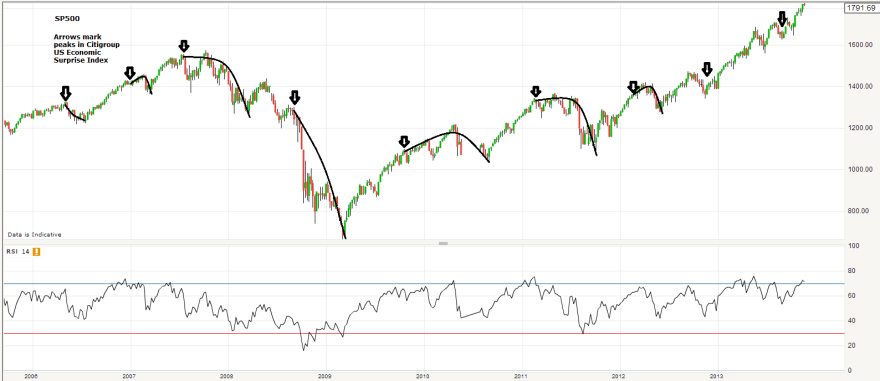
 I’ve charted the peaks in US economic surprises versus the SP500. It can be seen that from 2006 to 2012, trend reversals in economic surprises reliably brought about corrections in the SP500, but sometimes with the stock market eeking out a marginal new high and then rolling over. But since the end of 2012 the two economic surprises peaks have been largely ignored by the market.
There have been other notable divergences since the turn of the year.
Equities have diverged from geomagnetism:

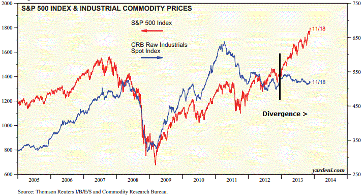
Junk bonds, which have historically correlated with equities fairly well under ‘risk-on/off’ sentiment, have parted ways with stocks and are actually down for the year. Commodities likewise:
 Source: Yardeni
I have extended this commodities:stocks ratio chart from early 2012 to the current level in November 2013, showing the degree to which stocks are now valued versus commodities:
 Source: Stockcharts
Down to 0.15, very close to the level reached at the 2000 equities peak.
Versus bonds, equities have also made a sharp run up in relative valuation this year:
 Source: ispyetf
If this is the solar maximum at the end of 2013, then it would be normal, by history, for the secular asset class of the time to be bid up in a speculative finale, diverging from normal correlations and leaving models behind, in a final overthrow. If this is occurring with equities (perhaps disinflation has killed off commodities), then the above charts would be evidence for that, and we are left trying to look for clues as to how much further, both in time and price, the speculative finale has to run. If it isn’t equities, but rather commodities that are bound for a speculative finale (as they would rather befit the ‘secular’ asset class leading into this solar peak), then the above charts are warnings that the rug could be pulled from under equities at any time.
Right now, the balance of evidence suggests that it is stocks being bid up to a speculative finale, if my solar thesis is correct. Even without solar, we see various evidence for that, in my last post and this. See how margin debt has accelerated over the last 12 months, as it did prior to the last 2 major stocks peaks:

Source: Dshort
And now look at the decline in trading volumes:
 Source: Marketwatch
There are fewer and fewer participants in the market chasing it higher, and the margin debt and credit account levels (last post) suggest increasing leverage to do so. Unless more people and institutions come to the market, then that is a recipe for a steep decline or crash ahead. By demographics, those additional participants are unlikely to materialise. Recall that demographic trends in the US were up into around 2000 and have since been downward, continuing this decade. I suggest that is what we are seeing in the trading volumes ‘mountain’ above.
In summary, I believe the equities bull is on borrowed time and that risk-reward is stacking up on the short side. But it comes down to how much further in price and time stocks can extend first. If solar-inspired speculation is at work then parabolic becomes more possible. If on the other hand equities are to make a topping ‘process’ rather than a parabolic, then by normal measures this has not started in a meaningful way so should at least extend for several months and postpone a major decline until 2014. If commodities are to become the speculative target then they should take off as late cyclicals whilst stocks make a topping process. This remains theory only, and deflationary demographics are a headwind to this occurring, so I have my doubts.
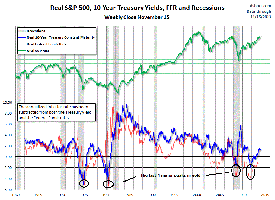
On that note, if we look at when gold really took off in the past, it was under conditions of negative real treasury yields. Rises in yields over the last 12 months, together with shrinking inflation, have taken real yields positive and are a problem for gold. Deflationary winds, due to demographics, threaten to take inflation yet lower, whilst treasury yields by late 2012 had reached historic extreme lows, suggesting renewed downside may be limited. So, if I could speculate how fortunes could be reversed in gold, it would be either the world tips into deflation and gold performs more ‘uniquely’ (gold’s performance under deflation is limited in history, but I suggest it ought to perform as the default go-to asset under such conditions when all others are unattractive) – or – central banks take renewed action against the disinflation in progress by increasing rather than decreasing stimulus, e.g. the ECB launches QE and the Fed maintains QE rather than tapers.
 Source: Dshort

I’ve gone long the Vix, just above 13 currently. There were two low periods of volatility, where it traded between 10 and 15, from around 1993 to 1996 and 2004 to 2007. I just don’t believe conditions support another 3-year benign. 3 months max.
Just posted below before I saw your comment. As I said in your last post QE is going to distort markets. Folks keep waiting for it to end. Think QE is a means to address USA demographics, albeit not being called that. The solar cycle peak is coming to a test, excited to witness.
Yes, if QE is doing enough to partially offset demographics and they keep it going then the scenario of low growth low inflation rising stocks could persist. But I see it as a QE trap that they can’t get out of, so don’t expect the status quo is sustainable. Like Russell Napier, I think perception at some point is going to shift.
Fabulous work John.
My personal opinion is that exceptional work should be shared as much as possible, and this coming weekend I’ll be doing my part!!!
Thanks High Rev!
John,
Great to see your ground-breaking work is continuing in these turbulent times.
Looking at the stock markets, remember that the lunar declination cycle (as used in Gann’s Financial Timetable) shows a high for 2013. For anyone unfamiliar with it, it also shows for stocks: 2000=high; 2001=panic; 2003=low; 2006=panic, crash; 2009=extreme low; 2013=high; 2015=panic; 2016=low. The 2006 “panic” and “crash” are references to the Major Lunar Standstill, which lasted through 2007 and 2008. I’ll not be betting against that record.
Looking at the solar cycle, the SC24 dipole reversed during March 2013 (20nHz Avgf measurement). The three previous reversals were 15 February 2000 (Dow high 14 January 2000); 28 January 1990 (Nikkei high 29 December 1989); and 23 January 1980 (gold high 23 January 1980). This time its different though! SC21, 22 and 23 were high SN/short duration cycles.
SC24 is most like SC16 – lowSN/long duration. The speculative asset class during SC16 was the late 1920s Dow, indicating a corresponding asset peak around November 2014 this time around.
Here’s a model I posted here a couple of years ago http://daedalearth.files.wordpress.com/2011/03/hcs-vs-barycentre-a.png
It shows, with a 97.5% correlation coefficient, that SC24 dipole reversal (ie. the solar peak) will struggle to assert itself until early 2015.
Also, have a closer look at the two planetary graphs hear the end of your In-Depth Guide – they show that the solar peak is unlikely before mid 2014. Interestingly, the VEJ alignment graph shows a initial minor peak around Q3 2012, decreasing to zero around Q3 2013 before a sharp rise into mid 2014 and then late 2016. Sunspot peaks occur on average 12 to 18 months after the alignment peaks, and up to 3 years after.
The sun has, in fact, recently come to life again after that Q3 2013 alignment dip. Al told, we are most likely looking at a solar peak from mid 2014 at the absolute earliest, and more likely nearer the lunar declination/Gann 2016 stocks low.
Mark
Very interesting!
Great input Mark – good to hear from you again!
Leif Svalgaard thinks SC24 is going to be similar to SC14 with multiple peaks, which would also give the potential for things to be stretched out to your kind of timescales.
http://www.solen.info/solar/cycl14.html
John, I do not fully understand how solar cycles work. What ive read is that the mid-point of the cycle is reached with both poles change polarity. Ive read the north has already changed polarity and south should change soon. Where can I get the dates when these other low sunspot topping solar cycles completed their polarity changes? Also what can I read in order to understand Mark’s link regarding the graph “Relationship solar ‘current sheet’ & solar barycentre”?
Thanks,
Joseph
Joseph, don’t know on the first sorry, and I think Mark could better answer the second as it’s his chart
Joseph,
The link to that chart is a website run by Tim Channon, who is the creator of the model. However, he now posts more at this website: http://tallbloke.wordpress.com/
They’re primarily interested in climate science, but are also leading the way on statistical evidence on how the solar cycle is influenced by planetary movement.
The important lines on the chart are the dark blue “data” and green “model” lines. The data is the solar polar field strength taken from here: http://wso.stanford.edu/Polar.html
These lines cross the central zero when the solar dipole reverses, corresponding to each sunspot maximum. So this model, which has been reliable so far, indicates that a high sunspot count could continue for longer than we have come to expect from recent solar cycles.
Scientists do not yet fully understand how the sun works, so you might find some more interesting reading if you search for things like “Svaalgard solar dynamo”.
Mark
Thanks, Mark, I founded this >http://time-price-research-astrofin.blogspot.com.es/2012/03/wd-ganns-financial-time-table-extended.html, but doesn´t fit with your timetable. Is possible you can input your source? Thanks a lot
@apanalis
Sorry, Mark, I founded this, but is really reliable?>http://time-price-research-astrofin.blogspot.com.es/2012/03/wd-ganns-financial-time-table-extended.html
@apanalis
Antonio,
Yes, that table seems to be accurate. I think you’ve noticed that Gann’s original typed version differs slightly to the modern one after 1989 – he noted that this would happen, because the timetable uses alternate 18 and 19 year gaps along the top row to give an 18.5 year cycle, wheras the exact lunar declination cycle is 18.6 years.
So the modern version you have linked to is the most accurate. As for reliability, I suppose we can only judge it on past performance. After more than 100 years of data, it looks to be one of the most reliable cycles.
The cycle is based on the relative heights of the sun and moon in the sky as they appear to an observer on earth. Ancient people spent many generations building places like Stonehenge and Callanish in an effort to measure and understand it. I suppose the instincts that led them to do that are still with us today, in a subdued form.
Mark
Mark, where have you been? Welcome back! Great stuff.
Cheers Kent!
My hibernation has been interrupted by the prospect of being able to buy more gold at $1033 over the next few weeks..!
Mark
Hi Mark,
Great to hear from you again! Please stay in touch with us even after your anticipated trade ;-).
Btw you predict $1033 to be the final low in gold before new all-time highs?
Thanks,
Milan
Thanks Milan.
I’m looking at $1033 more as a compelling potential opportunity, rather than a prediction. I believe that $1270 and $1033 are extremely important Fibonacci levels in gold’s secular bull market, more important than the $1180 June low.
So I’d want to be buying if it reaches $1033, but will be happy to stick with what I’ve got if it doesn’t…
Mark
Thanks Mark. Does it mean that 50% Fibonacci levels are more important than 61.8% levels in this bull market? Cheers, Milan.
Milan,
Try these two Fibonacci retracements (showing 23.6%, 38.2%, 50.0%, 61.8%, 76.4%) on your charts, as an illustration of what I’m looking at:
Firstly, draw down from the last $1800 high down to the June $1180 low. There’s the obvious bounce back up to the 38.2% level, but I’m much more interested in what the gold price did during the primary move down to $1180: it mapped out in advance what all the retracement levels would subsequently be – distinctly and accurately. This is just one example, and could not possibly be simply coincidence.
Secondly, draw up from gold’s $260 secular low and keep extending up above the $1920 high. When you’ve drawn up from $260 to $2275, what do you see..?
Mark
Thanks, Mark, by the way, dou you know the most important magalithic formations in Europe, south Spain, Antequera in Málaga>https://www.google.es/search?q=antequera+d%C3%B3lmenes&hl=es&tbm=isch&tbo=u&source=univ&sa=X&ei=RAOOUrnFLY-qhAeX2YHAAg&ved=0CC4QsAQ&biw=939&bih=579
@apanalis
I wasn’t aware of that site Antonio, but those photos show the incredible amount of effort people put into building them!
Mark
Hi Mark,
many thanks, it’s really very interesting! Have you tried to set the secular high to $3579 instead of $2275? I think it follows potencial retracement levels even better and ‘your’ circa $1040 level is preserved (it would be 76.4% instead of 61.8%). What do you think?
Best Regards, Milan
Milan,
Ah yes, that’s another striking fit; as valid as the $2275 projection. In fact, $3579 would seem to be a more realistic final top, but I think there’s a probability that a move to one of these levels will be just the first step in a bigger projection.
For example, $2275 as a first step would lead to an ultimate top at $8830.
Also, I see no reason why these projections cannot applied to time (ie. along the horizontal axis). Obviously time cannot retrace the way price does, but we are not interested in retracements – just projections. I don’t have a charting package which allows me to do this.
Any ideas?
Mark
Hi Mark,
I agree that those levels could constitute a basis for even a bigger price structure.
I have tried to apply Fibonacci relationships on time and would like to share some charts with you. Could you contact me at fibomilan@yahoo.com please?
Milan
John, you have written sometime inthe past, that there are some examples in history, when final mania in commodities occured one year, or even two years after the solar maximum. I am wondering, how this is possible. If solar flares should in theory support speculation, why this speculation occurs sometimes just AFTER this solar influence has dissapiered? I think maybe some “reason” for this happenig should be find somwhere in the process how this solar flares influence is being transferred to traders mania mentality.
And that brings me this idea: isnt it possible, that the same conditions as in the past are here again now, and final rally in commodities will be postponed one year after solar maximum, or even later?
Thanks a lot for your excellent work.
Peter
Hi Peter, yes, commodities could still yet produce a major rally and top out some months after the solar peak and it would still align with historic examples, which is why I still consider it possible (though due to demographics more doubtful) that commodities could yet be the solar speculation target class. As to why belated, I see that’s fairly a common phenomenon in the markets. Markets will top or bottom after leading indicators have turned or after demographics have turned, with a lag. Perhaps that’s something to do with the herd mentality.
Hi John,
Thank you for your great work!!
Do I understand it correctly that your original theory of behavior of specific asset classes near solar peaks was adjusted during your subsequent work on demographic issues? If so, does the adjusted theory say that equities will be the only asset class benefiting from solar-inspired speculation in the future?
Thank you,
Milan
Milan, solar maximums = human excitement, which I suggest is behind the secular peaks in financial markets and inflation peaks that have historically correlated with the solar maximums. If there is a difference this time it would be the unprecedented collective demographic downtrends in place, which could prevent an inflationary peak occurring and prevent commodities being the target class for a speculative peak. It would rather be equities. However, we will only know this for sure with hindsight, once the smoothed solar max has been agreed and once we have allowed a year or so after that for any belated speculative peak.
Hi John, thank you. And if your demographic research goes beyond the current decade, does it mean that commodities could be the solar speculation target class for the next solar peak instead of equities? I mean what would have to be changed in your Roadmap to 2050 if SC24 peak is connected with equities peak instead of commodities peak? Many thanks.
Yes it’s because of the demographics that I speculated recently that gold could peak at the SC25 max
Interesting point Iv’e pondered as well. An anomaly seems to have occurred in SC #10. The maximum monthly SSN occurred in February, 1860 but the peak on gold occurred on 12/31/1861.
Mark,
I looked into the comparison of solar cycle 16 vs 24… This is what it currently looks like.
http://twitpic.com/show/large/dlvvpj
I then created an analog variant where I aligned the 1st peaks of each cycle and this points to a 2016 final peak.
http://twitpic.com/show/large/dlvvuu
It looks like you are anticipating this cycle to correspond to a stock mkt peak like cycle 16. Where do you see gold fit into this?
Apologies on the 2nd chart. X axis is off about 6 months which then corresponds to a 2015 peak.
Thanks chaps, interesting.
For me, if stocks continue into a solar-related mania peak, then gold is going to continue to lose luster. It’s going to take that shift in perception, which needs to be inspired by real world events – e.g. ECB launches QE or global deflationary recession evidence mounts or emerging market crises gain traction
Joseph,
Thanks for posting your two graphs. The difference between them highlights an important curiosity with SC24: when exactly did it start? There was an (as yet unexplained) 2/3 year delay between when scientists expected it to start, and when sunspots eventually appeared. I think your first graph aligns SC24 with the expected start, and your second graph with the first appearance of sunspots.
So your second graph is more in line with comparisons between all the low SN/long duration cycles: http://www.solen.info/solar/images/comparison_similar_cycles.png
There is a striking consistency through all these low SN cycles, including SC10 as mentioned by eclectic and SC14 by John and Svalgaard.
I believe the evidence strongly supports the second scenario; but if the first is the correct one then SC24 is almost finished!
The reason I mentioned the 1920’s Dow and November 2014 was just to illustrate the asset-bubble timescale during SC16, and not to suggest that stocks will benefit during SC24. In fact, I suspect that stocks are forming a high around now before a decline possibly as far as 2016. But stocks could also benefit from surging inflation and the threat of hyperinflation – there are too many questions hanging over the stock markets for me to bother betting on them.
Gold – sentiment at zero; likely to be the beneficiary of almost every future scenario I can think of; available below the cost of production; at a time when weak hands have been shaken off. The opportunity of a lifetime!
John mentions the possibility of the ECB starting QE – according to Draghi and Praet its recently become a certainty: http://blogs.telegraph.co.uk/finance/ambroseevans-pritchard/100026052/ecb-ready-to-print-germany-ready-to-scream/
Mark
Thanks for sharing your thoughts all. My bias is also towards gold as the “solar speculative target class”. I updated the dates axis on the chart. Oct 2015 would be the projected top.
http://twitpic.com/show/large/dlyp3o
I’ll look into sc 10 and 14 as well
Looks like I also screwed up my axis on 1st sc16 vs sc24.
Based on the comparisons of sc 10 14 16 & 24 the earliest final peak of cycle 24 should be anticipated in 2014, most likely around April 2014. But as we saw earlier if we stretch the topping process of cycle 24 to match the lengthiest of the topping processes corresponding to cycle 16 then the final peak will be likely around October 2015. Based on this analysis (given my fundamental bias towards bullish gold), the highest probability is the “solar speculative target class” this cycle looks to be equities with a top in 2014 and then an anticipated gold top late this decade coinciding with sc bottom.
http://twitpic.com/show/large/dlyu86
http://twitpic.com/show/large/dlyuew
http://twitpic.com/show/large/dlyuhw
http://twitpic.com/show/large/dlyun5
Joseph, not Mark, but according to my examination of SC # 16; the maximum monthly SSN occurred in May, 1928? (red line?) On 3/09/1933 citizens were prohibited from owning gold and at the time I think the price was fixed at 19.39.
Then on 1/31/1934 gold was reset at a fix of $35. HMining went from from $3
to 34 7/8 from 1929 to 1938.
http://www.zerohedge.com/news/2013-11-19/chicago-fed-evans-unveils-2014-year-end-sp-500-target
One more year at least…
FYI I saw something about a London based investigation into manipulation of gold prices earlier. Not sure where that’ll go.
Not to keep junk posting, this one I felt was worth passing on.
http://www.bloomberg.com/news/2013-11-18/gmo-s-inker-predicts-losses-for-stocks-over-seven-years.html
Many thanks wxguru. Various long term measures align to suggest poor annual returns ahead. But it doesn’t preclude higher first, and that’s the threat to my stance.
The major cause of higher prices are higher prices…
Thank you Robert,
Thats the Holy grail.
Did Gann trade his own models? Or just double tops and bottoms he traded….
despe906 🙂