The exhaustion gap (from Friday) is still in play, and I’m now looking for a gap down day. The current Nasdaq is shown below followed by a typical exhaustion gap pattern:
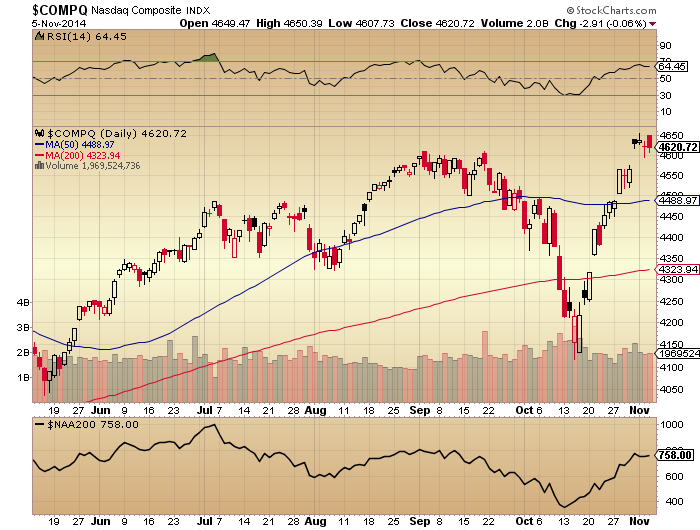
Source: Stockcharts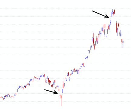
Source: TraderPower
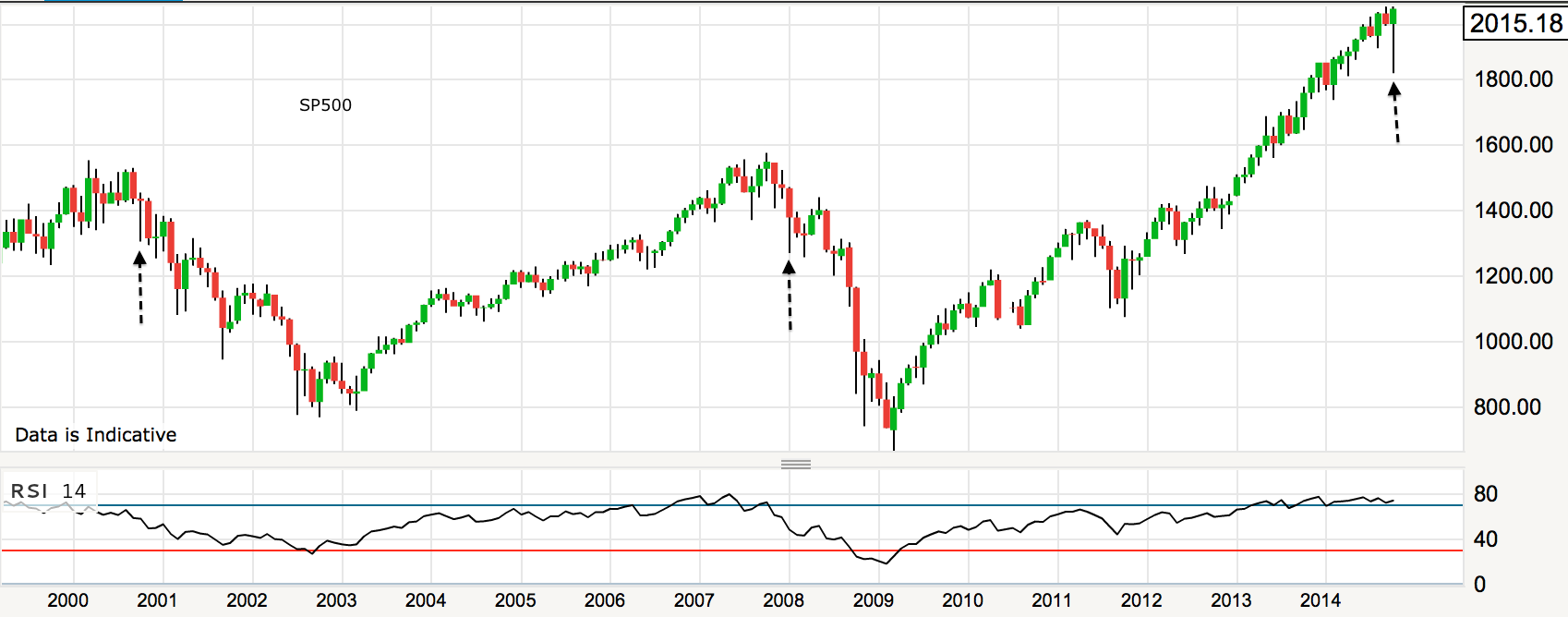
The equivalent point from the year 2000 looked like this on the SP500:
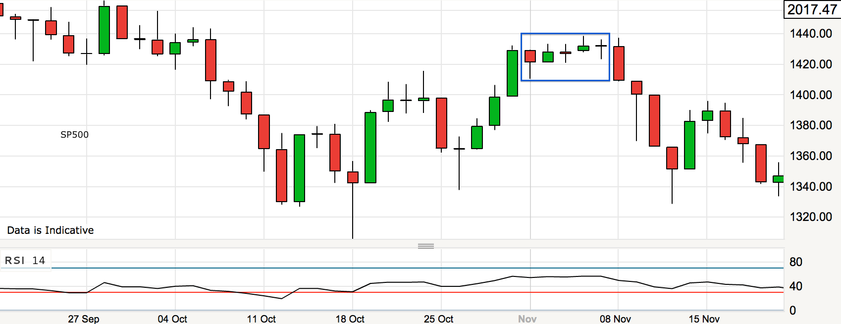 It took a few days to reverse, but the key is no significant break higher. Today is the full moon (or early tomorrow if in the US) which could mark the reversal, plus we have a potential gap down trigger from ECB disappointment. If the ECB surprise to the upside then I still don’t have a case for a continued rally, and that’s because I don’t see the fuel for higher.
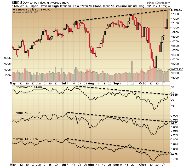
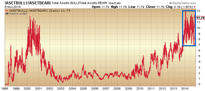
The latest II % bears reading is 15, which has been the historic limit, and AAII bears also now stand at 15%, which is their lowest reading since 2005. Rydex closed yesterday just below 12 which is thereabouts the historic limit too. Here we can see the market went down or sideways-then-down at such high allocation readings:

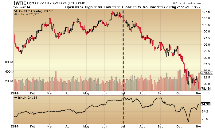
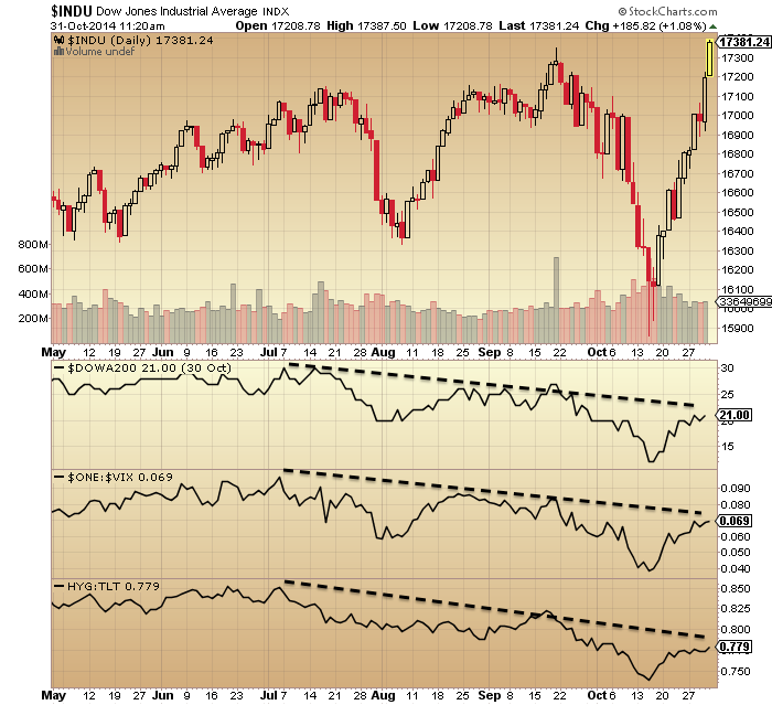
Add in the overbought indicators and current geomagnetic disturbance and it is likely the next move is down. Junk bonds appear to be leading this move.
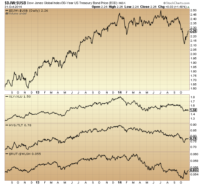
 Plus note at the foot of the chart the renewed move lower in defensives versus cyclicals: XLY:XLU.
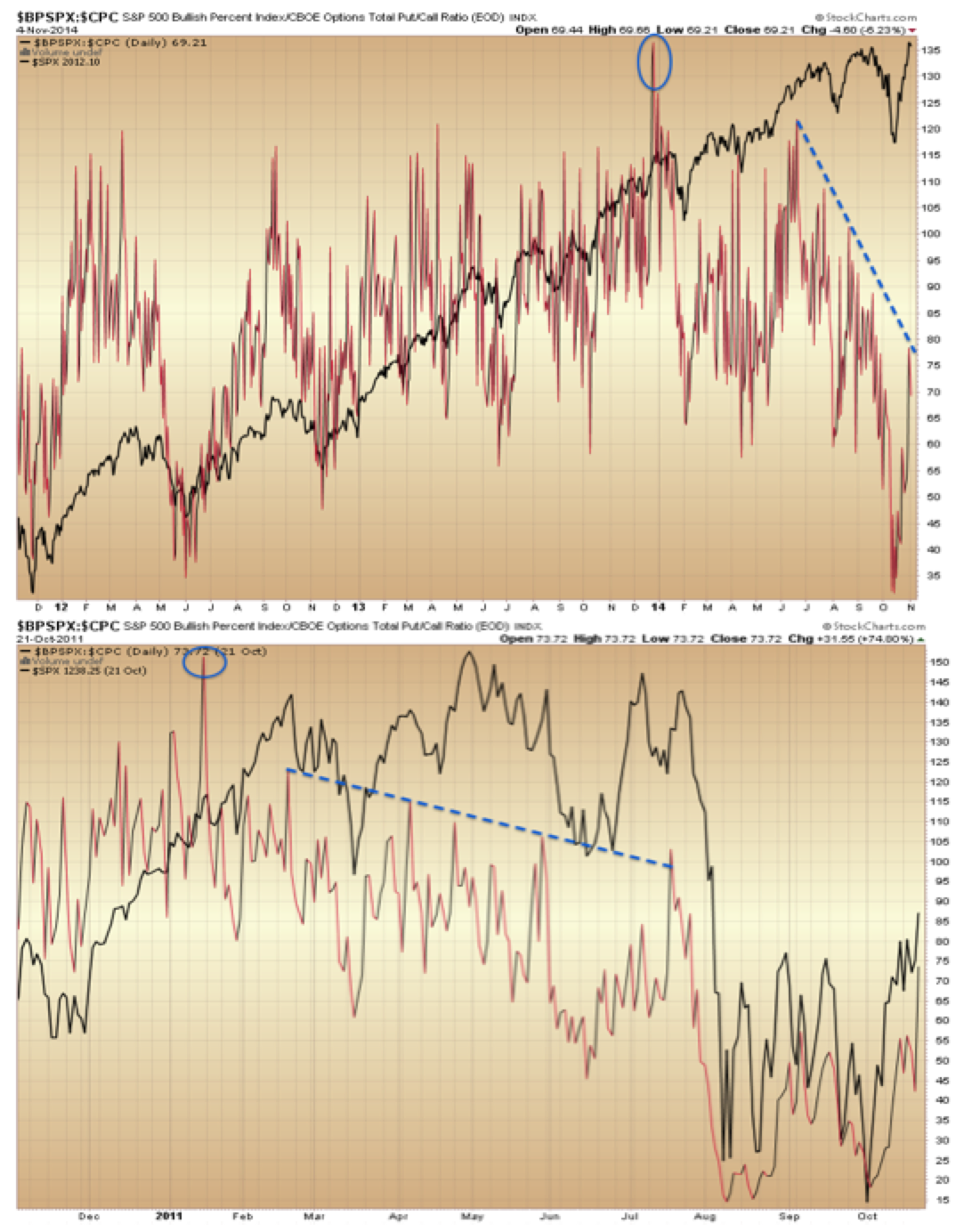
Bullish percent over put/call ratio is showing a five month divergence following a turn-of-year spike peak. The only mirror I can find for this is 2011, where something very similar occurred.
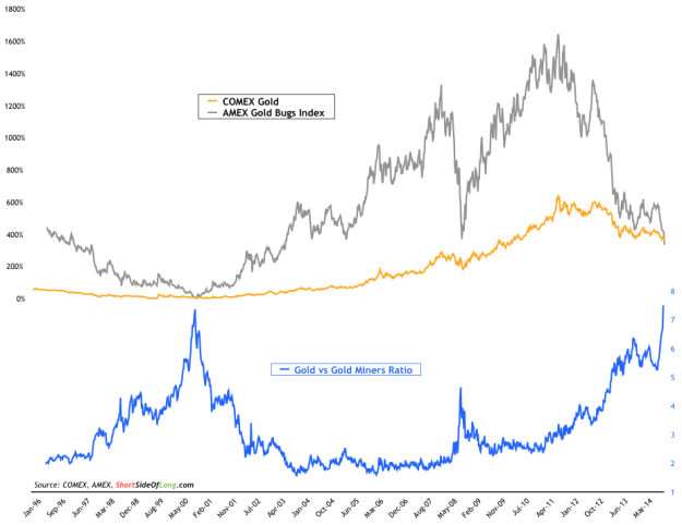
 For those who missed it, gold miner bullish percent is now at zero and suggests an imminent bounce or bottom for GDX:
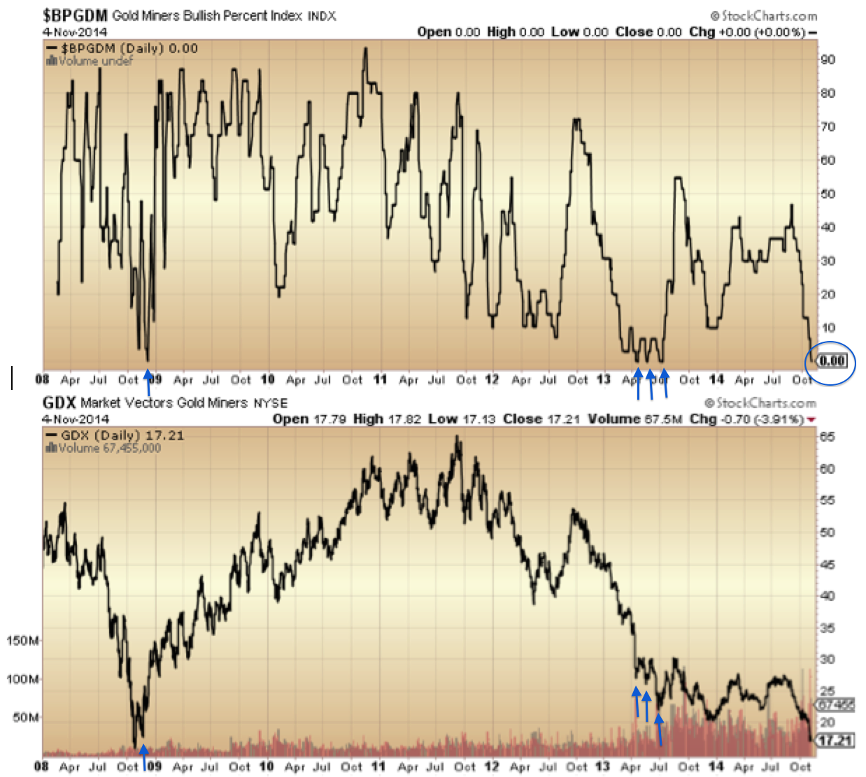
This is the flip side of the equation: gold and miners are capitulating whilst stocks top out. Reversals in both should occur together. I wondered previously whether gold miners would be sold off in a steep stocks sell-off, but the difference this time, say compared to 2008, is that they start from total washout levels, so I see the only way is up.
Moving on, a bubble I noted previously was the Dubai stock index. The parabolic terminated in May and there is a clear second chance peak since. This is a text book bubble/pop chart as it stands, and plays into the solar max being behind us circa April.
 Source: Bloomberg
The bubbles in Indian and US stocks look to be the the last to pop.
The mania in US stocks has been unprecedented in history in various ways:
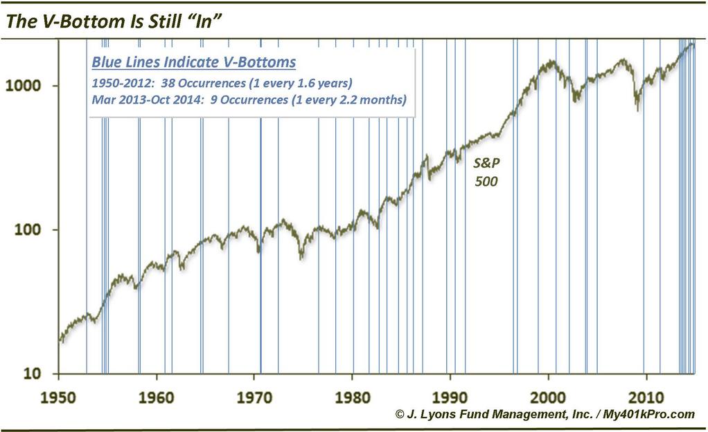
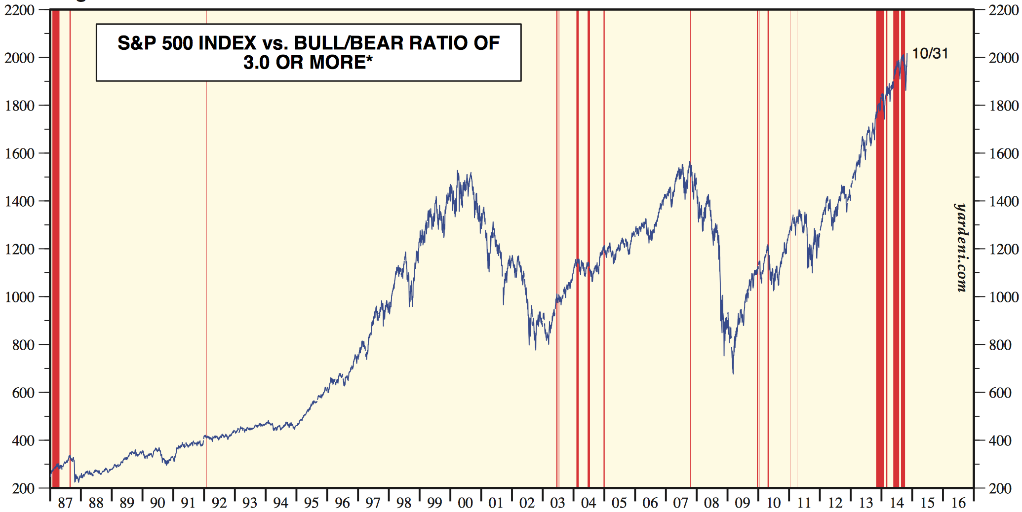
Source: Ed Yardeni

Source: Rory Handyside Source: Doug Short
In short, sentiment, allocations and leverage have stretched to levels and durations not seen before. The unprecedented v-bounce cluster or swift dip buying has, in my opinion, stored up a mega-correction, and the record Skew level and duration warns of such a large drop. The October drop in equities did nothing to reset sentiment or allocations. I won’t be shifted from my stance that this is the set-up for a crash unless these indicators reset without a crash (which would also be a first in history).
It’s clear to me that the solar maximum has driven the mania and the lack of demographic tailwind has been compensated for by investors going all in on allocations, leverage and bullishness. With the mantra for the mania being central bank policy trumps all and the Fed being the most aggressive CB (until BOJ this year) I believe that’s why the stretching has been so pronounced in US markets. But ultimately, no-one could be prepared for this set of unprecedented developments in the markets. History has been well and truly made this year.
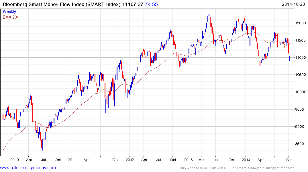
Recall at the October low we saw a capitulative breadth reading similar to bear market bottom lows? Bullish percent shows something similar:

Drawing in the nature of the reversal…
 Source: Dana Lyons
…similar reference points are popping up. Namely, what happened in October is either a sign of a market top or early bear, or it is a bear market bottom or major (~20%) correction bottom. It is neither of the latter two, so I suggest it is in fact the market peak / early bear sign and I have shown similar hanging man candles to October’s at the end of the 2000 and 2007 topping processes. However, there is one other option: it is an unprecedented catapult to an even bigger leg up in equities, which would fit with an anomalous delayed solar peak, if the bulk of the solar scientist models have it wrong, as well as the general ‘unprecedented’ markets theme.
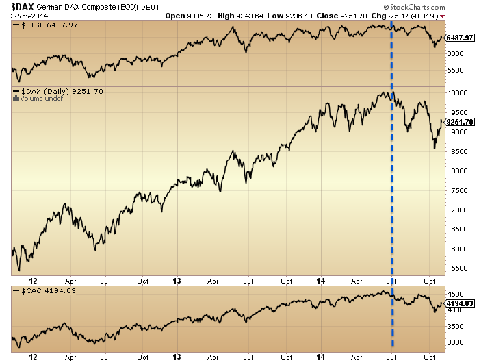
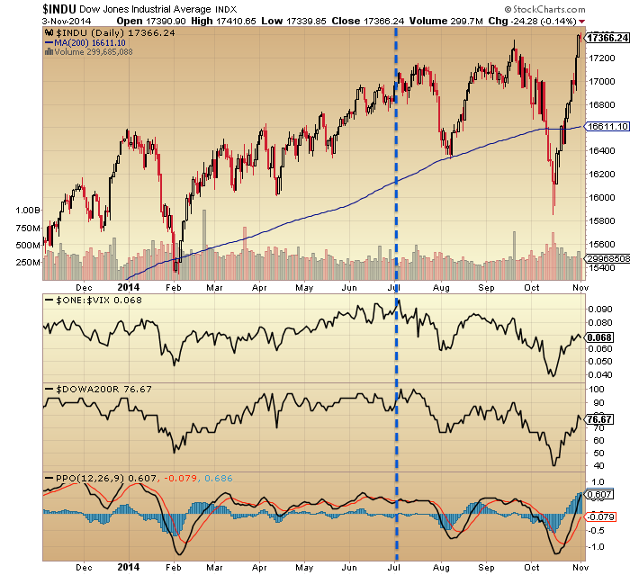
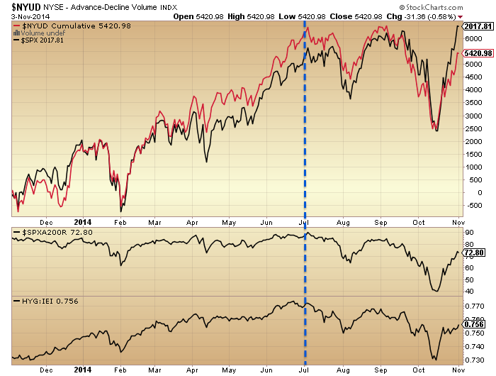
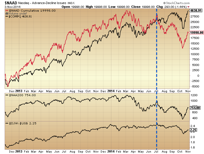
I can’t rule that out. But it’s the cross-referencing again that keeps me from giving that serious probability. Leverage has failed to increase since February, sentiment and allocations are at an invisible limit. Negative divergences in breadth, defensives, volatility, smart money and other indicators are mature, and particularly compelling since the start of July. Since that point we have lower highs and lower lows on European indices and US small caps, which I believe are in bear markets. The positioning by indicators puts us right at the end of the topping process, meaning the next leg down is the definitive. In my opinion the case is so strong now that I can’t give an alternative much weight. So I continue short stock indices and long precious metals, but I am ready to step aside and wait if the market decides otherwise.
UBS see similar signs for a leg down from here but believe we will then scrape another marginally higher high by the end of December – but just in US large caps. I know this fits with some of your views that the final peak won’t happen until then. So, I would say: let’s see what indicator signals we get if and when this November leg down erupts. I believe this will be the definitive fall, but the possibility of a year-end peak would become clearer if we were to see swift capitulation again.