
A long post coming up, but I found this to be outlook-changing research.
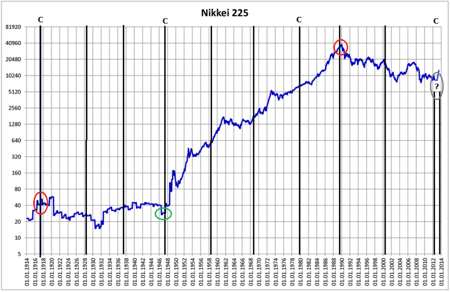
Firstly, the Japanese stock index long term chart, with solar cycle maximums marked as black lines (C for commodity secular peaks):
 Underlying source: Wikipedia
A fairly simple 100 year history: a long secular bear followed by a long secular bull followed by a long secular bear that potentially just ended at the turn of 2012 into 2013. The secular turns fell very close to solar maxima.
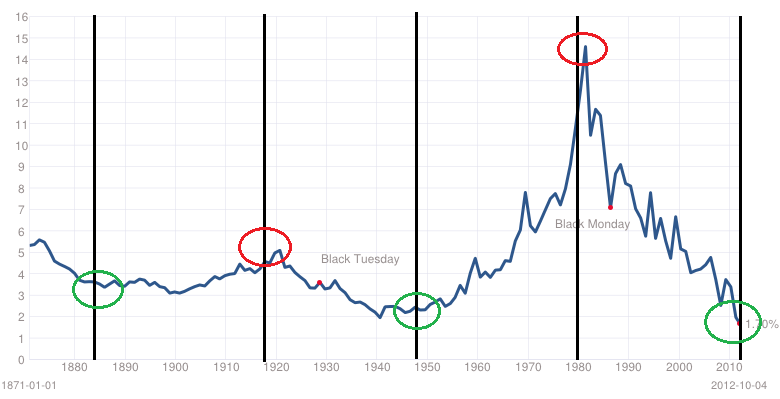
Secondly, the US Dow stock index long term, with solar maximums again marked in black.
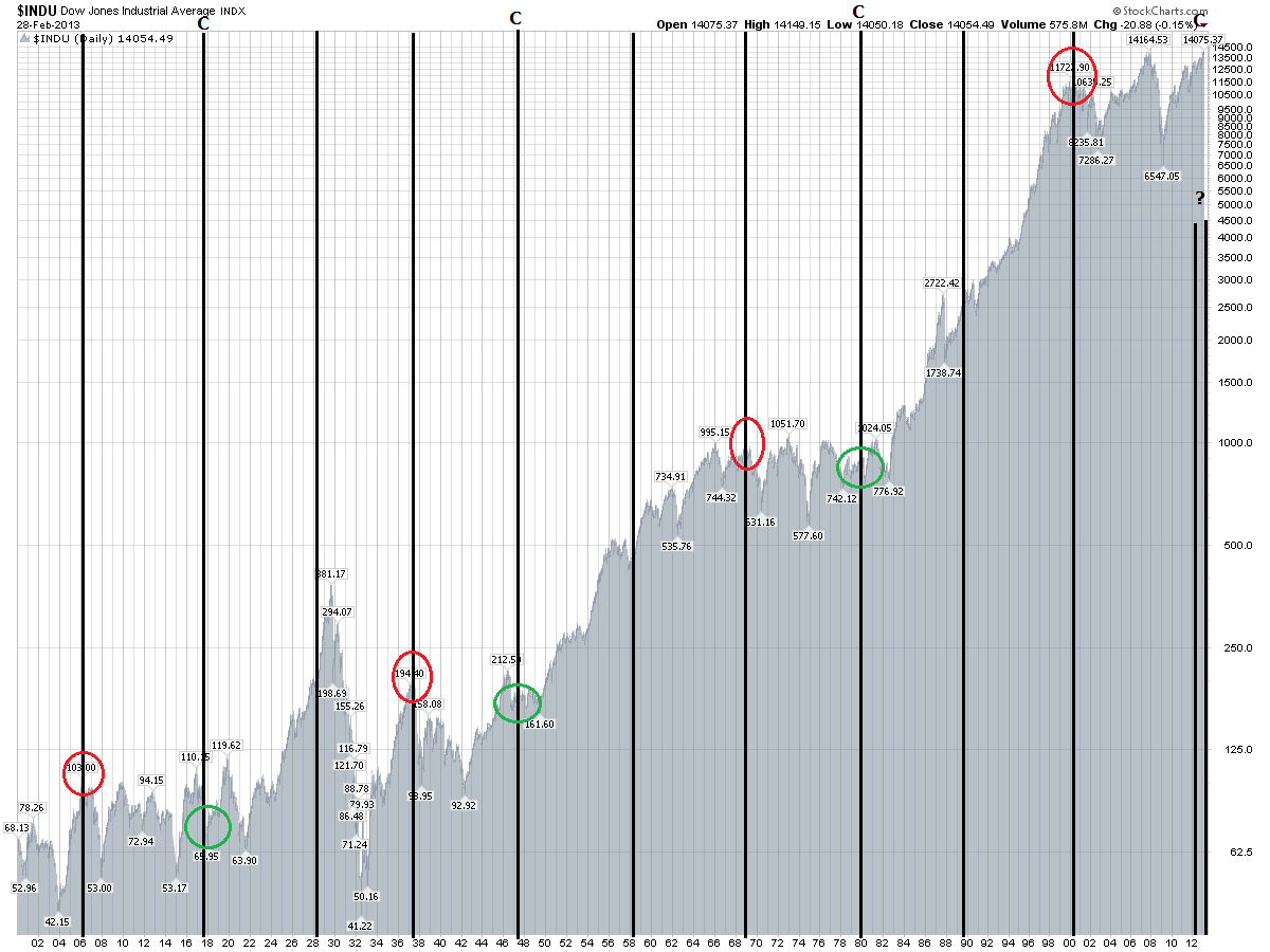
Underlying source: Stockcharts
Alternating secular bulls and bears. I argue the mid 20s to mid 30s episode was outsized greed and fear events that cancelled each other out on the way to the true secular peak in 1937. The secular turns fell very close to solar maxima.
Thirdly, the commodities index long term, with solar maxima marked. Again, alternating secular bulls and bears, and again secular turns falling very close to solar maxima.
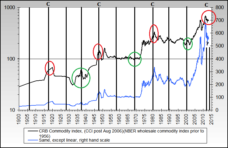 Source: Nowandfutures
Fourthly, 10 year treasury yields long term chart, with every third solar maximum marked.
 Underlying source: Multpl
A longer term cycling of secular bulls and bears, but again the secular turns falling close to solar maxima.
Here is real estate, but only half as much history available as a global index (hat tip Rob):

Underlying Source: P Loungani
There is a tentative cycle here, with the peaks alternating on solar maxima and solar minima. Furthermore, there is the main (circadecadal) solar cycle averaging 10.66 years, and a lesser (circahemidecadal) solar cycle averaging 5.75 years. They fit rather well with the two cycle parts noted above. But a little more history going forward is required to judge this model’s validity.
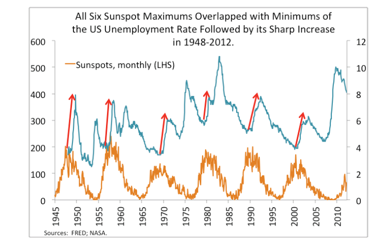
Moving on, the next chart is US unemployment versus solar cycling.
 Source: Gorbanev / Ktwop
Rises in unemployment just after the solar peaks. The chart fits well with my own chart, showing recessions occurring after each solar peak (which correlates with geomagnetism peaks lagging sunspot peaks).

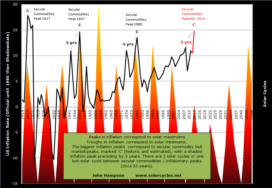
And also this chart, which shows inflation spikes occurring at each solar peak.
Below we see money velocity rising into solar maxima and peaking before or at the subsequent recessions:
 And the next chart shows the treasury spread (10 year treasury yields minus 3 month treasury yields) widens to a peak leading into a recession:

Source: New York Fed
Let me draw all that together. At each solar maximum, we see a particular risk asset or assets making a secular peak, whether this be equities, commodities, real estate or bond yields. I argue this is sunspot-driven biological human excitement that translates as a speculative mania in the popular asset class of the time. We also see inflation and money velocity spikes at each solar maximum, which I argue is also behavioural effects in the economy of the same excitement phenomenon. After each solar maximum we see peaks in the yield spread and unemployment and recessions. Market history dictates that bull market cycles end with inflation rising, yields rising and overtightening, so this fits with the picture being revealed. Excessive and unsustainable speculation and buying in the markets leads to excessive inflation and tightening and tips the world into recession – economists would relate to that phenomenon as a regular cycle of greed and fear, boom and bust. But add in solar theory, and sunspot maxima biologically help inspire the greed/boom part, whilst geomagnetism maxima (lagging sunspot peaks) depress sentiment to assist in delivering the fear/bust part.
So by this modelling, we should be seeing a secular peak in commodities and a secular bottom in treasury yields around the current solar maximum, which should fall either Feb 2012 (past) or ahead in Fall 2013. Both commodities and treasuries have fulfilled secular bulls through to 2012/13, regardless of what happens next. The difficult part is in timing the turns when you are close in on the action, as we are as traders here in 2013. What is clear is that money velocity has not yet picked up and inflation has not peaked (making its high thus far in 2008). US jobs and yields spreads do not indicate a recession, and geomagnetism is currently benign. Jobs are in fact predicted to grow ino the Fall:
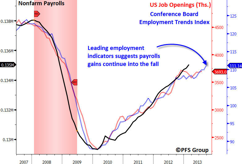
Source: PFS Group
Historically, recessions have begun an average 14 months after solar peaks, so we might expect to see leading indicators for jobs falling by now if the solar peak passed in feb 2012.
Collectively, these suggest the solar peak is more likely ahead in Fall 2013 than behind us in February 2012. I previously showed that world bond yield and money velocity charts could be bottoming out based on technical action thus far in 2012-2013, and in which case an escalation from here through the solar peak (assuming Fall 2013) would fit well with history. That would also suggest an inflation peak, and a secular commodities peak, lies ahead.
We can now cross-reference this solar picture with demographic models.
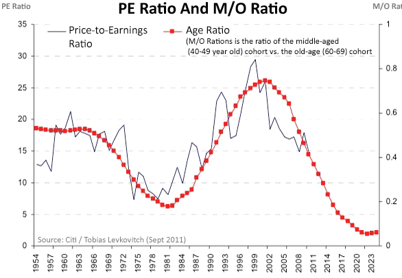
The next chart is a 100 year chart of the US Dow p/e ratio together with the trend in US demographics as measured by the middle-aged to young-aged ratio:
 Source: CXOAdvisory
This chart is the same demographics trend shown against the inflation-adjusted Dow.
 Source: CMG Wealth
Both the p/e and ‘real’ Dow do the same job of removing inflation from the picture. There is a clear correlation between equities and demographics.
Chart 14 shows the SP500 netted of inflation versus the same demographic trend, and I have added in the solar maxima (black lines) again.
 Underlying source: Chris Puplava
Now things get interesting, because there appears to be a three-way relationship between solar maxima, demographics and equities, with peaks and troughs in all three lining up. In my Trading The Sun PDF I noted there was some research identifying solar cycling as influential in population and demographics in other species, as well as research attempting to correlate solar cycles with longevity and mortality in humans. But I have now additionally found a research paper by Walter Randall (1991) that identifies an 11-year cycle in human births, and here is the chart showing that dominant cycle in the US:
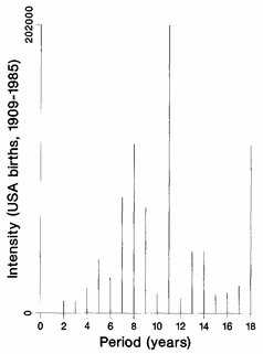
Source: W Randall
Randall also found variation in human conceptions relate to sunshine levels and geomagnetism.
I have added the solar maxima to the US births per year chart below. We see births have typically spiked up a little at the solar peaks.
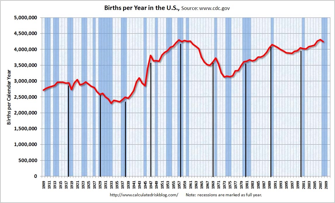
Underlying Source: CalculatedRisk
And here are UK births, with solar maxima overlaid:

Some clear peaks and troughs aligning with solar maxima.
So, we have solar-inspired waves in demographics which provides a reasoning for a correlation between the two.
We can also explain the demographics correlation to the stock market. There are young borrowers/spenders, middle-aged investors (partially investing for retirement) and old-ages disinvestors. If the middle group is growing relative to the others, then we have a growing demand for the stock market. Similarly, the old and the young don’t typically buy houses, so a swelling middle-aged group relative to the others is an environment for a housing boom, and vice versa.
So there we have our three way correlation between sunspots, demographics and equities (and housing too). Because of the solar cycle related births swells, we will find certain demographic groups peaking in numbers and relative numbers around solar peaks. That provides peak demand or supply (e.g. a peak in retirees disinvesting), and together with the sun-driven biological changes in human excitement at the peaks, we have a recipe for asset invesment and speculation peaks at solar maxima.
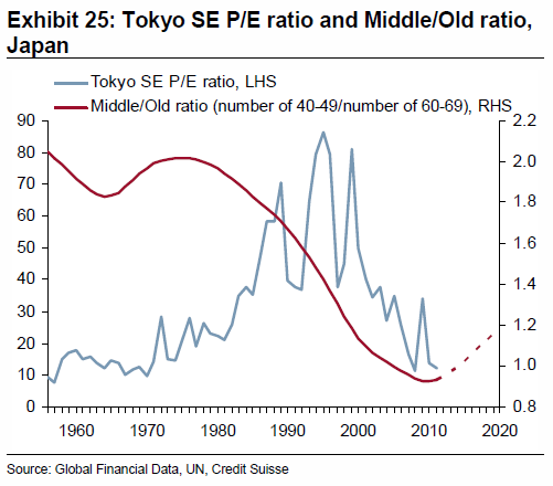
In the US demographic chart above we can see that the steepness of the secular bull from 1980 to 2000 appears related to the steep demographic uptrend of that period. Now here is the same demographic model for Japan:

Underlying source: Chris Puplava
Again, peaks and troughs in stocks, solar and demographics line up. The steep secular bull up until 1989 again appears related to the steep demographic uptrend of that period. The reversal in demographic trend as of 1989 appears to explain why Japanese equities topped out at that solar maximum and did not keep going until the 2000 solar maximum, whereas US demographics did.
Looking forward, we can see that the US demographic model reveals a new uptrend from this solar maximum (circa 2013) to the next (estimated mid 2020s), which is supportive of a secular bull, albeit a relatively shallow one in real terms. Meanwhile, the Japanese model is already in an uptrend and is good until around 2020. Japanese stocks are currently in a sharp upswing, belatedly catching up the demographics and suggestive of a new secular bull.
We have looked at middle-young demographics, so let’s now draw in middle-old demographics. The chart below shows the picture for the US:
Source: BusinessSpectator
The US faces a demographic headwind looking out to 2020 in this regard, unlike its middle-young asset. Using the m/o ratio only we see a prediction for the p/e ratio to drop to just 2-3 by 2020. This should be offset to some degree by the improvement in the m/y ratio. Nonetheless, there is something notable here, which is that p/e ratios for country stock indices appear to largely reflect demographics. In other words, a country stock index with a cheap p/e is only a good buy if the demographic trend forecast reveals an uptrend ahead. Some of the most ‘expensive’ stock indices around the world right now by p/e valuation are Indonesia, Mexico and Philippines, all of which have very favourable demographic trends looking forward compard to most of the world. Rather than shying away from these indices because they appear overvalued compared to historical averages, it might instead pay to invest there, as they should get more ‘expensive’ going forward. This also explains why the Nikkei around 1982 maintained a p/e of around 20 whilst other stock indices were making single digit secular bottoms, because it was in the midst of a positive demographic trend looking out to 1989. Note this relationship is longer term and does not preclude shorter term p/e oscillations. P/e valuations will overshoot and undershoot the demographic trend but mean revert to it over time.
The next chart shows the middle/old trend for Japan, which is a tailwind out to 2020, like the middle/young for this country.
 Source: Zerohedge
Two more demographic measures for the US. The first chart points to a bottoming out by around 2020, followed by an upswing into 2036, which is supportive for a secular bull market.
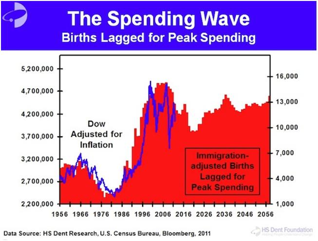
Source: HS Dent
And this chart shows an enduring trend in nominal labour force expansion in the US into mid-century, standing out from the other developed countries shown.
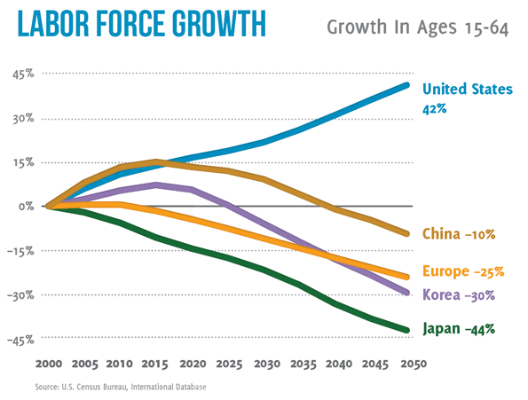 Source: SeekingAlpha
So combining all four demographic measures for the US, we have strong odds of a secular bull from around 2020 to 2030. Prior to 2020 it may struggle to gain traction, and need a deeper washout in p/e. Let’s not forget that we are dealing with ‘real’ Dow/SP500 and p/es, so inflation matters. A sharp rise in inflation could drive down p/es whilst the index goes sideways. A lack of inflation could mean the index falls nominally before embarking on a momentum secular bull run from 2020-2030. Either way, because this demographic uptrend from 2020-2030 is ahead, we might not expect a major washout in p/e in the US. The SP500 and Dow are amongst the more expensive indices by p/e around the world but this could reflect the positive demographics ahead.
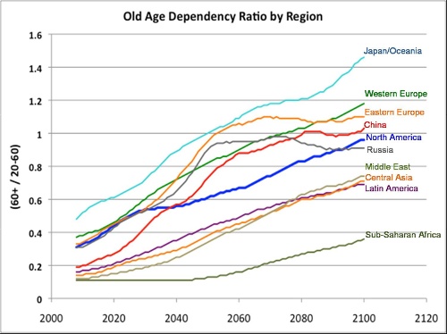
Let’s now look at dependency ratios (proportion of retired and young to the working population) demographics globally. Trends in the developed world contrast starkly with trends in emerging countries, as shown here:
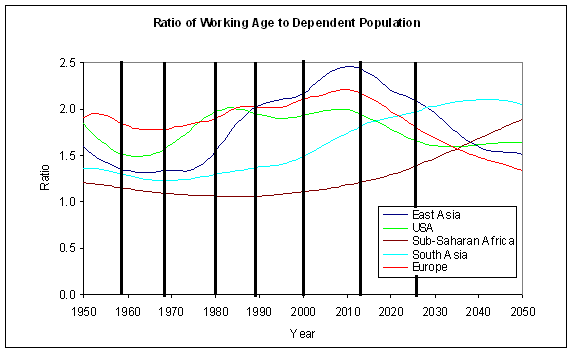
Chart 23 reveals the bad situation kicking in as of now in developed countries:
Whilst the next chart shows a particularly positive outlook for Philippines, Malaysia and India:
 And the next chart provides another comparison:
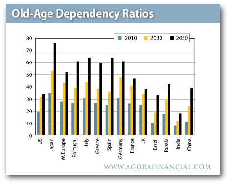 Brazil looks good. The USA improves looking out to mid-century. And the worst: Japan. So let’s return to Japan, which we can also model using the dependency ratio as below:

Japan is understood to have battled with asset deflation for 2 decades. However, we see that demographics were responsible for a p/e or real downtrend in Japanese equities from 1989 to around 2000. Then the m/o and m/y demographic trends picked up again, and we can see in the chart below that the Nikkei effectively tracked sideways since then.

We might therefore take a fresh look at it and consider the Nikkei was in a downtrend for a decade (or one solar cycle) and then turned sideways as the demographic trends in m/o and m/y changed upwards. The massive spurt since October 2012 therefore looks reasonable, as a belated catch up to trend. However, not all is well for Japan. The dependency demographic trend is the worst around the world in that it is likely to become devastating by mid-century. It also has the largest debt-to-GDP ratio in the world, over 230%. Interest rates are effectively zero, and cannot be allowed to rise much because of the servicing of the debt. There is little hope of major GDP growth in the years ahead because of the dependency trends and the debt. Despite this, Japan is going hell for leather in a bid to restart the economy and ignite inflation, now doubling money supply from 29pc of GDP to 56pc of GDP by 2014. The first result of this ultra-aggressive policy has been a swift 20% drop in the yen. As Japan is an energy importer, this has immediately produced a big uplift in energy price inflation. If I am correct in predicting a pick up in money velocity here, and also correct in a commodities/inflation peak ahead relating to the solar maximum, then I suggest there is the potential for Japanese inflation to quickly become problematic. As the government cannot combat with rate rises because of the debt servicing, the risk then would be hyperinflation. I know hyperinflation is overhyped, but I just wonder whether it is worth an outside bet here.
Hyperinflation has historically been initiated by either rapid increases in either money supply or money velocity, then the other one has joined in to complete the feedback looping. Japan is obviously at full acceleration on the former. Under hyperinflation, stock markets have historically gone wild in nominal terms, but the cost of living has gone even wilder. In Zimbabwe, the stock market went up 47,000% in a year, but the cost of living rose even faster. So a Japan hyperinflation trade could be achieved either by a spreadbet on the nominal index or a long Japan fund whilst short the yen. This is how I see it: Japanese stocks should rise on the belated catch up to m/o and m/y demographic trends, regardless of the Japanese government’s policy actions, but those actions have the potential to produce wild inflation which would then take Japanese stocks in nominal terms much higher.
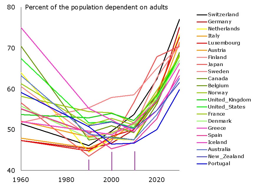
Back to demographics. The headwinds facing many developed countries in dependency trends are problematic. Here is real estate modelled against dependency for six developed nations:
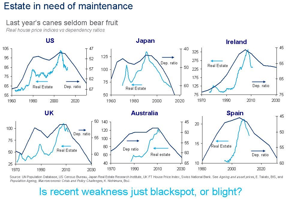 Source: Business Insider
If we refer back to the global house index chart further up the page, that cyclical model projected no real take-off in global house prices until 2019. These dependency charts suggest headwinds that further cement the likelihood that housing won’t offer a great return for the next few years in the developed world, applying equally to most other European countries, New Zealand and Canada. China and Korea also faces the same dependency trend issues starting around now.
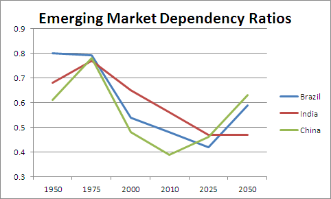
The countries with the best demographic trends looking forward include India, Brazil, Mexico, Indonesia and Philippines. South Asia, ASEAN and South America look particularly fruitful regions going forward, and Sub-Saharan Africa too. If this is a global transition into a K-Spring, then investments in equities and real estate (K-Spring’s champions) might do best in these countries and areas. The USA should perform well too, from 2020 to 2030, but the period before 2020 is less certain.
Brazil and Mexico have good prospects until around 2025 but India and Philippines extend until 2040. Contrast this with China, which is just hitting trend reversal point into a negative trend, and we can see the likelihood of China stepping back from being the world’s leading growth engine, and in doing so maybe provide a backdrop to a secular commodities bear (as it is the world’s largest commodity consumer).
Source: DarwinsMoney
Dependency ratio trends and projections for select nations:

Source: John Eyers
Maybe the investment star of the next two decades will be India, which could feasibly rise for multiple solar cycles in a powerful secular bull that resembles the Nikkei into 1989 or the Nasdaq into 2000. With its 1.2 billion inhabitants it has the potential to mobilise something significant. But India, just like Brazil or Philippines or Mexico or Indonesia is an emerging country, with emerging risks. Let’s say the demographic outlook provides potential for great returns in these countries, but the structure to achieve it is less reliable than in the developed nations. The developed nations conversely have the track record but now the demographic headwinds.
To draw back together demographic trends, solar cycling and equities, we might expect that the positive demographic trends that have been in place in some of these emerging countries to have provided a secular bull over the last solar cycle, much like the Nikkei powered its way through 4 solar cycles in a secular bull set against a positive demographic backdrop. This is indeed what we see:


Source: Yahoo Finance
Over the last solar cycle, from 2000 until now, all the four country indices shown have made secular bull markets, not secular bears, in line with the demographic trends. They are all also amongst the most ‘expensive’ countries in the current p/e spectrum in the world, again in line with the demographic trend. I suggest that the ‘expensiveness’ of a country’s p/e rather has to be measured in terms of its relativity to its demographic trends. I also suggest that due to the demographic trends in all four remaining positive for another solar cycle, they should go on to continue their secular bull over the next solar cycle. I suggest that may be at a steeper rate, because it will be against the backdrop of a global K-spring, an up-cycle. As a reference point, see how the Nikkei secular bull (first chart in the article) that lasted for 4 solar cycles was at its steepest in the solar cycles of 1947-1958 and 1980-1989, both of which were global upcycles, a K-spring and a K-Autumn.
To conclude, these are the opportunities that I see (for myself of course… I am not an advisor).
1. Long Japan, due to m/y and m/o demographic uptrends until 2020, and an outside bet for hyperinflation. Averaging into any falls. We can see Japan’s little window of positivity here, in the upturn in the green line between 2005 and 2020:

2. Long USA, but more compelling as of 2020. At risk of a p/e washout before then. These two charts show head and tail winds respectively for the US market from now until 2020:


Source: Informed Broker
3. Long a basket of emerging markets with the best demographic outlooks: choosing from India, Philippines, Indonesia, Brazil, Mexico and potentially sub-Saharan Africa. Averaging into any falls.
Here is the very long term look at dependency ratios to end:
 Source: Appliedmythology
If these projections hold true, then the four lowest listed regions should offer the best opportunities over the next solar cycle. The following solar cycle the USA stands to fare well (where the blue line flattens). And later his century Russia and Eastern Europe may get their shot at being investment gold.
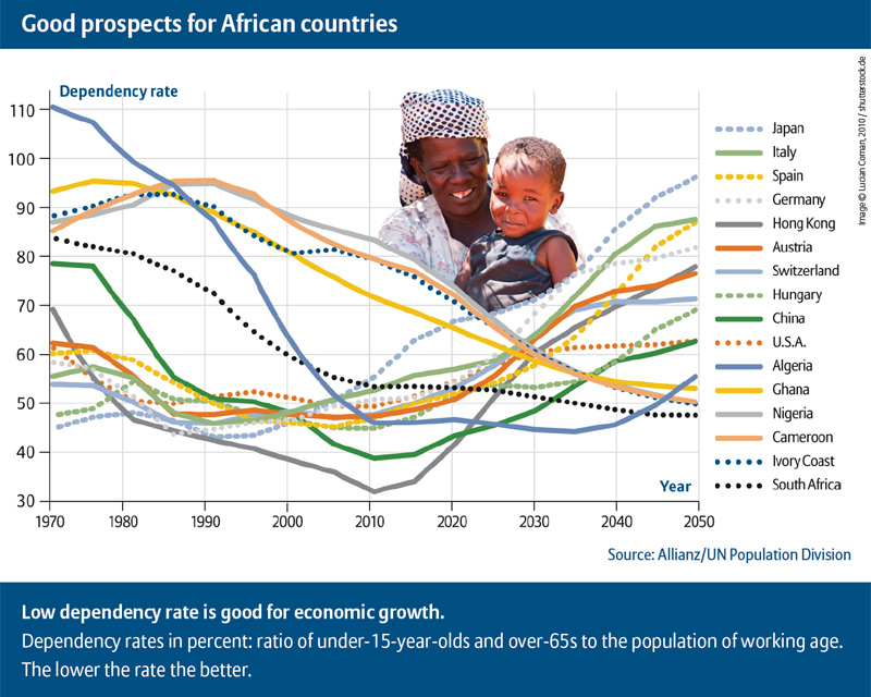
Additional chart: prospects for specific sub-Saharan African countries: positive demographic trends for the next solar cycle for Algeria, Ghana, Nigeria, Cameroon, Ivory Coast and South Africa:

I’ve opened a long position in the Nikkei and the India 50, and will open Ishares Latin America and Market Vectors Indonesia later. Will be looking to build into these positions over time.
Hi John
Your very best post
Now a question
You have bought the Nikkei in a Lunar red period, which could see markets going sideways or weakening.Do you see no value in Lunar cycles?
regards
bob
Thanks Bob. Yes I do, my buys going forward will be largely timed at the start of the lunar positive periods. I just wanted an opening position.
Hey Bob, could not reply to your previous question, no I do not trade for a living. That does not mean I do not invest per se. I have also been a business owner here in the U.S. and studied macroeconomics, finance, and solar cycles for well almost 12 years. I have studied meteorology and climatology on and off for almost 18 years. I am one to connect the dots between things most don’t readily see or want to admit to seeing and I use computers to crunch lots of data. (Profession is computer science.) John and I would email offline and he encouraged me to post publicly. Seems like I ruffle feathers when I make comments about gold, but no one should be too fast to digest what I say. At least we do not have to pay by the keystroke.
What’s your story?
Dear John,
An excellent and thoroughly intriguing post.
The demographic correlations are startling.
Presumably the Chinese one child policy would portend some gloom for the region?
Sincere thanks for sharing this research.
All the very best
Rufus
Thanks Rufus. Yes, it would appear to have helped put them in a difficult trend kicking in as of around now.
All models updated. Geomagnetism trend still up. Lunar positive period starts on Monday.
Geomagnetic storm forecast for the remainder of this week.
Have added a chart showing specific African countries dependency demographics to the end of the article.
Can’t find any vehicle that truly sovers sub-saharan Africa – any pan-African funds or ETFs are largely limited to South Africa, Nigeria and Egypt. Will be buying the South African stock index direct and Market Vectors Africa in my SIPP.
I assume there are a lack of things to invest in, in sub-Saharan Africa because economic development is years behind for sub-Saharan Africa. Most African nations will still have extremely young populations, even by 2050. The next 10-30yrs are probably the time in which these sorts of things may begin to be introduced, but it all depends on how the countries all develop.
That’s what I imagined. Just not far enough down the line to be available as a play thing on overseas trader platforms.
Fascinating stuff. Thanks for sharing!
You may find this YouTube channel interesting – it focuses on the effects of solar activity also, except from a more geo-process perspective – earthquakes, weather etc:
http://www.youtube.com/user/Suspicious0bservers
Thanks
Hi John. Investing based on demographics is a well-known concept. My favorites in that sphere have been Vietnam (VNM) and Turkey (TUR), which combine great demographics with low pe ratios, the best of both worlds. I have held them since 2011. I am also looking to add Egypt (EGPT) or Africa etf (AFK) this year.
Europe is going to be a global laggard for a long time, because the EU is combining poor demographics with self-defeating regulations. Young people in Southern Europe are already moving away to places like South America and even Angola, where jobs are easier to get. This will further weigh on the demographic situation in the EU.
Can’t find a demos trend projection chart for either Vietnam or Turkey – you got one?
I don’t remember exactly where I pulled up the info. But Vietnam is known to be in an extraordinary demographics situation because of the Vietnam war. Here is a good article I just googled about it: http://www.indochinacapital.com/investing_in_vietnam.php
70% of the population is younger than 35.
Whenever I want to look at macro-fundamentals I always go to http://www.nationmaster.com. Under “statistics” you will find all kind of info that can keep you busy for a day or two.
Wikipedia has articles about demographics for nearly every country. I always look at population younger than 14 vs population over 65. The more young people vs old people the better. That’s why I don’t like Japan’s demographics, even though the chart you posted seems to suggest otherwise.
Thanks.
Hi John
I see one problem with this demographics idea, and it applies especially to South Africa…..the unemployment rate. Some 70% of school leavers cannot find a job , and there is no likelhood of a job in the future unless GDP grows above 6% PA
Is this growth achievable?
No chance.
I wont go into the reasons, but high labour costs and a very high skills shortage are standouts.
So we now have the youth and the elderly being supported by the middle aged group, which is not sustainable. And the tax base keeps shrinking..
Europe is in exactly the same boat.
I think the idea will only work under growing employment conditions….Asia and South America.
Regards
Bob
Makes sense. I see the JSE has performed the same as the others though – a big bull since the last solar max. I know there is a relation with commodities and gold, but it is in clear air despite commodities relative weakness the last 2 yrs.
The International Census bureau’s database can be very useful, for finding out the current and projected population structures of countries. It covers most countries in the world, and can help you form population pyramids, help you calculate dependency ratios and so on.
The differences between age structures in places like Spain and Mexico, for example, are immense. Both are Spanish-speaking nations, but they have built up their economies differently, they have had differing economic issues and Spain has a far lower birth rate than Mexico. All of these variables should prove invaluable for investments and expectations of future performance.
Young, skilled and economically free people have been so far the only real engine of growth in human civilizations. What seems to matter a lot is immigration policies of countries : USA itself was made of free and relatively young entrepreneurial arrivals. Japan is densely populated and immigration unfriendly. Russia : low levels of personal freedom and hostility towards immigration. UK, Germany and France have been helped in the past decades by moderate immigration from Eastern Europe and Africa. Levels of freedom and skillfulness are low in Africa. South America, especially Brazil have been my favorite for a long time – it seems that getting Brazilian residency is relatively easy and cheap in comparison to Asian countries. Today’s states policies will change, because humans have been always roaming about plus the distances are getting shorter and cheaper thanks to global technical development. It was a good article John – now I understand why I have been bearish on housing market despite money printing and credit expansion.
Good point, thanks Despe
How may years does it take to become an European i.e Italian, Swede etc? I would say it takes about 3 generations to become really accepted perhaps 2 i.e. generations.
How many years does it take to become American? If you know the language and you are entrepreneurial/skilled worker and can get past all green card stuff etc. I would say 5 years (think Sergei Brinn).
How many years does it take to become Chinese? – You can not.
This is the single force of empires such as the US and Rome. The ability to attract. When a country loses this force then it goes downhill. Think about Rome again.
I feel like reading my own thoughts. 😉
Briliant post.
Thank you for global demographic charts. I haven’t seen many of them earlier, but i’ve known about Japan opportunity gap.
Do you have any historical charts of London Stock Exchange? I mean the Great Depression period.
Contempletion of Dow Jones of that times gives wrong impression of Great Depression globally.
I look at All ordinaries in 30′ and I see in 1937 higher high than in 1929.
It’s easy to forget that then USA was one of EM of that time. Rising in power, but the centrum was in London, the City of actual Imperium.
History repeats, but never in the same place.
Best regards
Found a good bit of data for the FTSE All Share index since 1800. It gives a yearly performance of that index over the course of 200+ years. I created an excel chart of the early 1900s period for the FTSE All Share, and the index fell by about 50% from 1929 until the early 1930s.
This reflects the fact that the UK didn’t suffer as much as the US did in the 1930s. The UK did, however, suffer an economic depression in the early 1920s, with a huge bout of deflation, following the post war period.
http://www.finfacts.com/Private/curency/ftseperformance.htm
Thanks a lot Pete.

I found something that should make John pleased.

British equities made a real top in 1935 or 1936
Inflation adjusted.
A bit different view, if it’s going about secular bear and bull markets.
Intresting, that GB had it’s Great Depression in the 70′.
Thank you both. Had been looking for a long term UK chart – will use that in the next post.
The enormous crash seen in the FTSE All Share back in 1974 really does look like a huge spike down. There was a general stock market crash around the world in 1973-74, but the UK stock market crashed more than others. During this huge crash, 2 general elections were held, which produced weak governments with slim majorities.
The recession of the mid-Seventies does start to seem like a mini-depression, given that inflation was about 24% at one point, and the economy went from overheating to an economic slump. The Seventies seem like a lost decade for the UK.
Pyretta, John, this chart also is of interest from the 1952-1953 perspective.
John, thanks for all the work you’ve put into your recent posts. Today’s marathon resonates and, while needs further digestion, also leaves me hungry for more. If you continue delving into demographics perhaps you could develop your own p/e-demographic ratio
Fwiw a few notable results during today’s Fake Tweet Flop.
Up: Yen, Gold, Silver, GDX, Treasuries, VIX
Neutral: NonYen Currencies, Japanese Bonds (not sure about all JGBs)
Down: Stocks (US, Developed, Emerging), Oil, Copper, US High Yield Bonds
Also, US to settle about $300 billion in Treasures from 4/25 to 5/2. Definite short-term hit to liquidity.
Wow! Thank you for another great post.
Remember that 1st chart of the Nikkei. It looks like now is the bottom of a major 4, extremely similar to the huge commodity 4 that bottomed 1998-2000.
John, I feel the content above needs to be Trading The Sun 2.0, but in doing so merits a little expansion. Strongly encouraged!! I find it excellent and previous discussion about population concerns with you may not have been exactly the same thing here but underscores my thinking process. Communication over long distance isn’t ideal, but feel synergy here. That at a cellular level we are reactive to external electromagnetic influences. The populations swings as well as the greed and risk taking is evident in reproduction as well as investing. If you absorbed too much sun, you go party wild in decision making, rationalization. Cellular health seems to be affected to the positive and I would argue it leads us to our creative spurts that drive innovation. The same risk that makes educated folks gamble in investing also drives crime higher. Privately, I have it on my to do list to overlay stocks, sunspots, and USPTO patent approved and requested per year. On crime, I want to overlay population, crime, and sunspots. I’d argue that crime deters growth as does
Want evidence of a K-Spring now? Ask and you shall receive. At least a USA perspective. USPTO opened a satellite office in Detroit first ever. Patents filed are at record rates. Bankruptcy in California and Alabama cities. Emergency manager runs city, auto-sales rebounding, progress being made in cleanup, real estate is rapidly flipping to those who can re-image. Look at Texas (Okay I know it’s just USA but also where regulation is being reduced) A friend of a friend of mine is moving to Switzerland to help deal with fixing issue in Europe’s auto-sales to labor overages. The trucking industry is in a huge shift to change petrol from diesel to nat gas engines. Cummins has a new engine coming out. Been watching this since 2009!! Imagine if deregulations allowed this to change faster. Doubtful, but the roots are there. Obviously the shale and WTI recovery in abandoned wells is a sign. Will traders be able to see anything but a smooth flat line until 2016? 2020?
On commodity inflation, I’d argue its been occurring but not observed correctly. Example, I go the grocery store. I pay the same price, but get less, so I buy more packages. Prices do not drop even when speculation drops.
Want evidence of the recession being here now (but concealed) we can cover that. PMI out of China is latest example. The revised GDP algorithm will also help here. Jobs is negative, hiring freezes exist, Obamacare is the misunderstood black swan. Not bad really, just chaotic. Jobs, well in the biggest economy, small business represents a lot of the main street self employed folks, the outlook is sour, been sour, and national data doesn’t aggregate this. Data is skewed as a result. The knowledge of and now in progress government mandated spending reductions whilst rising taxes through healthcare, and social security are going to make Q2 and Q3 have less then desirable numbers. Deflation being a concern currently by the fed…recession. I’d argue this is the last recession of the K-Winter, but is more stagflation-like. We’ll look back in 15 years and wonder why we repeated the 1970’s again.
Jobs:
http://www.cnbc.com/id/100622802
By the way the global home price index weighted chart you had showed a 17 year cycle. We need to give the 17 number more weight on the electromagnetic shifts in the solar cycle. I had emailed you about this, not sure if you digested that yet.
Some other thoughts as I read your excellent post:
What about Greece’s dependency ratios?
Population globally as year over year numbers versus sunspot numbers. This would give a good statistical basis to what you point out. Especially if solar influence is at cellular levels. For those concerned about the Lunar, point back to posting month or so back to NASA article how lunar orbit disturbs radiation belts or solar wind distribution.
Able bodies, improving health care, labor force participation, and technology going to play a role. I’ll be able to start asking for higher salaries in 2020, a record number of programmers will supposedly retire. Doubtful, more and more jobs in developed economies will be about reducing the need for human capital. More and more people will be idle and therefore dependent on society under a pure capitalist model. Energy exports may allow this. I foresee a gradual evolution driven by technology.
The information age is over and the knowledge age is economically in. K-Spring to expand on this to automate and use big data to do what we do today which is connect unrelated things and realize they are indeed related.
Minorities used to be a source of growth in the US, now they are more of a liability. Majorities of the yesteryear quickly becoming the new minorities in developed nations at an alarming rate? Combine that with aging?
War cycles? No mention of war or how economic and population realities above could lead to theoretical wars. China ratio of males versus females comes to mind while Japan experiences Hyperinflation.
India is a source of growth, India also like oil and water with China. Future black swan here I feel. Is it ironic that you point out India whilst the gold hoarding there is in the news.
More to the effect about physical versus paper gold last week…
http://www.bloomberg.com/news/2013-04-23/u-s-mint-runs-out-of-smallest-american-eagle-gold-coin.html
Disclaimer: Don’t own any Eagles myself. Probably should.
On Japan, they will obviously Hyperinflate, high interest rates encourage saving, but a growing global currency via SDR’s to play a role in a switch from the Dollar as reserve currency. SDR’s are planned to increase gradually over time. Would argue Europe has a Euro breakdown, some establish independent currencies and have integrity via SDRs. China wants SDR’s also. Less dependency on OPEC will correlate with SDR adoption.
From a CXO / CEO view, population drives demand, potential customers. Short supply a separate algorithm.
A red blue shift applied to population and solar activity would be interesting.
Save the best for last. If the Landscheidt Minimum hold weight and we have to factor in a slowdown in population growth, a cooler period for agriculture, how might that build on top of what you added here. Birth rate spike a solar max, but much smaller? Less sunspots, less innovation?
Cheers!
Hi wxguru
You post good stuff,thats why I ask if you trade .If you said yes I would then ask how you applied your posts to trading.
regards
Bob
I still am educating myself enough to make jump ship beyond mutual funds. I do plan to jump out soon. Put/call options and ETFs not really gotten to that level of trading yet. I comprehend them, need to get my feet wet. Perhaps in a few years. All self taught to date. Look to leverage U.S. tax code to legally avoid capital gains as much as possible. I have always been interested in foreign policy also so that always helps as any type of investor. John’s recent travels around the world are always beneficial, opens your eyes to what is really going on versus only what can be seen from a computer screen. That flash crash of the DOW due to the fake tweet. Supercomputers will produce more of these. Some of the type of software I’d like to work on in my free time potentially aggregate unrelated data. Make the software an extension of what I observe (stuff I post about) Based on my solar cycles and economic knowledge, I actually moved to Detroit, MI USA from Washington D.C. area in 2008 in the midst of the collapse of everything. Some good opportunities as a result aside from stocks. Told my family to buy gold back in 2001. Taboo to advise elders haha so not sure if they listened.
Great ideas wxguru, many thanks.
Greece is in the same dependency boat as most of Europe:

Ireland is relatively the best.
Yes I recall your 17 yr cycle email – the field switch. I delved around online but couldn’t find much more about it. It could glue things together though.
It has been on my mind that Trading The Sun is now out of date in many areas as ideas have evolved. But that needs time, and I’m kind of leaning towards letting this solar max play out first and judging its impacts first.
A new solar minimum period – yes all kinds of potential implications. One thing I have wondered is to what extent solar cycling is hard coded within us, like lunar phasing is. Artficial lighting and cloud cover don’t appear to prevent its influence suggesting lunar sentiment swings are hardcoded to some degree. Supermoons don’t appear to be any more potent either. So I wonder if solar cycling is also partly like that – hardcoded excitement swings regardless of potentially weak maxima ahead. Got a view on that?
Have been hunting for a global births per year chart but can’t find.
I hope you do that interesting overlay work that you have in mind and share. Would be very interesting.
John, a woman’s body is hardcoded to cycle very closely to lunar cycle. I have no doubt there is some hard coded excitement mechanism going on. I think since were all electric signals anyway, the hard coding is no different then kicking the old UHF/VHF antennas around. The sinusoidal waves will react like a pendulum in harmonics producing the gradual increase and decreases.
Just the other day to display how closed minded we are. Dark lightning was in the news as some new founded thing. All it is really is the fact that the electromagnetic spectrum is more then visible light. If science is just discovering dark lightning, imagine how long we have before solar cycles and behavioral excitement is accepted. Plate tectonics was laughed at the turn of the 20th century.
Get a microscope go to a pond, get some amobeas, and scientifically track rate of reproduction during the same month, temperature, etc. for 11 years. Peas or other plants may be easier. We’re hitting a wall where research is going to be the only way to validate this. Commonsense I think yields us a certain level of statistical probability to hedge here even if we are in the minority.
On the 17 year switch, I’d like to grab a copy of the gents book to see what his math reveals. What sort of stuff you were searching on. I may be able to help? Can discuss offline until more firm.
Coriolis force is fairly easy to compute and although I do post somewhat disconnected, the atmospheric physicist I pointed out a few weeks back ( granted its a dry read) Robert Black, the summary had spoken to how he found a correlation of how the Coriolis effect influences PDO and seasonal changes related to electromagnetism. There is research that is floating idea of how nuclei of rain drops attract condensation to form clouds is electromagnetic influenced. I always say the one true science is physics. As traders, I know this will not be of any immediate use but it begs the question that an opportunity exists to connect everything.
I will try to post here for sure as I generate plot-able material overlaying things. Since this doesn’t provide for the family yet, have to take it slower.
I found a global births numbers page yesterday on viewing your posting. I’ll post as a followup once I am back on that computer.
http://www.uspto.gov/web/offices/ac/ido/oeip/taf/us_stat.htm
Found this a few minutes ago…
Link share time…
http://www.prb.org/
http://www.npg.org/facts/world_pop_year.htm
Look at chart on page 1…
Click to access GCRhurricanes.pdf
17 year cycle..Coriolis force drives angular momentum, field inversion, CME ejections in solar wind. Think the polarity is also important when it interacts with Earth.
Click to access 4451_leplae5.pdf
Enjoy. The last link you need to have been fairly good with physics to really take it to the next level. John, not sure again what you were searching for but willing to help.
http://tallbloke.wordpress.com/2011/08/05/jackpot-jupiter-and-saturn-solar-cycle-link-confirmed/
“1/(1/9.93 – 1/23.72)=17.01 years, the period Leif Svalgaard claims for the “true solar cycle length” due to the continuing appearance of ‘old polarity’ sunspots after the new ~11 year Schwabe cycle has begun and ‘new polarity’ spots start to appear before it finishes.”
Thank you again. The sun velocity 17 year cycle matches up with the real estate cycle, but that would just be a very tentative observation.
Agreed, just thought I’d point it out.
Let’s remember that John’s hypothesis rests on the concept of “excitability” as introduced by Chizhevski. That in itself is still a contested hypothesis, considered fringe science.
But let’s assume that Chizhevski’s concept is valid. In his work he linked the peak of solar cycle to higher excitability in the people, leading to more wars, violence, revolutions, strikes and so on. The solar minimum is supposed to bring lower excitability and peace.
The idea is that this excitability also increases speculation and risk-taking in stock or commodity markets.
I think that will necessitate another qualifier in John’s model: based on the war vs no-war situation. When the excitability from solar max brings war and revolution to a given country, then we cannot expect that the excitability will drive up the stock market in that country (example: Egypt). These countries rather go to a major market bottom because the war/revolution.
So, when excitability is driving the stock market to high levels in the peaceful parts of the world, then at some point it makes sense to buy into the war torn countries that have sold off because the violence that came with the very same excitability. As the solar cycle winds down into its next maximum, the intensity of ongoing conflicts wanes, and these countries markets start recovering.
A recent example is the first Gulf War which came near the 1989 solar max. This gave us a market bottom.
Well, from my understanding Chizhevski would have gotten the Nobel price for his theories but Stalin was not very happy about the study. I would postulate Stalin would be quite pleased about how the world looks today ;). Economic science is total bullshit.
Do not forget Nobel prices and mantras:
– Black & Scholes (Bankrupt)
– Markowtiz (Bankrupt)
– Kaynes (Bankrupt)
– Banking system and all the accepted finance in 2008 (Bankrupt)
– Amaranth Advisers (Bankrupt)
– The list goes on and on
I like your work on the moon Danny but not the squeakily lines drawings. It is as bad as Funny-Mentals. No statistical validity. SPY going higher into May. What can we do? Predict bla bla. No. Just follow price.
Hi Robert. It is well-known that economists do generally very poorly when it comes to investing. That already shows that their “fundamentals” are of little or no use. I think it is like trying to predict next week’s weather on the basis of today’s temperatures (=fundamentals).
As for the line drawings you find on my blog. Like most other blog writers I bring on the table what I am using myself. The readers are welcome to pick up anything they find useful and can quickly forget all the rest. That’s how it should be, and that’s what I also do when I read other blogs.
Some people tell me they like my indicators and don’t care much about the moon cycles. Obviously one cannot satisfy every type of reader.
Hi Danny, I have found it very difficult to test lines that are not horizontal. It becomes in the eye of the beholder. It is just that. I like horizontal lines. I do not think one needs anything else really than a horizontal line to trade. Cheers
Kerry in theory you could apply the posting re: 17 year along with positions of planets historically to validate and predict sunspot intensity i.e. when the real peak will happen. No more guessing, but that’d be some computer modeling work take some time.
Hi Wxguru,
As I am sure you know, I am a big fan of 17 years cycles (17.6 to be precise in my case). I’d be grateful fi you could point me in the direction of more info on teh field switch that John refers to.
Thanks,
Kerry
Hi Kerry. Have you checked out Bradley Cowan’s pentagonal cycle theory? It is based on Uranus 84 year orbit, which he divides into 5 parts of ~17 years.
http://www.cycle-trader.com/
There happen to be quite a few other astronomical cycles that are close to 17-18 years.
Draconic cycle (moon nodes): 18.6 years. Saros cycle (eclipses) : 18 years. Metonic cycle : 19 years.
Sure I’ll post it. Kerry, you are the author of the book yes? It gets into physics of the Coriolis force impacting angular momentum of the sun. It better articulates points Landscheidt was making. The 11 year cycle does occur as is. A 5.5 year cycle for the magnetic field to completely switch creates a clashing of magnetism. I’ll look up the links tonight.
Hi Danny,
Thanks for the link, I will do some research on Cowan’s ideas. I am familar with the astronomical significance of 17-18 years, particularly lunar perigean cycle of 8.8 years (2 x 8.8 = 17.6!).
Thanks,
Kerry
Thanks wxguru, looks like I have some reading to do 🙂
Regards,
Kerry
Thanks John – an epic and top quality post. The theory of linking solar cycles, demographics and equities, is quite beautiful in it’s elegance and coherence. Makes intuitive sense too.
I think part of the obstacle for traders to accept your views may be that these theories are crossing many disciplines. Typically finance & economics is ‘stuck’ in the confines of social sciences, which has a bias towards understanding causality only within the terms of it’s own discipline – i.e. that ‘social’ factors tend to drive the economy and financial markets. Factors outside of this paradigm, from the biological to the astronomical, are hard for social scientists to accept. A parallel example is the way historians tend to underplay the role weather has had on human history as the humanities also tend to ignore the role of biological and astronomical systems.
So I think these paradigm biases can actually get in the way of people understanding the data and seeing the parallels.
Thanks Rob
Well said. My thoughts exactly.
Full moon coming. LOCK AND LOAD!
My 52 week high and low babies:
– XCO Resources
– AIG
– BAC
– HHC
and that that little BBRY of course
Put 100 traders in a room and they can all agree on the direction of price on a given time frame. Put 3 economists in a room and they will NEVER be able to agree on the direction of price. JUST TRADE YOUR PLAN
Very interesting stuff from John however. I am just being a bit provoking so that nobody loses out thinking about price and planets and statistics. 😉
I don’t think anyone forget about these Robert.
Full moon tomorrow and geomagnetic disturbance in progress – but only minor so far.
I am so bearish but after that 5 min reversal in SPY yesterday, I am starting to believe the Fed has a plunge protection algo or something ;).
Hey Robert, so you are long BBRY and short AIG/BAC/HHC. Had a quick look at the charts.
Regards,
IWiz
Supposedly, when secular bear of stock market is close to an end and the US real interest rate hit thebottom , US dollar reach a starting point to secular bull market(like 1980). As a reult, strong US dollar will lead to underperformance of emerging stock market. Is it still a long term investment opportunity?
I expect USD to make a new bull too. But USD was in a bull 1995-2000 whilst China and Brazil were also in bulls, so the two together is possible.
Hi John
You talk about a “secular ” bull / bear market .
What does the “secular” stand for.?
bob
Secular bull is long term uptrend comprising several cyclical bulls and bears within which there are swings. Secular – cyclical – swings.
Have been following your work since the old site. Thank you for sharing your knowledge. This artical was amazing! My unserstanding is no where near your or the people who comment on the blog.( 2019 to 2020 time was what I was coming up with from all the info i have gathered).Thanks to all the people who comment for the additional insight.
Thanks
Hi Robert
I am also a Robert..
Without distracting from Johns monumental post,
how do you draw these horizontal lines?
Support / resistance?
Or are you including planets and stastics?
Kind regards
Bob
Hey Bob,
I think you can use ANY randomly drawn line as long as it is HORIZONTAL. Support and resistance may only be a social construct but yes I still look at those. Always go long in the direction of price relative your line. Defend your line. Do not be long if price reverses by much through YOUR line. Not sure about the planets yet but John, Dave and Jan have very interesting information – regardless whether it is the way I see it i.e, we may just be fooled by randomness and every entry is only a 50% chance (enough to be successful). Astro-economy makes you think about the universe and sets your internal clock right to be able to trade in my opinion.
God bless you!
Robert
Thanks Robert,
I agree with everything you say.
Thats dangerous
Must be because we have the same name!!(roll eyes)
Kind regards
Bob
Look at this, John>http://forosdebolsa.com/foro/foros-de-bolsa/1099908/hola-a-tod-s/55/
Sorry, once again, the link, John, look at this>http://advisorperspectives.com/dshort/updates/Durable-Goods-Orders.php
Yes we also have renewed weakness in some PMIs, some CB leading indicators
Hello, John, I really like to see your analysis of the article
My problem is that the chart can not be opened, may I ask what kind of browser
Do you think that the gold bull market end? Some analysts believe that gold still have a chance before the end of the year highs, before the end of next year, how do you see?
SSEC, the end of the year of 2014 is the starting point of the new economic long wave?
I think this is interesting research. What I have found is that the solar cycle affects the climate and the earth’s economy in profound ways. These cycles are actually driven by electromagnetic cycles of the planetary fields. see my website for all the details of this research. http://thecanadianinstituteforappliedastronomy.yolasite.com/sunspots-planets-and-economics.php