

The latest Conference Board leading indicator updates were Japan at -0.2 (improvement on last month), UK at +0.2 (improvement), Korea at +0.2 (drop back). Other country updates ahead this next 7 days.
The latest OECD leading indicators show all round improvement, summary here:
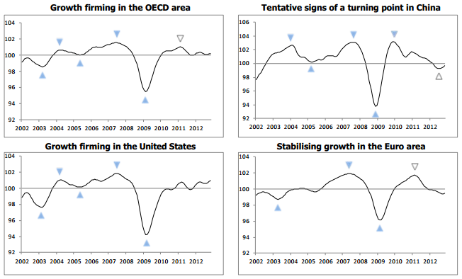 Source: OECD
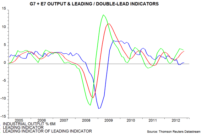
Fidelity’s recession risk scorecard for the key economies show a mixed picture:
 Source: Fidelity
ECRI’s US leading indicators remain in an uptrend and positive:
 Source: Dshort/ECRI
Global narrow money as a leading indicator continues to show growth into the Spring but thereafter it could weaken:
 Source: MoneyMovesMarkets / Thomson Reuters
Global equity fund flows show too much frothiness in shares currently:
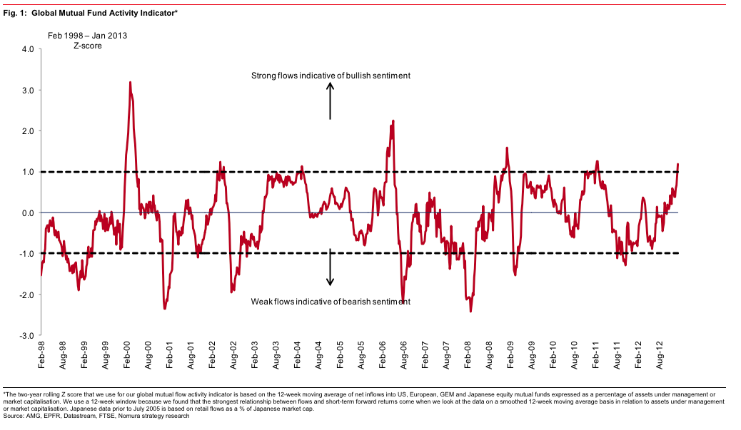 Source: Humble Student / Nomura
Note that in March 2000, such excesses pinpointed the cyclical/secular top for stocks, whereas in 2007 it did not highlight a cyclical top. As we do not see a congregation of other cyclical stocks topping indicators at this point, I believe this is a warning flag rather than a sell-all signal.
Economic Surprises look like this for the USA and Europe respectively:
 Source: Ed Yardeni
 Source: Alphaalcove / Bloomberg
Europe surprises (white line above) are finally moving into the positive, whilst US surprises are dropping fast.
Lastly, US earnings came in at a 65% beat rate for the first week, but we need to await more to be confident of a theme.
If I draw together all the above data, the picture is one of weak global growth ahead into the Spring, with mixed fortunes and rotating leadership. The differences between major countries and between leading and surprises continue to suggest a picture that needs watching closely. I suggest there is slim chance of a global recession right now, but will be looking for evidence of countries uniting in weakness ahead to bolster that likelihood. On the flip side, I will be looking for a more united picture of improving fortunes across the globe ahead to provide evidence that we can push for the growthflationary finale into the solar peak that my solar/secular research predicts.
One more chart to finish. NOAA’s global climate report revealed that 2012 was in the top hottest years globally on record. But within that it was the hottest year on record where La Nina occurred (which has a cooling effect). The chart of the last 60 years looks like this:
 Source: NOAA
The question is whether the cluster of bars over the last 10 years is a topping pattern or whether the uptrend is still in tact and 2013 potentially becomes a new record hottest year without La Nina around and a possible weak El Nino in play. Were the latter to occur that would help deliver an acceleration in soft commodities.
I have updated all models this morning. Geomagnetism is forecast to continue to be tame the next 3 weeks, which is supportive for pro-risk; and the recent higher daily sunspots counts add weight to the likelihood that the sunspot peak remains ahead and that excitement in humans should accordingly build.

NOAA climate chart added since original post
Thanks John! Good stuff. I think the inflows are a bit dangerous to use as they could also indicate money shifting from bonds into equities. They indicate peaks but just as the VIX also indicate break-outs. After the cyclical bear, it is probably going to be all into equities when gov bonds start to a generational turn and the inflows should explode. What softs are you holding?
Thanks Robert. My complete list of holdings is in the comments on this post:
https://solarcycles.net/2013/01/02/review-of-2012/
Also started dumping shares and moving stuff into commodities and one stock. RIM ;). Expecting a geomagnetic storm to hit anytime next week.
If we hold today it looks like we broke out in the SPY.
Another squeeze—and the market goes higher. It may be true that more money are perhaps lost trying to guess the TOP ( by shorting stocks) than actually lost in a bear market.
John, you decision to have only sold 40% long position is a good one. Gold is looking very good now.
Thanks Edwin
I think the rally in Gold will start in Feb as per gold/presidential cycles.
Hello John,
I´m new here and I think all what you write is really very interesting. It´s always a good cause for thought, but of course I have my own opinion.
I have a question. Do you know, which indices the PFS Group use for the early/late cyclicals Y/Y% change? When I use just financials/energy I get a very strong picture.
Regards
Roland
Hi Rolandu. Early cyclicals: consumer and tech; late cyclicals: basic materials and energy
Thanks John, very informative (as all your comments and articles)
Checked it. Maybe financials/energy also a good possibility.
I was casually gazing at GLD’s performance on Google Finance the other day, and I was surprised to see what GLD’s P/E Ratio was. As of 18th Jan, it’s currently at 28.59 times earnings, surely that’s a sign that paper Gold is getting excessively overvalued?
SLV is marginally cheaper at 21 times earnings, but still, paper Silver and paper Gold do look much like dot com stocks in the Nineties. Back then, nobody took notice of the stock market P/E ratios, even when they soared to 20-40 times earnings. We all know what happened next, so I’m guessing that any further gains in paper Gold or paper Silver will seriously overheat the price, and create a proper bubble
Thanks Pete. I’m struggling with that as the GLD is a gold-holding trust and as gold doesn’t have any earnings I can’t understand a p/e. Can someone explain?
When Gold itself is sold, there are no earnings, but because GLD is a trust, they sell shares, backed by Gold, as opposed to the actual Gold. The reason why GLD follows the Gold price so well is because when the share price differs from the real Gold price, the fund’s manager exchanges 100,000 blocks of shares for 10,000 ounces of Gold.
The share price is, in theory supposed to represent a tenth of the actual Gold price. Interestingly, viewing GLD charts on some sites simply says N/A for the P/E ratio, whilst Google Finance clearly states the fund’s P/E ratio as being in the high 20s. A P/E ratio of 25+ signals several things: high expected future earnings growth, present earnings being amazingly low, or there may be excess speculation (a bubble)
Chart and post on Bradley turns for past year.
http://thekeystonespeculator.blogspot.com/2013/01/spx-daily-chart-shows-bradley-turn.html
Thanks Marlowe
Just saw this today…triple dip recession for UK possible