I lost my short term edge for downside in Norway, and my cycles turn up next week, together with the seasonality (bullish last two week of December). So covered my shorts.
But my signals want to reshort in a couple days… so not sure how this will play out. My statistics say that the correction is not over for Norway.
I have a bit of a feeiling like December 2007. Markets were making a shoulder, bit then Xmas came… and the market said: “now hold that bearish thought, but allow the Xmas rally to complete, and then get bearish again”
Thanks Jan. I have big short positions but with stops. Have to allow for that market rally possibility. The complacency is still there though despite the correction – put/call ratio yesterday straight back to contrarian levels.
The 1920’s Dow analog is suggesting an equities top mid-January. Mercury’s declination is indicating an upturn starting next week until 8 January: http://time-price-research-astrofin.blogspot.ca/
The 01 January 2014 major Bradley is a big one – so is the next one during July 2014.
Milan (who sometimes posts on this site) has discovered major Fibo timelines in the gold market to be early January and July 2014.
And the huge, sudden dumps of newly-created paper gold have recently started again (although they are becoming less effective) – this could be an attempt to keep the gold market subdued before a no taper vote next week.
Perhaps one final holiday surge for equities until reality bites in the new year, and a corresponding major low for gold and commodities…
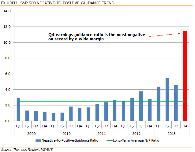
Thanks Mark. Leading indicators point to global industrial production peak between Dec and Feb – http://moneymovesmarkets.com/journal/2013/12/9/global-leading-indicators-confirm-coming-growth-peak.html – suggesting the current strength in economic data is temporary and will give way to disappointment again. Likely disappointing earnings as per the chart above in Q4 earnings season kicking off around Jan 9, there’s a potential combo to change perceptions.
Thanks, John. Good luck. Investors Intelligence historical reading> 58,2/14,3> 43,9. It is a matter of time. Must see 30-years-T-bond reaching ascending trendline and ETF TLT-20years in lineal and logarithmic to point definitly the end of the current cycle.
The action has a downward bias now, in my opinion. Nasdaq broke down out of its wedge, RUT has a lower higher and lower low. Markets closed at the lows again on Friday. Leaders rolling over whilst stocks like Twitter (up 30% in one week despite no profits) propping up under narrowing breadth. All tentative of course – am very much open to bulls taking charge again and markets making new peaks under further froth. But historically when market sentiment hits that kind of extreme as seen with Investors Intelligence, stocks normally struggle to gain further upward traction until it’s purged.
John, you’ve been right for quite some time now about equities. I give you credit, sir. We are seeing some key developments I think is critical for the next couple of months:
I think the big thing to watch here is high yield corporate debt. Everyone knows that it is at record lows (yields), however if you get granular with it and look at some of the individual co. bond performance vs. equity, there are some disconnects out there. This is deeply concerning as bond prices are not at or near yearly highs like their equity is.
Second, the ratio between high yield corp debt and US treasuries (using HYG and TLT as proxies) is hitting a resistance trendline which started at the top in 2007. The TL was formed when the 2011 debt downgrade occurred. We are now testing it. I have a feeling we probably won’t break up and through it (bearish for equities).
Third, the price pattern from 2009 to 2013 in the SPX is nothing new. In fact, we have seen similar price patterns in 6 other occasions, all with varying end results. This includes 1929, 1987, and 2007. I wrote about this on my blog.
Fourth, the spread between Gold and the SPX is testing major support developed in 2000 and formed in 2007. The fear stocks bring hit because of “whatever catalyst” translating into crushing gold and gold miners doesn’t show up historically. In fact, it is quite the opposite. If you plot NEM (Newmont Mining) against the SPX, the breakdown of correlation seen over the past 2 plus years occurred in 1996 – 2000 and in 2006 – 2007, signaling a top in SPX and seeing NEM outperform (moved higher while SPX moved lower). This looks more like the 1996 – 2000 setup however.
Lastly, IYR (Real Estate ETF) broke down months before the SPX did in 2007 after making a blow off-like top move which consisted of ~6 months. 2013 has seen the EXACT same pattern.
I’ve been posting charts and updates on Twitter and the blog. Hope you get around to seeing some of them.
The ongoing thesis is after 5 years of sub-normal recovery/growth the whole world economy is finally going to really take off. I have been following Investors Intelligence for years and that 58% bullish and under 15% bearish was eye popping. I had not realised it was a record ratio. The other charts were totally top looking. The timing problem, 2000 traded for 2 years in a range topping out. 2007, just 4 months.
This chart may mean something… or not
It shows the accumulated Tick Moneyflow (by WSJ), and the expected SPX-price (green) from the correlation with SPX
Data only excist since 2010.
We see some striking patterns, but what do they mean?
Both in 2011 and now, we first saw a period of decoupling of SPX and moneyflow, where moneyflow was negative, while SPX went up.
Then a 6-9 month period where SPX went sideways/up, while moneyflow started rolling over.
This created a big divergence between SPX and the expected price from moneyflow (-correlation). And when moneyflow really started breaking down in 2011, we got the August crash.
Similar, moneyflow is now starting to really break down to oversold levels.
So will SPX crash again, or does it mean that moneyflow soon will start to surge back, with a corresponding rally in SPX…
here is a speculation… IF SPX had broken down in October (default), things would have been very similar to 2011:
In the DOW daily it looks like this
BUT we didnt break down in October, and surged to new highs.
Could be just a squeeze and thereby a Three peaks and domed house.
So either a real breakout and continuation this winter, or a (domed) house of cards… 🙂
John been following you for a while and have been impressed by your analysis. You mentioned you are short and I tend to agree although I’m anticipating mid Jan as an entry point. I was just wondering what your stops are on your shorts. Are they at the recent highs or above? If the FED do not taper next week I expect a strong rally to around the recent highs or maybe just short of them.


I lost my short term edge for downside in Norway, and my cycles turn up next week, together with the seasonality (bullish last two week of December). So covered my shorts.
But my signals want to reshort in a couple days… so not sure how this will play out. My statistics say that the correction is not over for Norway.
I have a bit of a feeiling like December 2007. Markets were making a shoulder, bit then Xmas came… and the market said: “now hold that bearish thought, but allow the Xmas rally to complete, and then get bearish again”
Thanks Jan. I have big short positions but with stops. Have to allow for that market rally possibility. The complacency is still there though despite the correction – put/call ratio yesterday straight back to contrarian levels.
The next few weeks could be very interesting…
The 1920’s Dow analog is suggesting an equities top mid-January. Mercury’s declination is indicating an upturn starting next week until 8 January: http://time-price-research-astrofin.blogspot.ca/
Some short term cycles show an equities swing low next week: http://equityny.wordpress.com/
The 01 January 2014 major Bradley is a big one – so is the next one during July 2014.
Milan (who sometimes posts on this site) has discovered major Fibo timelines in the gold market to be early January and July 2014.
And the huge, sudden dumps of newly-created paper gold have recently started again (although they are becoming less effective) – this could be an attempt to keep the gold market subdued before a no taper vote next week.
Perhaps one final holiday surge for equities until reality bites in the new year, and a corresponding major low for gold and commodities…
Thanks Mark. Leading indicators point to global industrial production peak between Dec and Feb – http://moneymovesmarkets.com/journal/2013/12/9/global-leading-indicators-confirm-coming-growth-peak.html – suggesting the current strength in economic data is temporary and will give way to disappointment again. Likely disappointing earnings as per the chart above in Q4 earnings season kicking off around Jan 9, there’s a potential combo to change perceptions.
John Hussman’s Sornette bubble work with finite time singularity targets from around now to the end of January could also be added to that list!
http://www.hussman.net/wmc/wmc131111.htm
http://www.hussman.net/wmc/wmc131125.htm
And the rest of his work just raises the probabilities that it could be good for a pretty sizeable spike high. 😉
Thanks, John. Good luck. Investors Intelligence historical reading> 58,2/14,3> 43,9. It is a matter of time. Must see 30-years-T-bond reaching ascending trendline and ETF TLT-20years in lineal and logarithmic to point definitly the end of the current cycle.
Thanks Antonio
John is shorting ($RUT) the weakest of the major indexes with the highest PE along with weakening internals.
The chart pattern supports his short.
It is all about probability. Good luck!
Thanks Newt. I’m short various indices but my Rut short is the biggest.
Interesting but think it is dangerous to short into rallies =). Wait for the break down and play it safe =).
Study bitcoin. Think you guys are too eager too look smart. Let the price action dictate your bias =). It is enough to get the meat of the move.
The action has a downward bias now, in my opinion. Nasdaq broke down out of its wedge, RUT has a lower higher and lower low. Markets closed at the lows again on Friday. Leaders rolling over whilst stocks like Twitter (up 30% in one week despite no profits) propping up under narrowing breadth. All tentative of course – am very much open to bulls taking charge again and markets making new peaks under further froth. But historically when market sentiment hits that kind of extreme as seen with Investors Intelligence, stocks normally struggle to gain further upward traction until it’s purged.
Study markets from 1995 to 2000… same thing could happen.
That´s not the current cycle
@apanalis
Going long next week in positive lunar period.
John, you’ve been right for quite some time now about equities. I give you credit, sir. We are seeing some key developments I think is critical for the next couple of months:
I think the big thing to watch here is high yield corporate debt. Everyone knows that it is at record lows (yields), however if you get granular with it and look at some of the individual co. bond performance vs. equity, there are some disconnects out there. This is deeply concerning as bond prices are not at or near yearly highs like their equity is.
Second, the ratio between high yield corp debt and US treasuries (using HYG and TLT as proxies) is hitting a resistance trendline which started at the top in 2007. The TL was formed when the 2011 debt downgrade occurred. We are now testing it. I have a feeling we probably won’t break up and through it (bearish for equities).
Third, the price pattern from 2009 to 2013 in the SPX is nothing new. In fact, we have seen similar price patterns in 6 other occasions, all with varying end results. This includes 1929, 1987, and 2007. I wrote about this on my blog.
Fourth, the spread between Gold and the SPX is testing major support developed in 2000 and formed in 2007. The fear stocks bring hit because of “whatever catalyst” translating into crushing gold and gold miners doesn’t show up historically. In fact, it is quite the opposite. If you plot NEM (Newmont Mining) against the SPX, the breakdown of correlation seen over the past 2 plus years occurred in 1996 – 2000 and in 2006 – 2007, signaling a top in SPX and seeing NEM outperform (moved higher while SPX moved lower). This looks more like the 1996 – 2000 setup however.
Lastly, IYR (Real Estate ETF) broke down months before the SPX did in 2007 after making a blow off-like top move which consisted of ~6 months. 2013 has seen the EXACT same pattern.
I’ve been posting charts and updates on Twitter and the blog. Hope you get around to seeing some of them.
Thanks,
@Ryknow16
Thanks Ryknow, Interesting stuff, and your new site looks neat.
The ongoing thesis is after 5 years of sub-normal recovery/growth the whole world economy is finally going to really take off. I have been following Investors Intelligence for years and that 58% bullish and under 15% bearish was eye popping. I had not realised it was a record ratio. The other charts were totally top looking. The timing problem, 2000 traded for 2 years in a range topping out. 2007, just 4 months.
If global economy starts to gain traction then I suspect commodities and/or bond yields will rise and kill it off.
This chart may mean something… or not

It shows the accumulated Tick Moneyflow (by WSJ), and the expected SPX-price (green) from the correlation with SPX
Data only excist since 2010.
We see some striking patterns, but what do they mean?
Both in 2011 and now, we first saw a period of decoupling of SPX and moneyflow, where moneyflow was negative, while SPX went up.
Then a 6-9 month period where SPX went sideways/up, while moneyflow started rolling over.
This created a big divergence between SPX and the expected price from moneyflow (-correlation). And when moneyflow really started breaking down in 2011, we got the August crash.
Similar, moneyflow is now starting to really break down to oversold levels.
So will SPX crash again, or does it mean that moneyflow soon will start to surge back, with a corresponding rally in SPX…
here is a speculation… IF SPX had broken down in October (default), things would have been very similar to 2011:

In the DOW daily it looks like this

BUT we didnt break down in October, and surged to new highs.
Could be just a squeeze and thereby a Three peaks and domed house.
So either a real breakout and continuation this winter, or a (domed) house of cards… 🙂
Interesting Jan. The divergence you present fits with other divergences I’ve noted on the blog, as in the same kind of time window.
John been following you for a while and have been impressed by your analysis. You mentioned you are short and I tend to agree although I’m anticipating mid Jan as an entry point. I was just wondering what your stops are on your shorts. Are they at the recent highs or above? If the FED do not taper next week I expect a strong rally to around the recent highs or maybe just short of them.
Thanks Krish. Layered in shorts into the declines, stops at breakeven on most. Biggest short is the RUT, stops there between 1124 and 1127.
I think your timing is impeccable.
Now it’s just up for us to see how wrong we are. 😉
Thanks… we’ll see