
I wrote last year about secular equities bear market progression in this post (click to view). I suggested that a pentagon was a typical formation based on history, and that based on pattern repetition what should occur next was an upwards breakout, followed by a retrace to the nose level, then secular bull momentum after that.
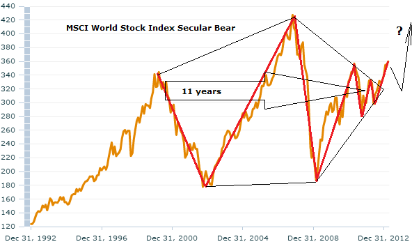
This is how the MSCI World Stock Index now looks:
 Underlying Source: MSCI
A breakout has occurred. This pentagon shape and breakout can be found on the same timeframe for FTSE, Dax, SP500, Dow, Hang Seng and other indices. The action represented by the black arrow is what I suggested could happen next, with the momentum go point potentially coming in 2014/2015. This idea was based around my primary scenario of commodities making a secular top ahead in 2013/2014, helping to tip the world into a mild recession with stocks falling into a mild bear accordingly, before they charge – rather than the alternative that commodities peaked in 2011 and secular stocks bull momentum is already underway.
Here are the SP500 and Dow technical shapes during the last two secular bears:
 In addition to the pentagon formation, I have highlighted on these charts and the top MSCI world chart above what is in effect a large W formation followed by a small W formation (in red). OK, we are operating on a fairly meagre sampling from history here, due to many country stock indices only having recent history, so perhaps don’t read too much into either of the formations that I am picking out. However, the message from both the pentagon and the WW formation would be that secular bears typically end with a coiling, a narrowing of volatility, and based on that we might not expect another major cyclical bear market ahead.
However, these charts are nominal. The inflation adjusted picture is very much a down-sloping pentagon, rather than the relatively benign-looking sideways range that the above charts show. The true secular bear progression can also be revealed through a gradual wash out in the stocks to gold ratio, and a similar gradual demolition in the price/earnings ratio in equities. In the last secular bear, US stocks began with a p/e of 24.1 and ended on a p/e of 6.6, shown here:
 Source: Zealllc
Also note the bottoming p/e of the 1940s secular bear reached around 9. What I have tried to highlight with boxes on the above chart is that both the last secular bears ended with overall sideways action whilst p/es fell significantly to reach their secular low. This was because they both ended with an inflationary peak (circa 1947, 1980). High inflation will pull down the p/e ratio as stocks trade sideways, because they are cheapening in real terms.
So, in our current times, if stocks are to end with a similar final washout in p/es before new secular bull momentum, then there are two ways to achieve it. The first would be in line with history and this would be a period of peak inflation, where p/es shrink as stocks trade overall sideways. The second would be an absence of inflation (commodity slack and low money velocity continue), whereby stocks fall hard in nominal terms to achieve the p/e washout. This second scenario perhaps has a rhyme with Japan’s secular bear from 1989, which made a series of lower lows as it progressed, in the clutches of deflation. So, like I posed yesterday, is the US the new Japan, or is inflation still dominating and peak inflation a likely possibility? I suggest the shaping of the secular bear to date (we are currently at all time highs despite being in a secular bear) and the undoctored picture of inflation reveal that inflation is in play in the US, rather than deflation.

I don’t subcribe to a hyperinflationary outcome, but I think a pick up in yields and in money velocity and an inflationary feedback looping with stocks moving overall sideways is more likely than a deflationary end to the secular bear, whereby stocks fall hard to reach a washout in p/es. But have stocks already washed out enough by p/e?
I believe there is a reason why US stocks bottomed at a p/e of 9 in the 1940s bear, compared to 6.6 at the bottom of the 1970s bear, and that’s the difference in yields and rates, which were at opposite extremes in the two periods. In the current enviroment, and back in the 1940s, bonds and cash are earning little or even negative returns. Dividends are higher on many stocks than the yields on bonds. The p/e alone then doesn’t tell the whole story, because stocks are relatively more ‘valuable’ if bonds and cash are paying you a guaranteed loss. I suggest therefore that, generally speaking, a bottoming p/e of 9, rather than 6, may be more appropriate for this secular bear.
The Dow, SP500, Dax, FTSE, Singapore Straits and Hang Seng all already reached either p/e of 9 or below in this secular bear, not to mention much lower p/es for the PIIGS. Plus equities in general began this secular bear in 2000 from a much higher p/e (44) than the previous bears began. This begs the question as to whether we are going to see higher secular p/e bottoms and tops now and in the future as stocks capture exponential technological evolution or human progress. This question aside, perhaps we could doubt that US equities have washed out enough when we look at CAPE (at its lowest 12 so far) or the Q ratio (0.6 so far versus 0.3 historically). However, not all stock indices necessarily have to washout to single CAPEs (Japan ended the last secular bear at CAPE 20), and the Q ratio perhaps has a long term trend towards higher values, as shown by the narrowing of its two components over time here:

Source: Dshort
In short, I don’t see a compelling case that equities need to wash out more than they have by valuation in this secular bear so far. Meanwhile, the Dow-gold or SP500-gold ratio has also washed out ‘sufficiently’ in this secular bear, if not to record extremes.
So could secular stock bull momentum already be underway and commodities flipped into a secular bear in 2011? Much of what I wrote in The Alternative Scenario (here) to support this alternative possibility is still valid, with the added developments that gold has since broken down and NASA say perhaps the solar maximum already occurred in February 2012. It will become clearer as developments unfold with time, but until then, perhaps my best case against this having happened would be a lack of pick up in yields or velocity by now.
So these are my current conclusions. I don’t see a massive case to wash out valuations further, but will assume that some last drag-down is ahead because of historical secular bear ending patterns and perhaps CAPE and Q ratio. I don’t see a deflationary case for equities to tumble in nominal terms to achieve this, as the secular bear has proceeded against an inflationary backdrop with stocks currently at all time highs, so any such washout, if it is to occur, I’d expect to be overall sideways against an inflationary backdrop. The environment of low yields and rates is pertinent: it perhaps means stocks do not need to wash out ultra low by valuation, and that bid support would be higher. And there is also the potential that we have a permanent shift higher in Q ratio and p/e bottoms. In summary, I don’t expect a major drawdown in equity prices. but something milder.
So, I want to buy into a significant pullback in stocks with a secular bull view. Ideally something that looks like the pullback to the pentagon nose level. Ideally with a few more countries dropping under p/e 10, and ideally on the back of an escalation in commodities and inflation. Until I can rule out that a secular bull in stocks began already, I will likely adopt the strategy of layering in to any pullbacks that I consider deep ‘enough’, perhaps 10% off or more. However, if stocks were to mount such a pullback, then the action in commodities would likely be telling as to whether they have a peak left ahead, and in turn shed more light on the secular equities position, which which to further navigate.

CB leading indicators for USA and China came in at -0.1 and flat, pretty weak readings.
ECRI up again
John, I can’t open your picture, please tell me how to solve
Bullish on stocks in the United States, you think the new economic cycle has started, but I think if to the end of 2013 or 2014 is the real beginning, what do you think? Gold bull market is over?
Sorry yu, which picture can you not open?
I think we are in the secular transition period. My favored scenario is that we have a final mild bear market before the momentum ‘go’ point for stocks.
J H,
Regression to a long-term mean strongly suggests we will head for much lower lows in the near-term, well below the Mar ’09 low of 667:
http://advisorperspectives.com/dshort//guest/John-Carlucci-120110-The-Great-Repression-Update.php
The state of the financial/political world seems to support this view.
Additionally, there is strong evidence which suggests the high was precisely on Apr 11th:
https://docs.google.com/viewer?a=v&pid=gmail&attid=0.1&thid=13e22383d8bfd8e4&mt=application/pdf&url=https://mail.google.com/mail/u/0/?ui%3D2%26ik%3De649b77eeb%2
We’ll soon see if these indicators are valid and severe downside will ensue
Hi Stanley, I can’t open the second link. I concur that regression to trend, like Q ratio and CAPE, suggests more downside may be required to wash out US stocks – but caveats are per my article above. However, most other countries have washed out better than US stocks. See the Dax here:

3 times hit p/e 9, and if we are looking for a third bear market leg down, it already had it in 2011. So I just don’t know if we need US stocks to wash out more comprehensively.
Hi Stanley, analysis on very long term charts can be very rewarding. But they hinge on getting the long term appreciation rate correct.
I have been doing similar chart for Nasdaq from 1970-now. My latest version was done in 2010 and can be found here: http://fourpillarsfinance.wordpress.com/2010/05/26/long-term-prediction-chart/ . You can see how I used crossing lines to time potential bottoms and tops. The Sep 2011 low has come right on the mark, and the expected top near Feb 2013 may also pan out quite well. Per this chart we are in a bull market until 2016, then weakness/depressed for the next 7 years.
John Carlucci is wrong. This is the same logic applied to US social security running out. I did a paper about the same thing for a macroeconomics class. On review it was found that money pulled out of the markets by boomers would have an impact on supply and demand greater then if they relied on government only support like welfare or social security. The ensuing inflation would have an impact on how fast the money withdrawn as well as if it were enough to survive on. Given that most boomers lost in the great recession (or never saved enough), most will work beyond normal retirement ages because they also are apt to live longer an do not want to run out of money in retirement. If a crash or decline occurred due to the withdrawal.Unemployment would jump very high due to reentrants running out of money in retirement accounts. Fed mandate on inflation and unemployment would kick in also. Do also keep in mind this scenario would vastly increase tax revenues to US Treasury. Finally, this type of scenario Carlucci speaks to is contrarian to so many other waves and cycles. 2007-2009 should not repeat until around 2083-2086 timeframe. Recession and downturn in Q3 2013 – Q3 2014. Increase until 2019 crash and then rebound until 2025.
Have added to ultrashort 20yr treasury – i.e. more short treasuries.
Hope this link works. The chart “Anatomy of a bubble” has been paired with a chart of the Gold price in USD, arguing the case for the Gold price having been in a burst bubble.
http://twitpic.com/ckfhq1
Thanks Pete. The same can be applied to the CCI index too. Though gold has the furthest to fall.
Hasn’t had much of a mania though about it.

No compelling reason why gold has to go crazy to complete its secular bull, but the post-peak action doesn’t look particularly post-bubblish either.
But I’m not being complacent here – it’s a tough one to call.
Here’s another but wider bubbles comparison. http://www.sharelynx.com/chartstemp/BubbleComparisons.php
John,
Several interesting correlations:
Charles Nenner’s latest video has him saying that at the beginning of May it starts to get scary when referring to the stock market. http://finance.yahoo.com/blogs/breakout/stocks-set-scary-may-says-nenner-151635217.html
The S&P 1952 correlation supports Nenner in that it shows a plunge in beginning of May http://www.mrci.com/special/dspi52.php but also a recovery soon after.
Your projections indicate a rise in the S&P then a sharp fall and then a rise; however, commodities continue to rise throughout this period. A war could cause this scenario to occur. This article on the cycles of war predicts a war in the year 2014. http://www.marketoracle.co.uk/Article40008.html
Charles Nenner predicts that gold will start to rise soon then top in December 2014 which may support the war prediction in 2014 and your prediction of rising commodity prices.
The S&P 1952 correlation indicates a top in S&P in December 2013 then a slide down to September 2014 before resuming what appears to be a bull market in stocks into 2016. This scenario supports the war prediction in 2014 in which stocks slide because of a war. This scenario also supports your prediction of a stock peak then a fall then a rise. This 1952 S&P correlation is also in line with the theory that stock prices increase in years ending in 5 (2015). This 1952 correlation is also in line with the presidential cycle which has stocks rising during last two years of the presidential cycle (2015, 2016).
Jack, int he past I have mentioned 1953 and 2013 are same year type in Chinese astrology. So I expect there to be similarities due to this. Keep in mind, between 1953 and 2013, this pattern did not reoccur. Given that the Chinese new year is later in the year, January and a little of February sometimes of a given year is considered as the end of the previous Chinese calendar year.
Also:
http://en.wikipedia.org/wiki/Recession_of_1953
Hi wxguru,
Actually from 1952 to 2013 is about 60 years so I was thinking that the Kondratieff cycle was somehow staring to repeat in 2013. Maybe some of the ups and downs in the 1952 S&P will repeat in 2013. See John’s excellent post on the Kondratieff cycle at https://solarcycles.net/2012/10/01/kondratieff-and-solar-cycles/
Although the Chinese, Indians and Tibetans also used 60 year cycles in their calendars http://en.wikipedia.org/wiki/Tamil_calendar#Sixty-year_cycle
Very interesting, thanks guys
Hi John,
I thought that you might like this article.
http://thewisemag.com/astrology/item/194-the-solar-and-planetary-cycles-and-world-trade
Thank you
The Widowmaker:
http://online.wsj.com/article/SB10001424127887324763404578428643259226034.html#articleTabs%3Darticle
Nat gas going > 6 bucks
http://www.minyanville.com/businessmarkets/articles/widowmaker-natural-gas-widowmaker-natural-gas/1/31/2012/id/39016
Nat Gas, likely my longest holding. Bought when it dropped sub 4.5, seeing it as a bargain. Finally may be heading for profit!