
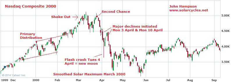
The dot.com boom peak in 2000 occurred on a monthly sunspot spike at the ~11 year solar maximum, with the familiar topping process pattern of primary distribution – shake out – second chance – waterfall declines. The major declines and flash crash occurred in March/April, with associations of Mondays and the new moon (correlations that hold up in wider stock market history).

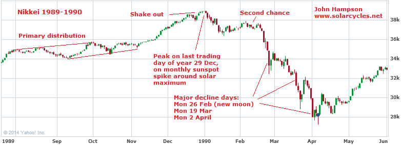
The Nikkei boom peaked on the last trading day of 1989 on a monthly sunspot spike at the ~11 year solar maximum, with the same topping process waves. The major declines were centered around March, with associations again of Mondays and the new moon.
The Dow peaked so far on the last trading day of 2013, on a monthly sunspot spike at the ~11 year solar maximum (11 years is average and this was a longer solar cycle), with a similar topping process so far.
 With the historic associations of Mondays and new moons, we have a potential major down day Monday 1st March, which is the new moon (CORRECTION: Monday 3rd March, 1st trading day after the Saturday 1st March new moon), and based on the percentage drops of the Nikkei and Nasdaq we could potentially waterfall to 11,000 by the end of April. The relevance of March and April is captured here:
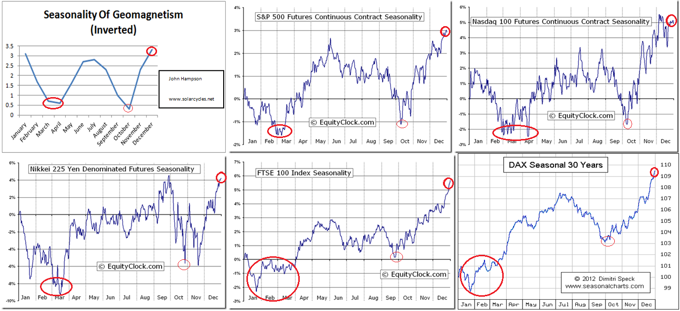
Just as the seasonal peak of geomagnetism (inverted) corresponds to peak stock market seasonality and a clustering of major tops having occurred at the turn of the year, so the seasonal lows of March/April and October have corresponded to worst seasonal stock market performance and a clustering of market crashes.

thanks…
^.^
welcome..
Hi John,. Not to mention an impending Puetz Window coming up in April.
Thanks, I gave up following Puetz crash windows after too many misses, but due to the solar/lunar basis it may be worth another look.
Thus, do you contemplate new marginal highs in some indices until end of feb´14?
For instance Nasdaq Compsite in 2000 made
@apanalis
I would have no problem with that as long as the main case held good, like for the Dec 31 peak case which was (so far) sufficiently honoured by the Dow and Nikkei (and SP500 double topping with Jan), without needing all indices to strictly make their peak there.
John, I say WOW to your geomagnetism (inverted) charts!
“Hong Kong stocks fell at start of trading on Thursday, as another trust-product default triggered concerns about the financial stress in China’s shadow-banking sector.”
http://www.marketwatch.com/story/hong-kong-stocks-fall-on-shadow-banking-concerns-2014-02-12?link=MW_latest_news.
As I have suggested before, Chinese people have been told (or indirectly warned) by the Reformers that (free) market forces are allowed to drive the financial market. i.e. defaults are allowed.and should be expected.
No more bail-out. China’s Lehman Brother moment has finally arrived.
As Chinese officials’ focus shifts to self preservation due to the corruption purge, economic activities will slow down even more.
I am adding more shorts (primarily against $RUT) today.
Thanks Newt
A note on March 1 as mentioned above by John.IF!! the turn down yesterday holds and the price in the SPX continues lower, there is a measured move completion at lines on March 1…. Many traders would see this and begin to build long positions as that price is approached.IF!! that price is breached, based on John’s work,traders would scramble to exit contributing to a cascade.
IF!! the indexes make new highs from here after this pullback,my own work has little to support the bearish case until the alternative upside target is reached.
the QQQ allows for a slightly higher high here; so a correct statement should be if all indexes make new highs.
Thanks Slater
John,
Last of couple of days you are building on a great website with great research. I hope your predictions are true.
What do you think about central Banks when they see such a cascade they wont stand pat. we saw Janet yellen clearly saying she can change tapering. I wanted to see your gut feel on that. more money printing is only way we come out of debt trap.Let us know what you think.
Thanks
Bill
Thanks Bill, they will act for sure. I gave some thoughts on that in the last 3 paragraphs of this post: https://solarcycles.net/2014/01/17/timing-major-market-peaks/
I amde a basic calculation that QE is something like half as effective as pushing the equity markets up as it was in the early days. Admittedly making a few assumptions, $2.5bn of QE equates to 1 S&P point now. In the early days (but after the initial injections of 2008) it ‘only’ took $1.1bn to send the S&P up a point. Bottom line is that the marginal contribution lessens the more you do. In the same way that you need incrementally more debt to feed the next 1% point of GDP.
John, The fractal comparison is good between the charts but the current Dow fractal is based off a lower %/magnitude move. I would not expect a similar down move to occur this time as in the other (more extreme up-move) examples above. If the fractal completed the ‘waterfall’ move, I think the realistic potential downside is more like 10-15%. Would you agree? Great blog by the way.
Thanks Alex. You may be right, but I would add that the more supersized moves to the peaks in the Nas and Nikkei were enabled by peak demographic swells, this current one being smaller due to a shrinking demographic pool. Less participants but the same levels of leverage as at those historic major peaks, which could enable the same kind of percentage move to the downside once liquidations begin.
March 1st is a Saturday I believe, so the big down day would be March 3rd, and potential low Tuesday March 4th (Both ’29 and ’87 bottomed on Tuesdays). Using the 18 calendar days that it took from the secondary high to the low in ’29 and ’87 gives us tomorrow for a potential high.
Interesting that DeMark counts are lining up a Countdown Sell for tomorrow on a new high.
Seems like a solid trade to get short with a price stop at the SPX Jan. 15 high and a time stop of ~ 2 days.
Good spot, thanks for correction
And another analysis (looking at harmonic cycles and Gann) suggesting a high during the next few days; then a downside panic into the first or second week in March…
http://equityny.wordpress.com/
Here’s some interesting in depth comparison with 1929 including MACD and divergences I found on stock twits:
http://charts.stocktwits.net/production/original_20014154.jpg?1392310189
Very intresting comparison, thank you.
No start of a bear market, when the cumulative A / D-line is making higher highs: I think, this will prove to be correct once more. But that doesn’t mean, that there is no hope for the shorts and your scenario of a waterfall decline. The AAII-sentiment improvement this week may be supportive of the July 2011 scenario. In that month $nyad and the NDX made higher highs than in den first days of may, but the SPX didn’t. We could well be in the first or even the second half of July 2011. Hopefully the sentimentrader sentiment scales will support this scenario too.
Hello John, I think you might have upset CNN, looks like your website pulling in a lot of interest from other parties. Keep up the good work.
A section of article….
You may have heard about this chart that’s making the rounds among traders and financial media types via e-mail and the Interwebs. It “appears” to show eerie similarities between how stocks have performed lately and how they did leading up to the pre-Great Depression/Stock Market Crash.
http://buzz.money.cnn.com/2014/02/13/stocks-market-correction/?iid=HP_LN
CNN seem to think that you need a looming 1930’s depression to trigger high valued stock markets to tumble – bafflling!
John – really great stuff as always; excellent research clearly presented. A great joy in this era of ego and up-to-the-minute hysteria. Thanks again.
John,
Please compare Japan 89′ with DAX today. Very similar except for the duration of the entire move from top to rebound high. DAX has recovered 75% of initial drop.
Rebought my first shorts today and exited my PM stocks (not the metal).
If DAX and S&P make new highs it is back to the drawing board. I won’t wait for the Dow to confirm and I am ignoring Japan as it was not a major long term high.
John,
Even with the historic associations of Mondays and new moons, I don’t think the 1929 scenario will happen just yet because the Feds will still be pumping money in 2014.
If we don’t fight the Feds, a more likely scenario, in my opinion, is the one found in the S&P and Nasdaq charts in your post:
1. minor low by 1st March
2. steep rise into beginning of June
3. a drop into July/August where there is a market pop that could be the second chance
4. a waterfall decline all the way to October to a low level
5. a rise into the presidential cycle all the way to the 2016 elections
Jack
Love the analysis!
Thank you!
This chart compares the 1929 crash to the current stock market based on a percentage of gains. From that perspective, the charts DO NOT look similar. During the 5 year bull market streak that ended in 1929, the market gained 214 percent. The current five year stock market streak has gained only 88 percent.
I still think we are in a cyclical bull market within a secular bear market that will end around 2017. Then the next secular bull market starts.
Jack
Jack – it’s the fractal comparison that counts, less so the % gains. The fractals are very similar but the % gain has relevance because it suggests to me that the downside is less should the fractal pattern complete. 13,700-13,800 might be a reasonable target IF the fractal pattern continues. Might expect a low in early March but the window for a low but the last 10 days of April have bearish signatures so I suspect we might expect a (primary or secondary) low in that timeframe.
Thank you all